Getting Started
When you purchase our Joomla! template, you’ll then be taken to the Downloads page. Click on the “template” file name to download or you can check back anytime by going to Customer Area page.
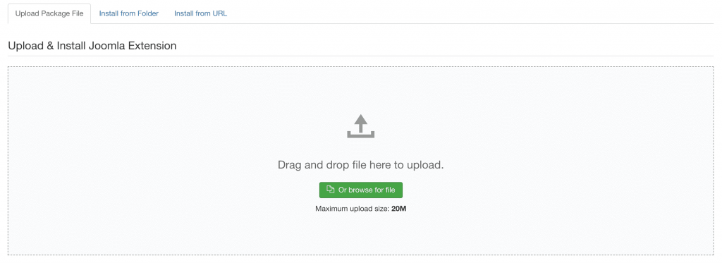
# Template Installation
Download the template installation package template_j3_VERSION.zip and install it by following the official Joomla template installation instructions.
# Joomla Demo Packages
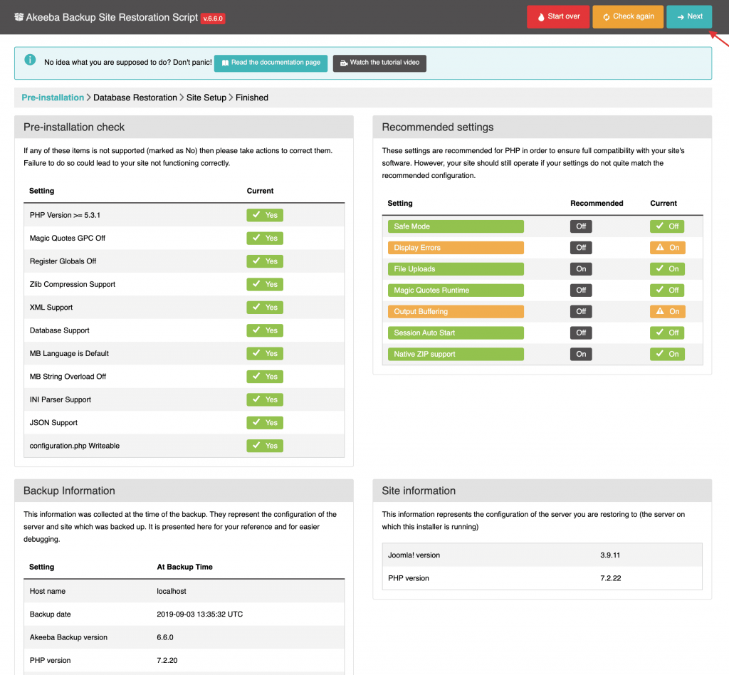
Browse the Customer area and download one of the Joomla demo packages NAME_joomla_quickstart_j3.zip. Unzip it to your web server directory. Now just follow the regular Joomla installation instructions:
Step 1 - Navigate to your domain and start the installation process
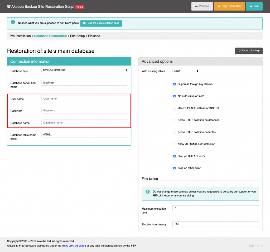
Step 2 - Database: select database type, host name, Database Username, Database Password, Database Name
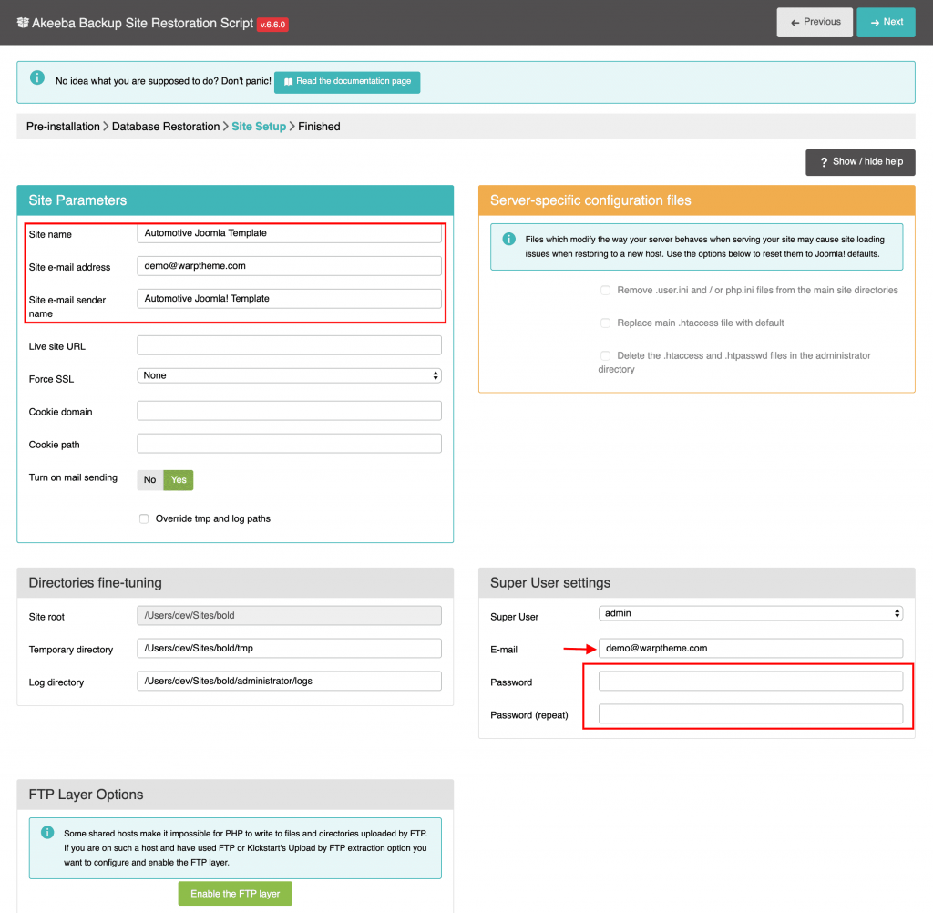
Step 3 - Configuration: add Site name, Admin email, Admin username and password
Step 4 - Remove/Rename "installation" folder: for security purpose, you need to rename or remove the "installation" folder
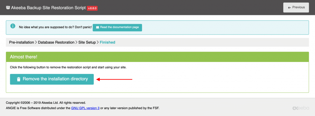
Once this final step is complete you’ll have a fresh install of Joomla, along with the template and all the settings and content needed to match the demo, including sample article content.
Updating
If a newer version of your theme or Helix Ultimate is available, you will receive a notification in the Joomla back-end.
# Update Helix Ultimate
Helix Ultimate framework can be updated using the Joomla update system. Whenever a new version of Helix Ultimate is available, you will receive a notification in the Joomla control panel.# Update Template
Before you can update, just visit the Account dashboard, download your theme package and install it.
Important We strongly recommend to make a backup before updating. That way all your changes will be kept when updating your original theme files by replacing them. Learn more here.
Changelog
To get an overview of new additions and changes, take a look at the changelog (by clicking the version number) of the latest template version.
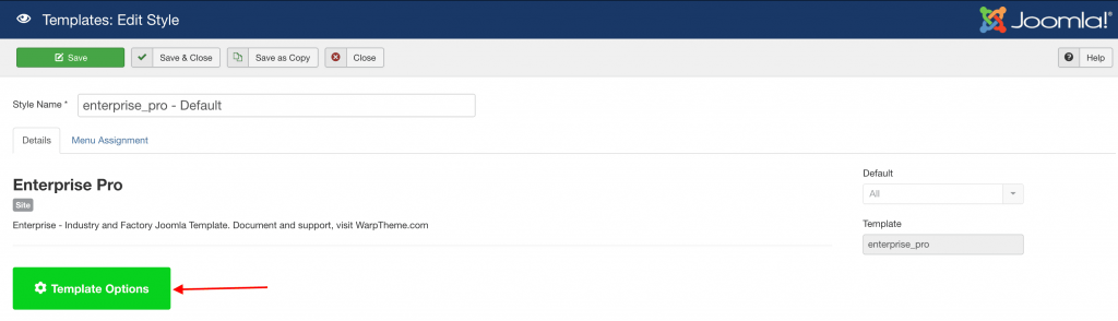
Access to settings
Simply click on Extensions → Templates → Styles, choose the template style and click on the Template Options button.
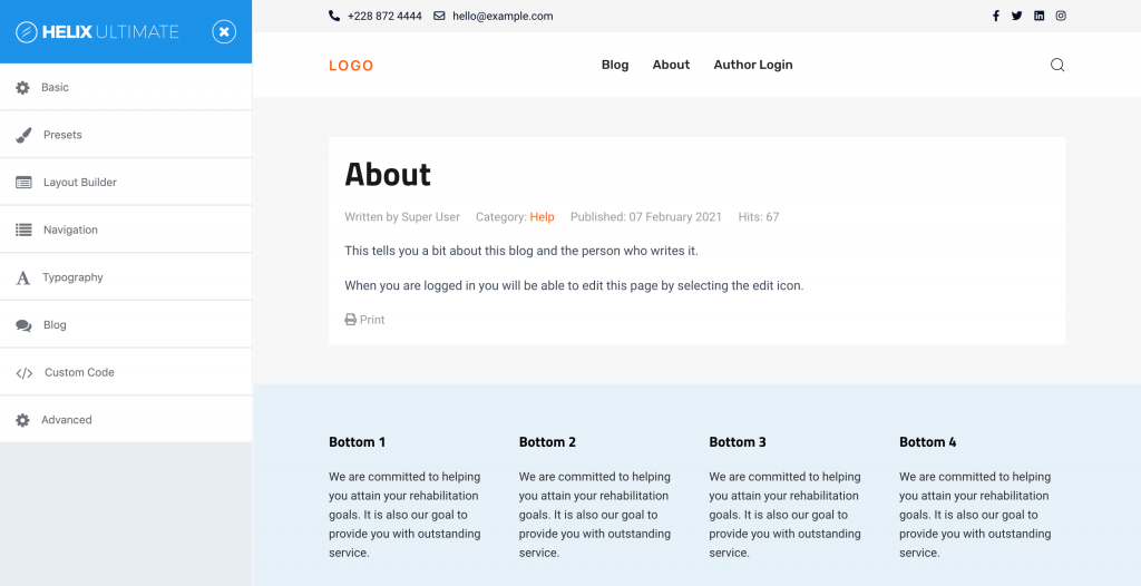
The Helix Ultimate customizer is split into a sidebar on the left and a frame preview on the right. The sidebar offers a navigation across the different setting panels of Helix Ultimate. You will learn about these setting panels in next sections below.
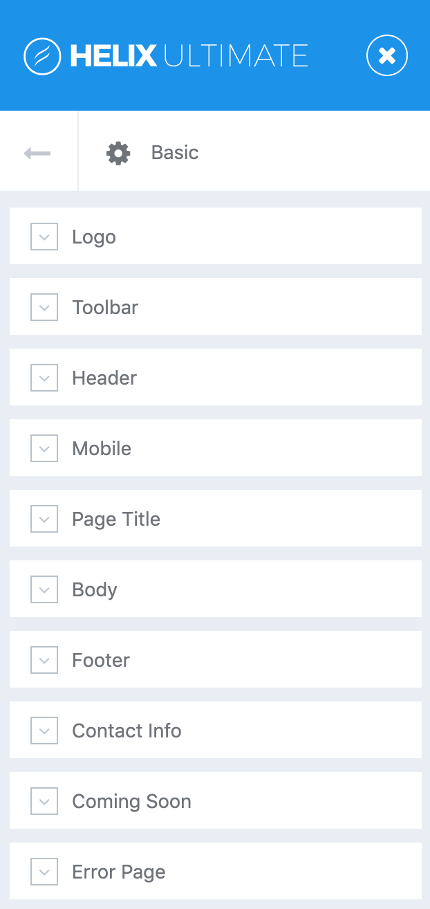
The Basics
Our Joomla templates are based on Helix Ultimate Framework and the front-end framework UIkit. If you are new to Helix Ultimate, these guidelines will help you understand the basics of working with template options.
Logo
The Logo is the brand identity of a website. By default, it is always displayed on the top left of each page. This can be changed by choosing a different predefined header layouts.
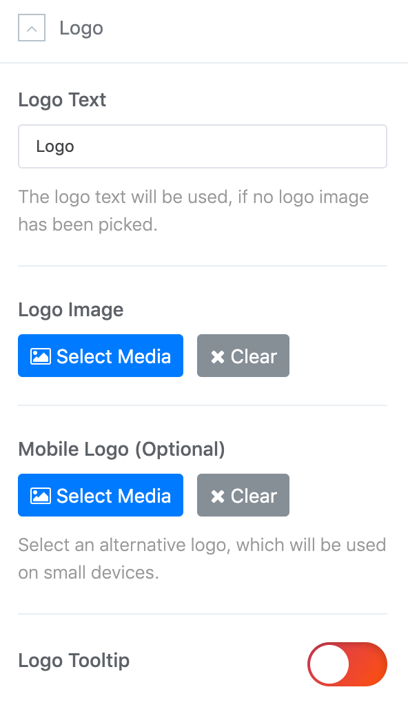
Type in the Logo Text that will be used in case no Logo Image from your media library has been picked.
Upload your logo in the SVG file format for best quality on all screens. Alternatively, you can use PNG or JPG in a high resolution so that the logo looks sharp on all displays.
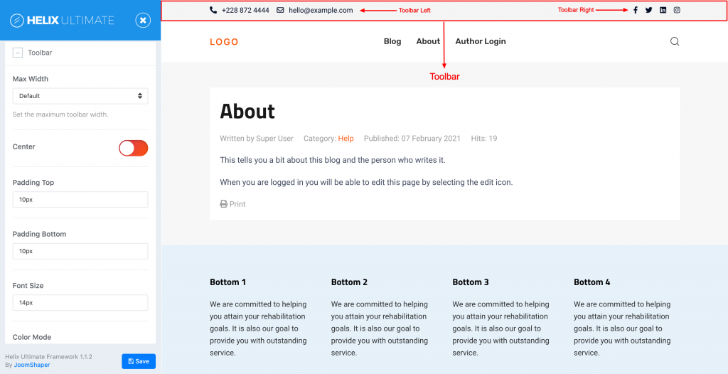
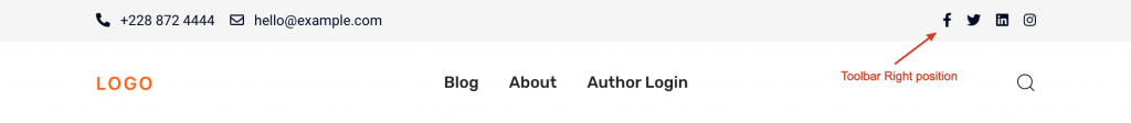
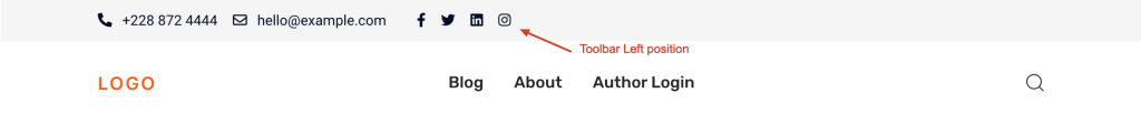
Toolbar Position
| Position | Description |
|---|---|
| toolbar-left toolbar-right | These toolbar positions are located above the theme header. By default, the social icons and contact info are located in these positions. |
The toolbar is only displayed when the toolbar-left or toolbar-right positions have anything to display on the current page. For example, social icons or the contact info be configured to show in the toolbar. By default, the content of the toolbar is constrained to the default container width.
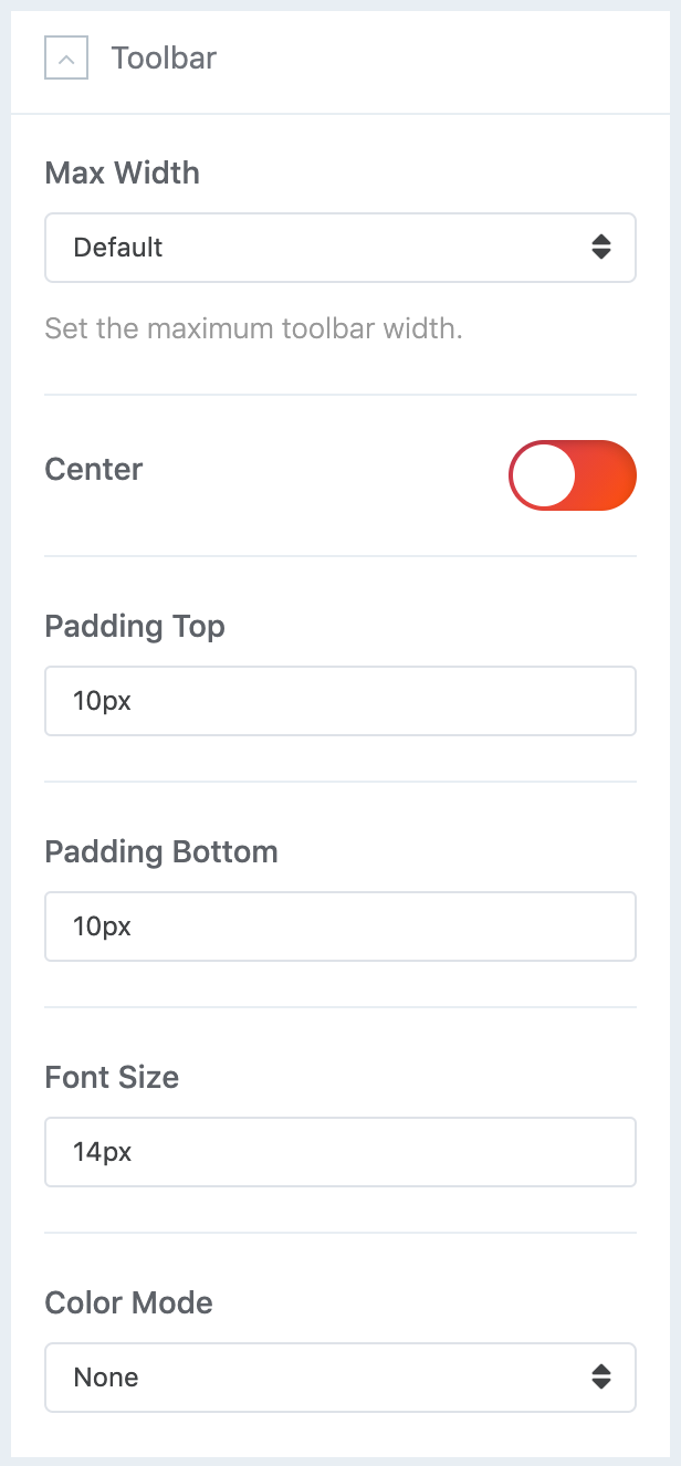
Set the maximum content width for the Toolbar using the Max Width setting. The Default, Small, Large, Xlarge and Expand options add a horizontal padding which adjusts to the viewport width.
| Setting | Description |
|---|---|
| Max Width | Set the maximum toolbar width. |
| Center | Center the toolbar so the toolbar-left and toolbar-right positions appear in the middle of the page. |
| Padding Top/Bottom | Set the padding top and padding bottom for toolbar position. |
| Font Size | Set the toolbar font-size. |
| Color mode | Set the transparent color mode for toolbar. |
Header
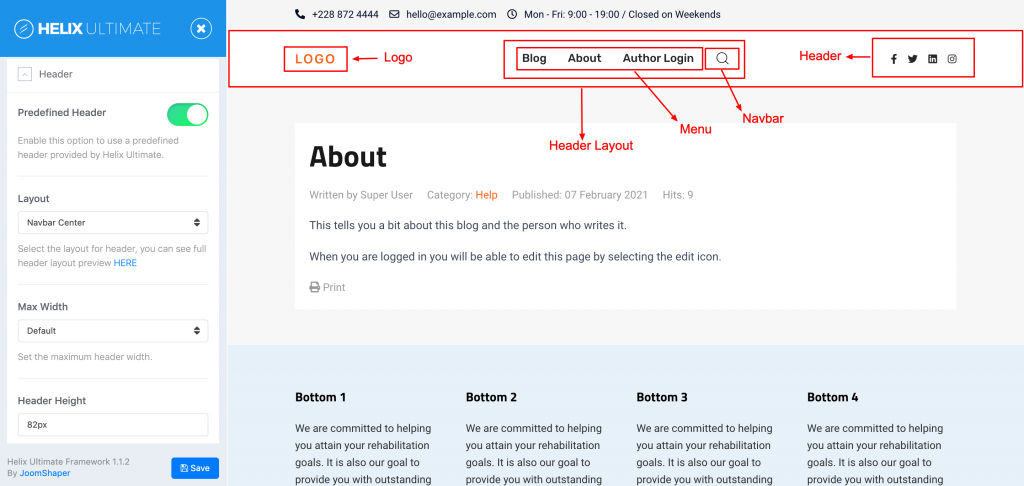
Prepared header layouts define the position of logo, navigation and search. The header layouts consist of three visual positions: logo, navbar/menu and header.
NOTE Menu position is backward compatibility for old Helix 3 based themes.
| Position | Description |
|---|---|
| Logo | This position displays the logo. |
| Menu Navbar |
These positions display the navbar itself as well as the navbar or menu module position. |
| Header | This position displays the header module position. |
You can select whether the social icons and the search show up in the navbar or header position.
Settings Overview
The header and its elements are visible on every page. These header settings apply to desktops and larger devices. All settings for the mobile version can be found in the Mobile documentation.
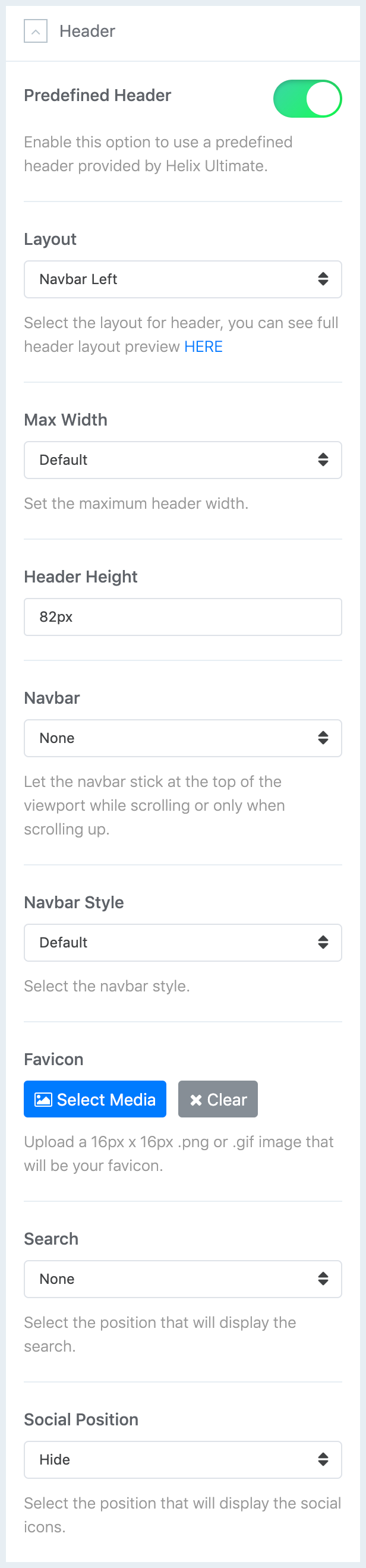
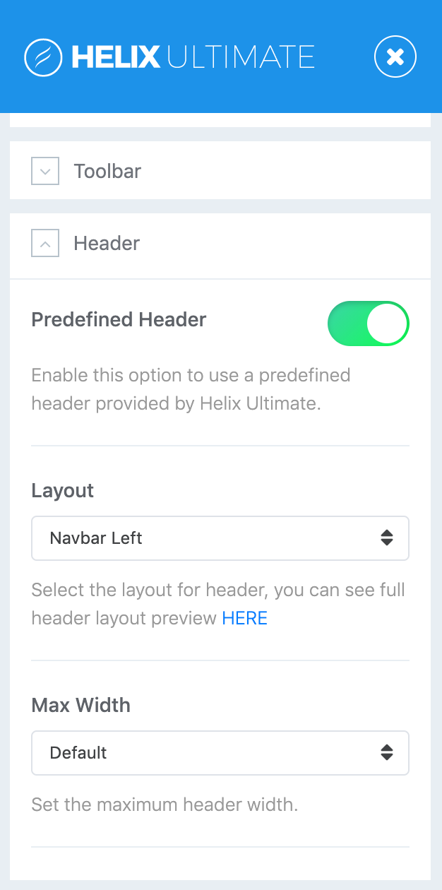
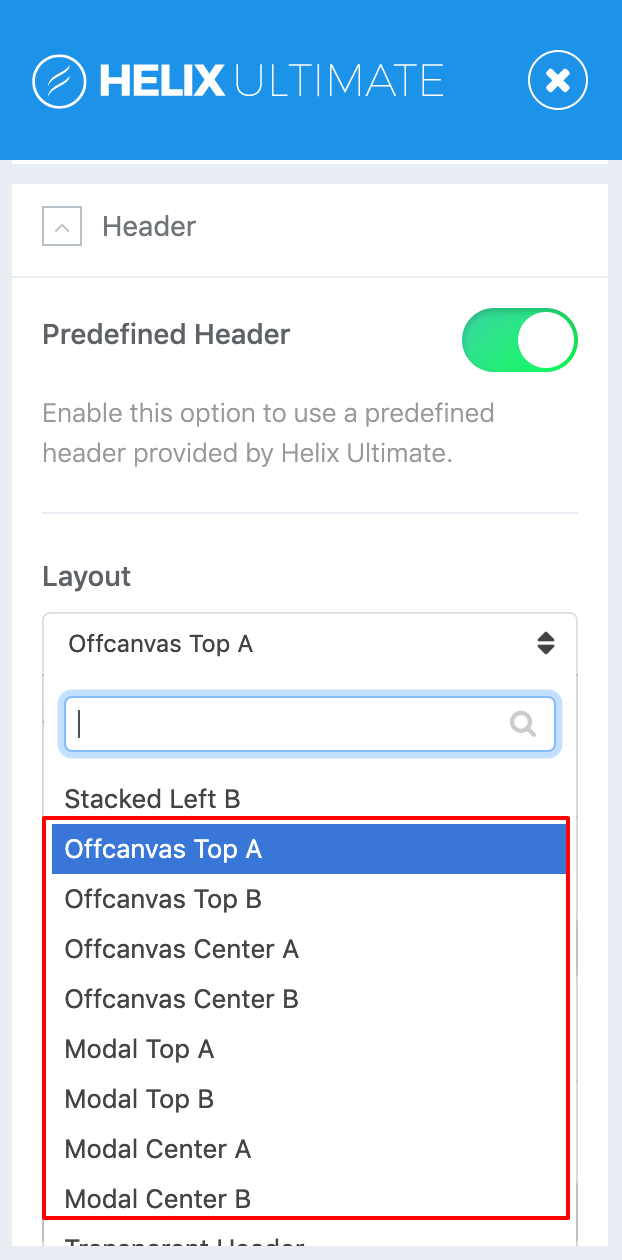
Predefined Headers
We added 18 predefined header layouts for our Helix Ultimate based themes, free themes are limited with 03 header types. The following settings can be found in the Basic → Header → Predefined Headers → Layout panel.
How to create custom header
By default there are 18 predefined Headers. But any time you can disable this option and build your own custom header variation using Layout Builder. Watch Video tutorial (English language) or directly from youtube.
Max Width
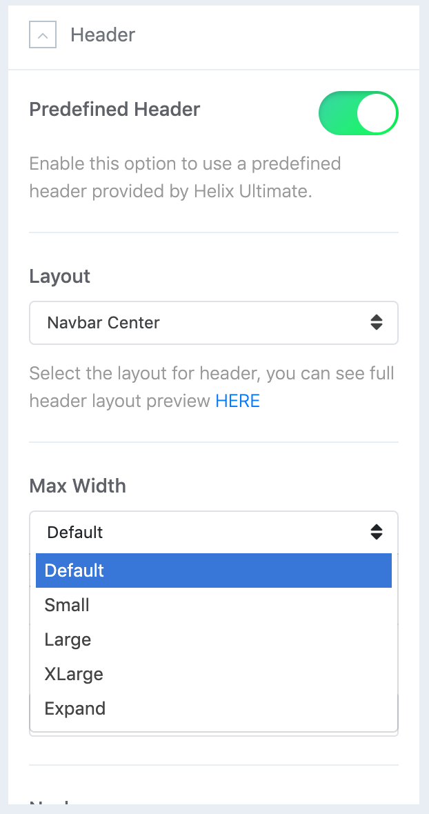
Set the maximum content width for the header and navbar using the Max Width setting. The Default, Small, Large, XLarge and Expand options add a horizontal padding which adjusts to the viewport width. Additionally, the logo padding can be removed for layouts where logo is positioned on the left.
Header Height
Set the header height to increase the height for the Header bar.
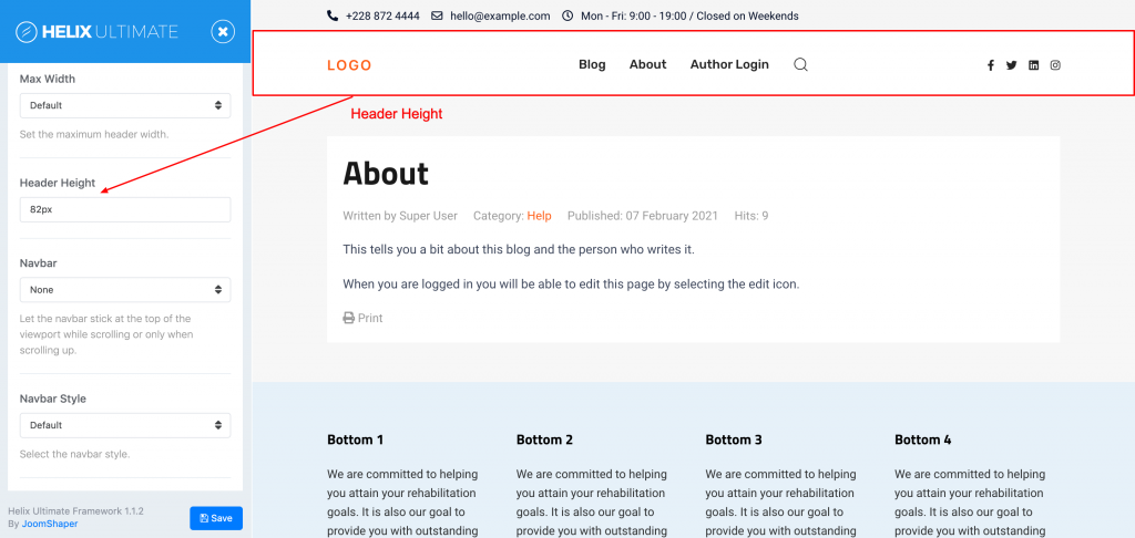
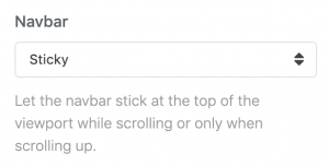
Navbar
Let the navbar stick at the top of the viewport while scrolling or only when scrolling up. There are three options available to control the header navbar position and its behavior.
| Setting | Description |
|---|---|
| Static | The navbar will move out of the viewport on scrolling. |
| Sticky | The navbar will stick at the top of the viewport on scrolling. |
| Sticky on scroll up | The navbar will move out of the viewport when scrolling down, and it will become sticky on scrolling up |
Navbar Style
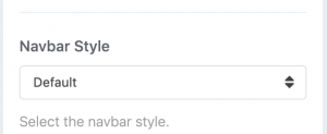
Choose between the Default menu and the Primary menu with a larger font-size.
Navbar default style

Navbar primary style

Favicon
The Favicon appears in the browser tab and your bookmarks as soon as you bookmark a website.

Off-canvas settings
Off-cavans mode, Overlay, Menu toggle, Flip and Center horizontally are available if you use Off-canvas or Modal layout for the predefined header layout.
Off-canvas Modes
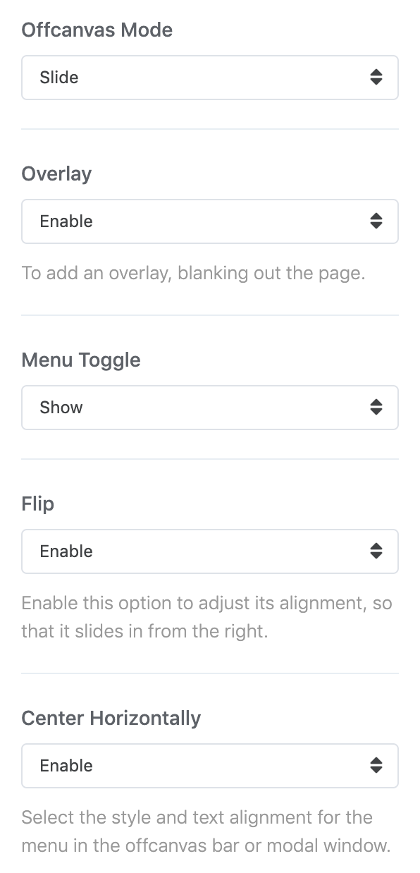
Choose between Slide, Reveal and Push offcanvas modes.
| Option | Description |
|---|---|
| Slide | The offcanvas bar slides on top of the page content. |
| Reveal | The page content moves out of the viewport revealing the offcanvas bar underneath it. |
| Push | The offcanvas bar pushes the page content out of the viewport. |
There are a few options available to style and align the offcanvas menu.
| Option | Description |
|---|---|
| Overlay | To add an overlay, blanking out the page. |
| Menu Toggle | Show the Menu text next to the hamburger icon. |
| Flip | Enable this option to adjust its alignment, so that it slides in from the right. |
| Center Horizontally | Select the style and text alignment for the menu in the offcanvas bar or modal window. |
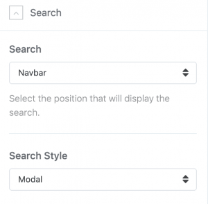
Search
As described in the Header Layout section above, you can choose to display the search either in the navbar or the header position.
Search module on navbar position

Seach module on header position

You can also assign any Joomla module to the navbar or the header position. Example screenshot above, you can see we added custom html joomla module for contact button to header position
Search Style
Choose between the Default and the Modal search style. The Modal style only displays an icon, and the actual search will appear in a fullscreen modal on click. As a result, this style is not available for the offcanvas and modal header layouts.
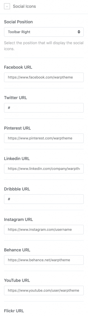
Social Icons
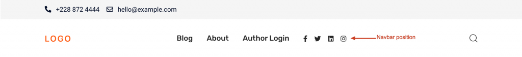
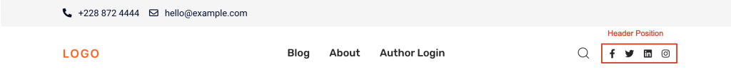
You can choose to display the social icons in the navbar, header, toolbar-left, or toolbar-right positions.
Display the social icons in the navbar position.
Display the social icons in the header position.
Display the social icons in the toolbar-left position.
Display the social icons in the toolbar-right position.
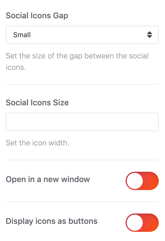
Social Icon Settings
| Settings | Description |
|---|---|
| Social Icons Gap | Set the size of the gap between the social icons. |
| Social Icons Size | Set the icon width. |
| Target | Open in a new window. |
| Icon button | Display icons as buttons. |
Mobile
On mobile devices the header is replaced by a mobile version, which just shows the logo and a menu toggle to display the navigation. The header that is displayed on desktops and large devices can be configured in the Header section.
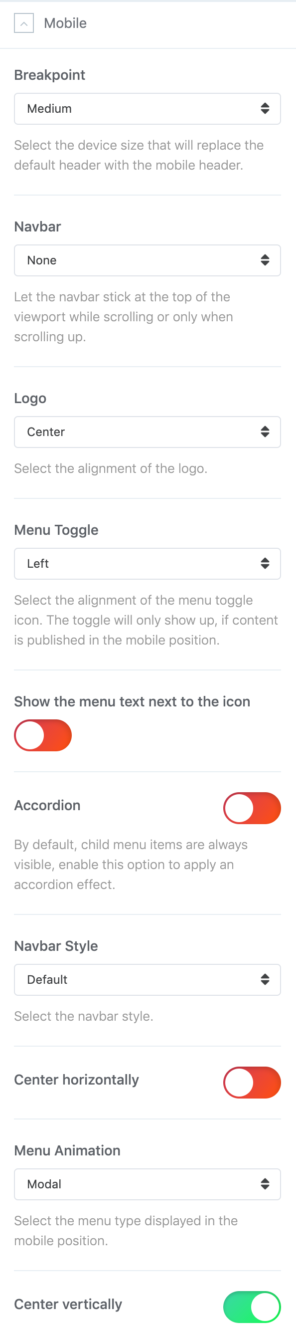
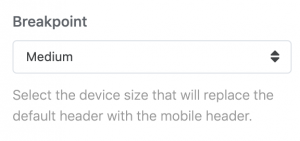
Breakpoint
Use the Breakpoint setting to define the device size at which the desktop header is replaced with the mobile version. The optimal breakpoint setting highly depends on the number and sizes of navbar items in your header.
| Breakpoint | Description |
|---|---|
| Small | Show the mobile header if the device width is below 640px. |
| Medium | Show the mobile header if the device width is below 960px. |
| Large | Show the mobile header if the device width is below 1200px. |
Navbar
There are three options available to control the mobile navbar position and its behavior.
| Setting | Description |
|---|---|
| Static | The navbar will move out of the viewport on scrolling. |
| Sticky | The navbar will stick at the top of the viewport on scrolling. |
| Sticky on scroll up | The navbar will move out of the viewport when scrolling down, and it will become sticky on scrolling up |
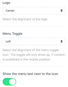
Logo and Menu Toggle
The mobile header consists of two visual parts: the logo and the menu toggle.
| Options | Description |
|---|---|
| Logo | Choose between left and right alignment, center the logo or hide it. |
| Menu Toggle | Choose between left and right alignment or hide the toggle. |
| Menu Toggle Text | Show the text label Menu next to the hamburger icon. |
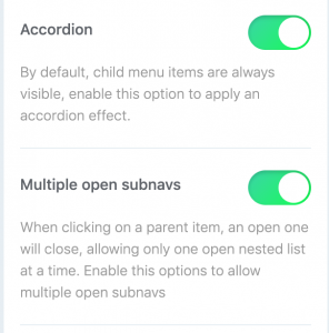
Accordion
By default, child menu items are always visible (offcanvas mode). Enable this option to apply an accordion effect and multiple open subnavs.
Accordion not enabled

Accordion enabled
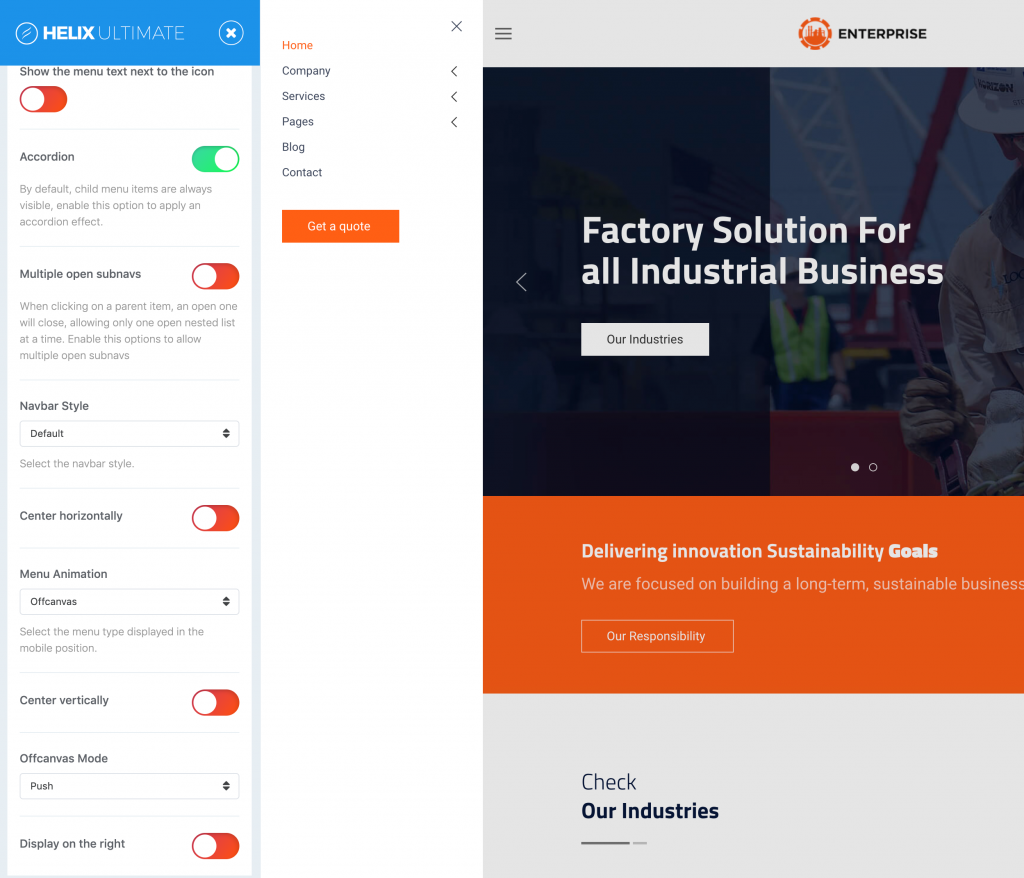
Navbar Style
Choose between the Default menu and the Primary menu with a larger font-size.
Center horizontally
Center the menu text and the content horizontally.
Menu Animations
There are three different menu animations to display the menu when toggled.
| Animation | Description |
|---|---|
| Offcanvas | An offcanvas sidebar slides in from the left or right side of the page. |
| Modal | A fullscreen modal fades in while covering the whole page. |
| Dropdown | A dropdown slides in from the top of the page. |
Center vertically
Optionally, for the Off-canvas and the modal animations, you can choose to center the menu and the content vertically.
There are two options available to control the Off-canvas and its behavior if Offcanvas is selected for Menu animation.
Off-Canvas mode
| Option | Description |
|---|---|
| Slide | The offcanvas bar slides on top of the page content. |
| Reveal | The page content moves out of the viewport revealing the offcanvas bar underneath it. |
| Push | The offcanvas bar pushes the page content out of the viewport. |
Display on the right
Display the Off-canvas bar on the right when toggled.
Page Title
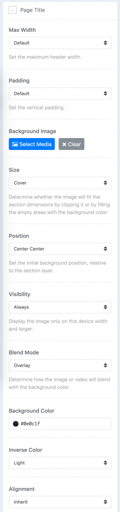
The page title allows you to add the Alternative Title, Page Subtitle, Background Color/Image for special pages.
| Setting | Description |
|---|---|
| Max Width | Set the maximum content width for the page title using the Max Width setting. The Default, Small, Large and Expand options add a horizontal padding which adjusts to the viewport width. |
| Padding | Set the vertical padding for page title. |
| Background Image | Select a background image for page title. This is a global background image for menu items that enabled the page title and not include the special background image itself. |
| Size | Determine whether the image will fit the section dimensions by clipping it or by filling the empty areas with the background color. |
| Position | Set the initial background position relative to the section layer. By default, the image is centered. |
| Visibility | Display the image only on this device width and larger. This is useful to hide background images if the content becomes illegible on small viewports. |
| Blend mode | Determine how the image will blend with the background color |
| Background Color | Use the background color in combination with blend modes. |
| Inverse Color | Use this option to adjust the text color depending on whether it's a dark or light image. |
| Alignment | Align the content to the left, center or right. |
NOTE You can add the global Background Image for all menu items that enable the page title via Basic → Page Title → Background Image or set a special Background image via Menus → Main Menu → menu item → Page Title.
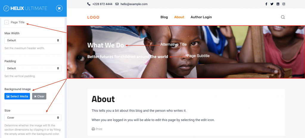
The following settings can be found in the Basic → Page Title → menu item tab Page Title
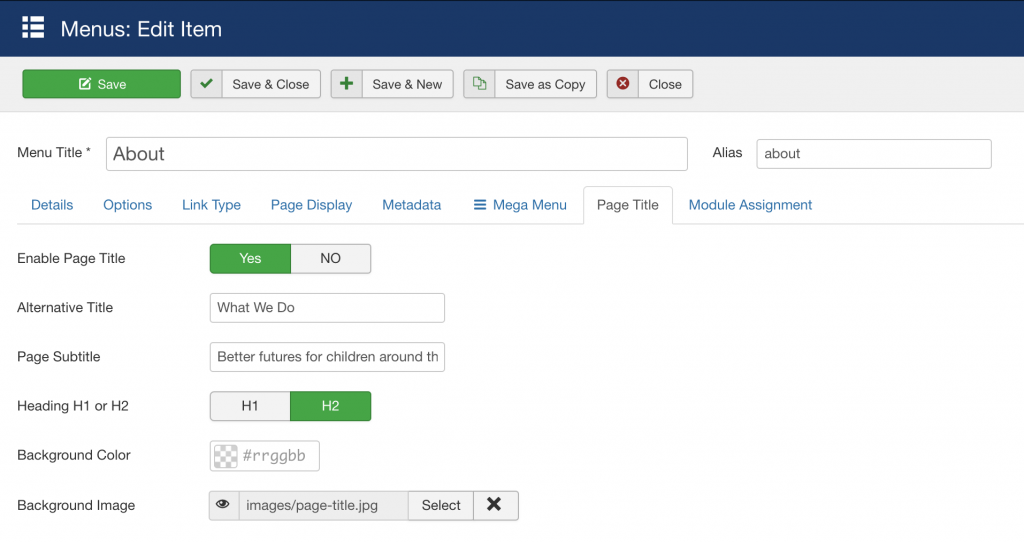
| Setting | Description |
|---|---|
| Enable Page Title | Enable/Disable page title for menu item. |
| Alternative Title | Alternative title will override Joomla default menu title. |
| Page Subtitle | Add a brief description about the page as page subtitle. |
| Heading H1 or H2 | Set the page title to be either an h1 or h2 element |
| Background Color | Background color for the title area. |
| Background Image | Background image for the title area. |
Body
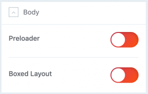
Preloader
In the Body section, you can turn the website preloader on or off. If you turn on the preloader, a spinning circle will be shown while loading your site.
Boxed Layout
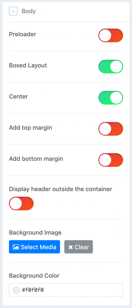
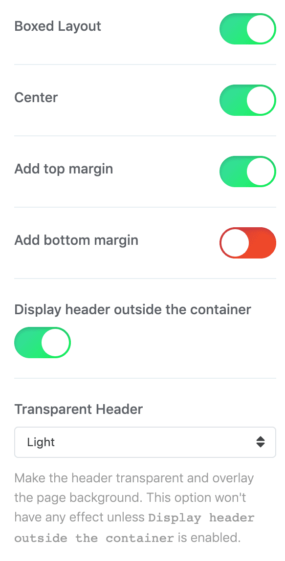
By default, the website expands to the Full Width of the browser window. You can also choose a Boxed Layout layout which will wrap all of your page content into a boxed container. The background of the boxed page layout will show a solid background color or background image which depends on your chosen style.
Boxed Page Layout
| Setting | Description |
|---|---|
| Center | Position the page layout in center. |
| Top Margin | Add the top margin to the page layout. |
| Bottom Margin | Add the bottom margin to the page layout. |
| Header Position | Position the header outside the container. |
| Transparent Header | Make the header transparent and overlay the page background. This option won't have any effect unless Display header outside the container is enabled. |
Once an image is selected, there are four options available to control the image position and its behavior.
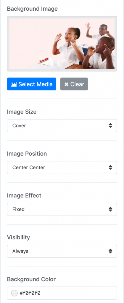
| Setting | Description |
|---|---|
| Image Size | Determine whether the image will fit the section dimensions by clipping it or by filling the empty areas with the background color. |
| Image Position | Set the initial background position relative to the section layer. By default, the image is centered. |
| Image Effect | Add a parallax effect or fix the background with regard to the viewport while scrolling. |
| Visibility | Display the image only on this device width and larger. This is useful to hide background images if the content becomes illegible on small viewports. |
| Background Color | Use the background color in combination with blend modes. |
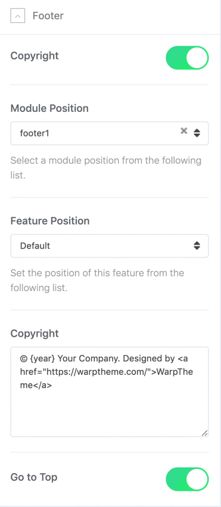
Footer
The footer is the last section on your website. It usually contains copyright notices, links and contact information
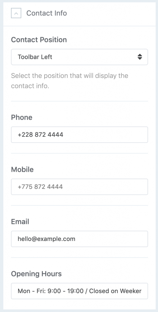
Contact Info
You can choose to display the Contact info in the toolbar-left, or toolbar-right positions.
Coming Soon
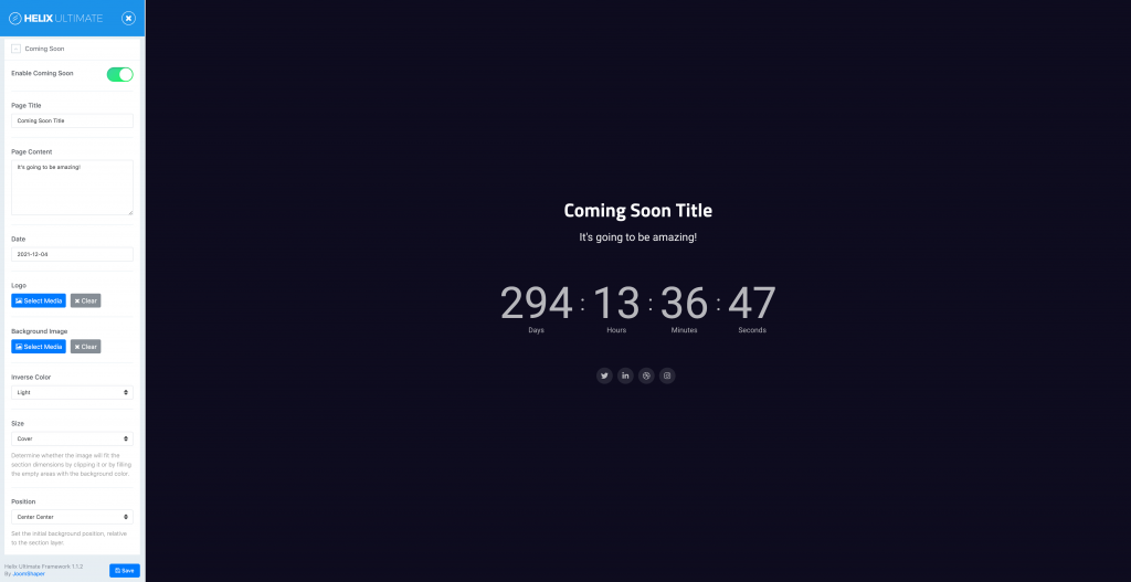
With Helix Ultimate, you can display a customized maintenance mode page (e.g. under maintenance, coming soon, site offline or so on) on the frontend of your site when your site is under construction.
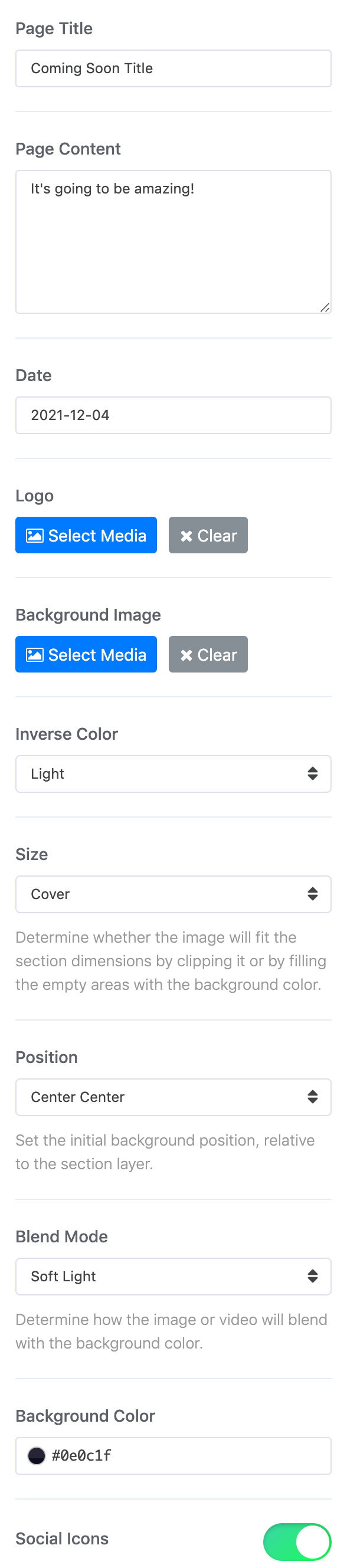
| Setting | Description |
|---|---|
| Enable Coming Soon | Enable Coming Soon mode for Joomla website. |
| Page Title | Customize the title for coming soon page |
| Page Content | Customize the content for coming soon page. |
| Date | Define the coming soon date. Date format:Year-Month-Date, i.e: 2021-12-04 |
| Logo | Upload your logo to display on coming soon page. |
| Background | Upload the background image for the coming soon page body area. |
| Inverse colors | Modify UI components to look great on light, dark or image backgrounds. |
| Size | Determine whether the image will fit the section dimensions by clipping it or by filling the empty areas with the background color. |
| Position | Set the initial background position relative to the section layer. By default, the image is centered. |
| Blend modes | Determine how the image or video will blend with the background color. |
| Background Color | Use the background color in combination with blend modes. |
| Social Icons | Use this option to show/hide the social icons on coming soon page. |
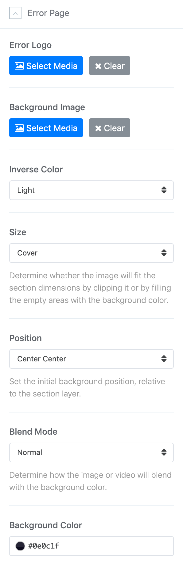
Error Page
A website may face several errors like 404 and so on. You can create a custom page for these errors. Use the Error Page option to do so. Upload a custom background image and a logo to display on the error page(s).
| Setting | Description |
|---|---|
| Error Logo | Upload your logo to display on error page. |
| Error Background | Upload the background image for the error page body area. |
| Inverse colors | Modify UI components to look great on light, dark or image backgrounds. |
| Size | Determine whether the image will fit the section dimensions by clipping it or by filling the empty areas with the background color. |
| Position | Set the initial background position relative to the section layer. By default, the image is centered. |
| Blend modes | Determine how the image or video will blend with the background color. |
| Background Color | Use the background color in combination with blend modes. |
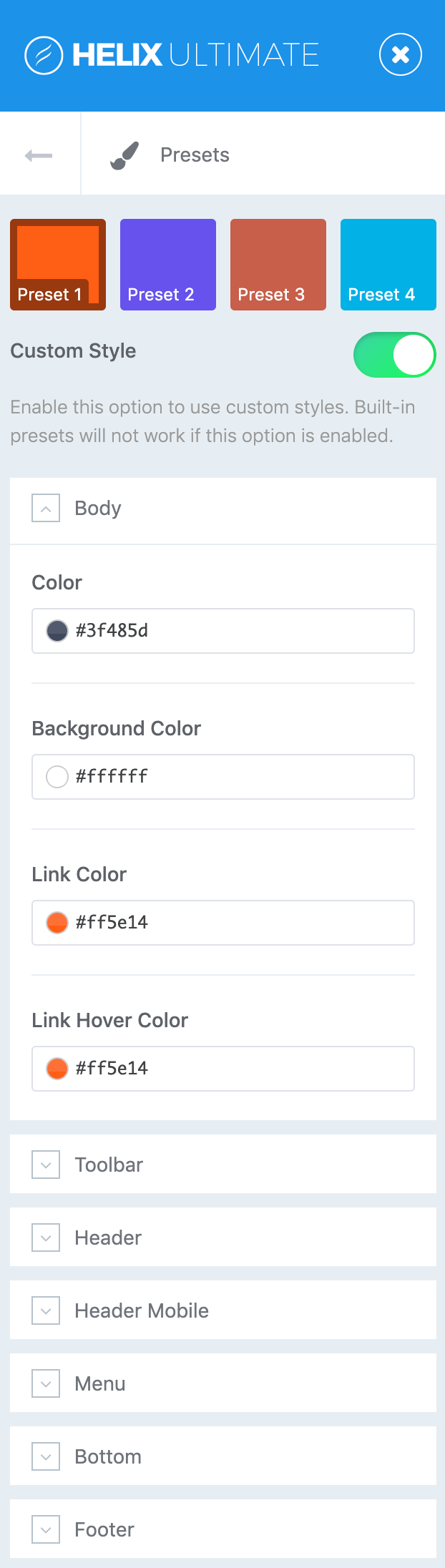
Presets
The Presets tab gives you the ability to quickly and easily configure color settings related to the appearance of the Helix-powered template. This includes being able to switch between pre-configured presets and custom color sets.
| Panel | Description |
|---|---|
| Body | This panel contains global variables for Body like Color, background , link, link hover. |
| Toolbar | This panel contains global variables for Toolbar position. |
| Header | This panel contains global variables for Header, Header Bar top and Header Bar Bottom(Depends on the predefined header layouts). |
| Header Mobile | This panel contains global variables for Header Mobile like Logo Mobile, background , Toggle, Toggle hover. |
| Menu | This panel contains global variables for Menu. |
| Bottom | This panel contains global variables for bottom. |
| Footer | This panel contains global variables for Footer. |
Change any aspect of your site’s appearance like colors, background, etc...
The Layout Builder
Layout Manager allowing you to build flexible layout based on module positions. A layout always consists of rows (sections), columns and module positions that can be added and arranged with drag and drop.
Overview
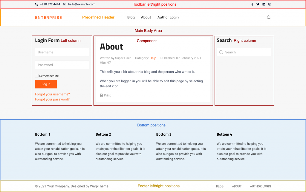
Default back-end layout builder for WarpTheme templates:
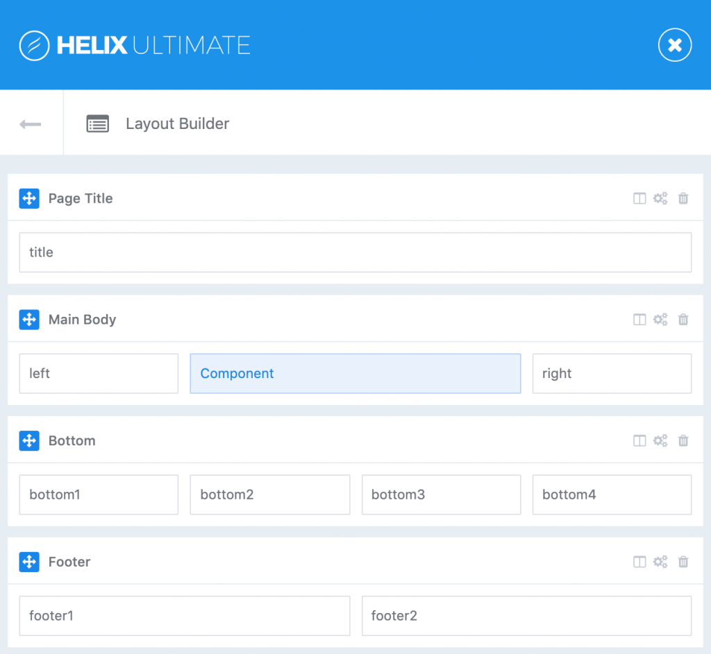
Visual positions overview
Predefined Headers and Toolbar positions are located above the Layout builder rows by default, they are not defined via Layout Builder.
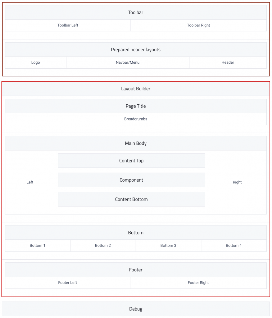
Positions explained
| Position | Description |
|---|---|
|
toolbar-left toolbar-right |
These toolbar positions are located above the prepared header layout. Find the toolbar settings in Basic → Toolbar |
|
logo logo-mobile |
These positions can be used instead of the logo set in the Basic → Logo settings. |
|
navbar header |
These are the two theme header positions. Find the header and navbar settings in Basic → Header. |
| title | These positions allow publishing Joomla breadcrumb module or display the Helix Page Title. Find the Page Title settings in Basic → Page Title. |
| Left/Right | These positions allow publishing Joomla modules to the Left or Right component area. |
|
Content top Content bottom |
Yes, you can publish any module below or/and above component area. For this purpose we created two built-in module positions: Content Top & Content Bottom |
|
bottom-1 to bottom-4 and Footer |
These positions are defined via templateDetails.xml. Using layout builder to render the grid columns then assign the columns to these positions. |
You can disable the predefined header and create a new row and columns for custom header if needed.
Front-end rendering:
Rows
Rows control the grid columns layout of your content. Their columns are filled with module positions – the actual content of your page.
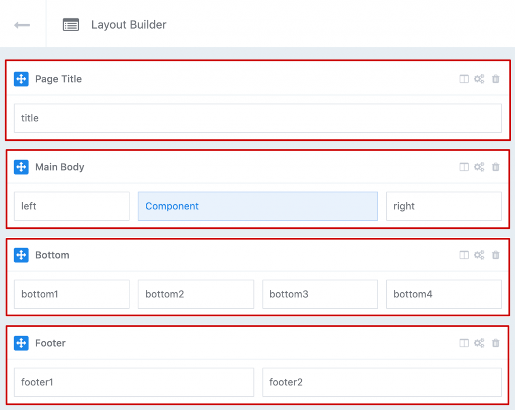
To create a new row from scratch, click the Plus button that appears in the bottom center corner of the hovered section.
Ordering
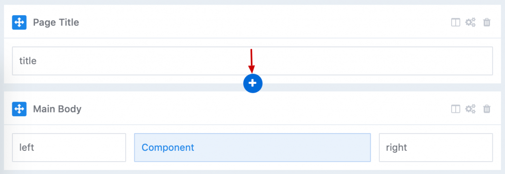
Rows can be ordered with with drag and drop.
Action Icons
| Setting | Description |
|---|---|
| Columns icon | Edit the columns of each row. |
| Gears icon | Open row settings in a modal. |
| Trash icon | Delete the row including all its content. |
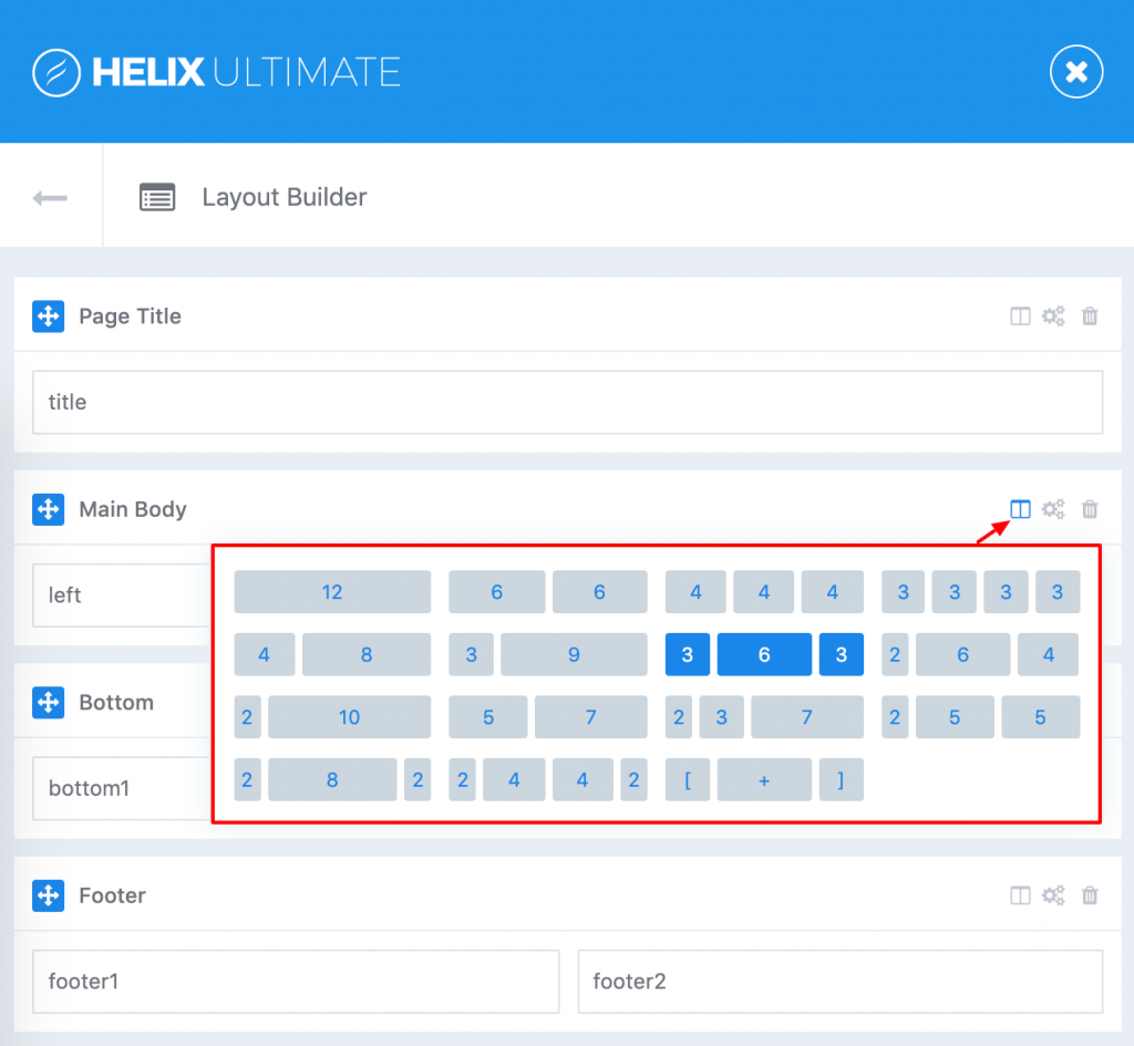
Grid columns
Helix Ultimate Layout is based on 12 column layouts from Bootstrap 4. When hovering a row icon column, the column layout appears in the top right corner of the row that allows you to choose existing columns preset or custom the grid column layout.
Row Options
Rows control the style of your content section. Change any aspect of your section's appearance like spacing, colors, link color, background, full width section or responsive without writing any CSS.
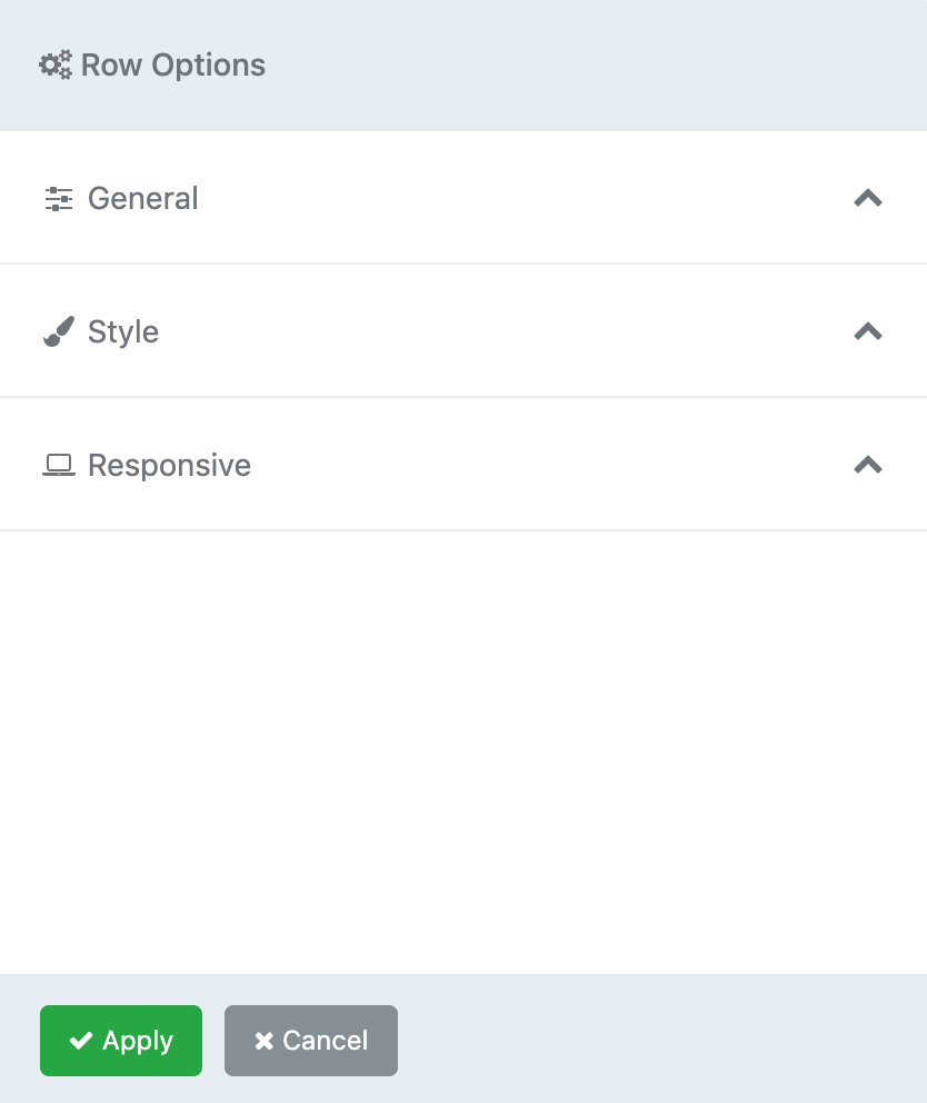
Click the Row option icon (Gears icon) to open the row settings (in a modal).
There are three options available to control the row options and its behavior: General, Style, Responsive.
General Settings
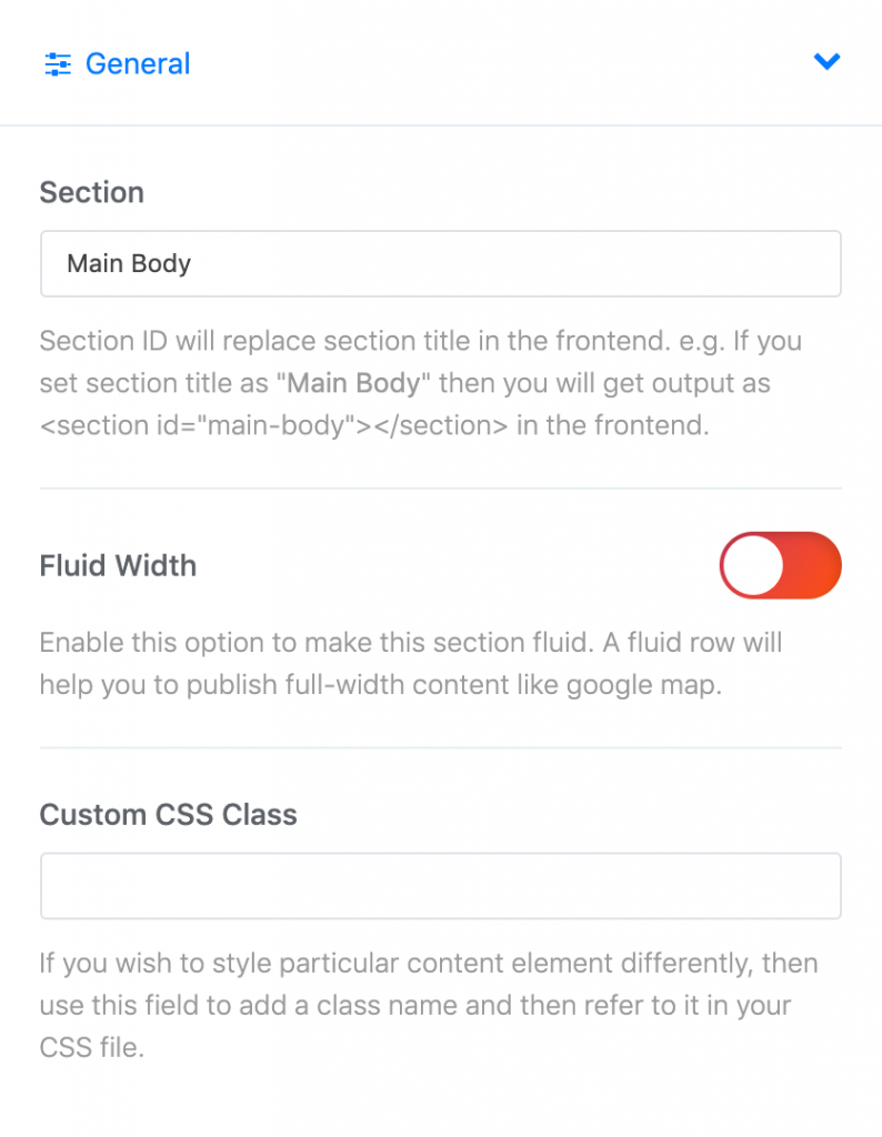
| Setting | Description |
|---|---|
| Section | Define a name to easily identify this section inside the layout. A section's assigned id determines its tags. For example, an id of page title will appear as id="sp-page-title" in the front end. Note: the sp- prefix added by Helix Ultimate automatically. |
| Fluid Width | Enable this option to make this section fluid. A fluid row will help you to publish full-width content like google map. |
| Custom CSS Class | Define the css classes to apply custom styling to any section. |
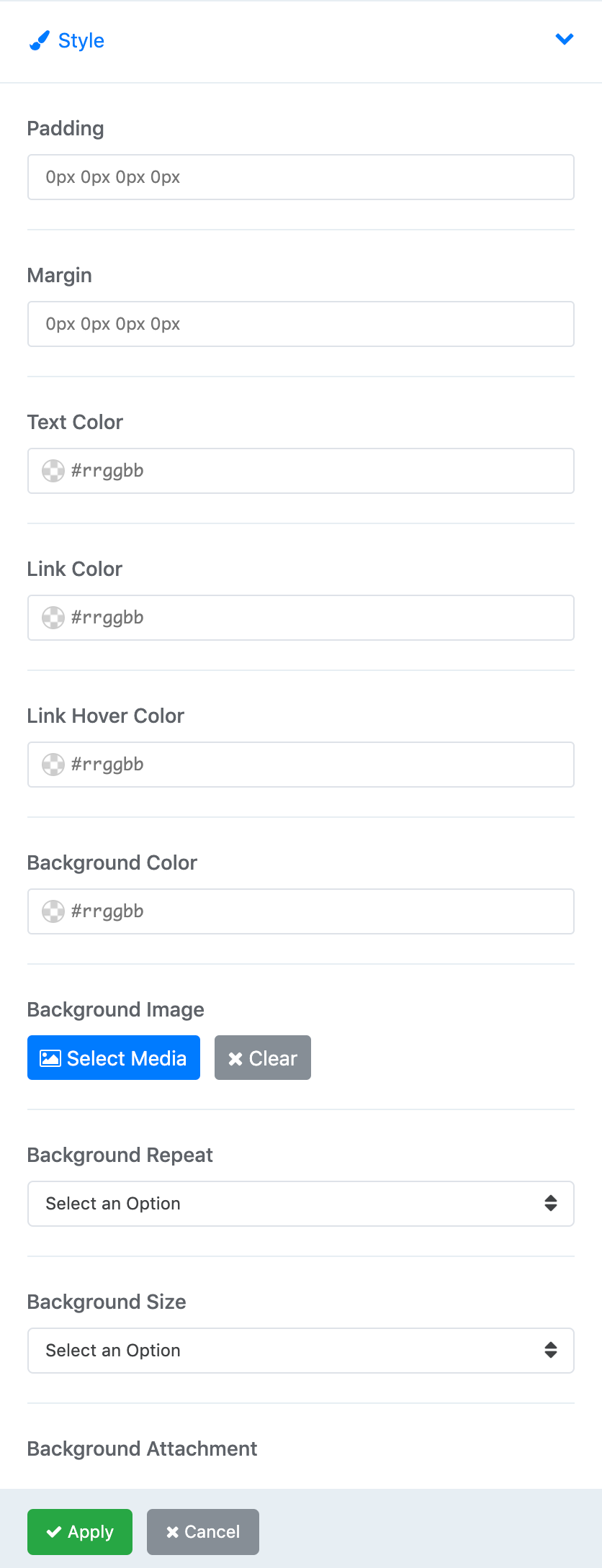
Style Settings
Define Row Style: margin, padding, text color, link color, link hover color, background color or choose background image.
Responsive Settings
Allows to control of visibility of rows. You can hide Row on selected devices, related with screen resolution:
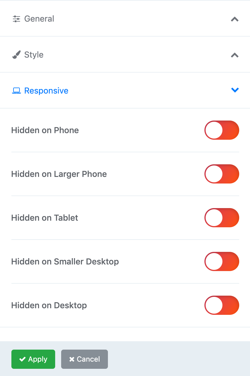
- Hidden on phone - screen width less than 576px
- Hidden on Larger phone - screen width equal to or greater than 576px
- Hidden on Tablet - screen width equal to or greater than 768px
- Hidden on Smaller Desktop - screen width equal to or greater than 992px
- Hidden on Desktop - screen width equal to or greater than 1200px
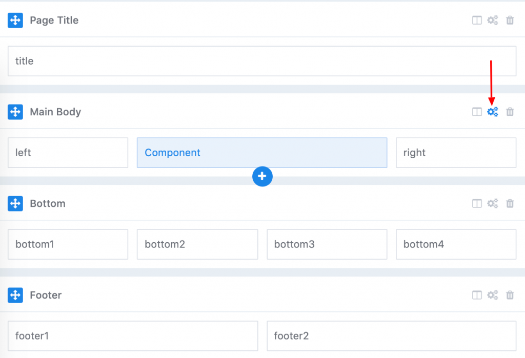
Columns Options
Each column has an option to set its module position. Hover on any grid column and click the wheel icon to access column options.
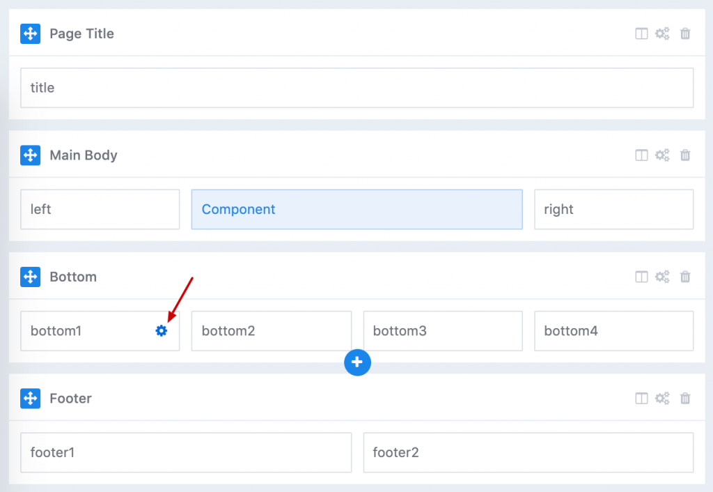
The column options open in a modal.
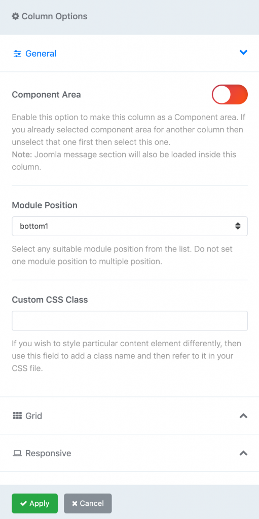
Component Area - Enable this option to make this column as a Component area.
Module Position The Module Position allows you to select an existing Joomla position into a column and render all its modules anywhere in your layout. The column collapses if all its modules have no content output. There are several module positions that can be assigned to column layout:
- title
- toolbar-left
- toolbar-right
- logo
- logo-mobile
- header
- navbar/menu
- search
- slide
- user1 to user4
- left
- right
- feature
- slider
- position1 to position8
- content-top
- content-bottom
- bottom1 to bottom4
- breadcrumb
- footer1
- footer2
- comingsoon
- offcanvas
- pagebuilder
- 404
- debug
Note These positions are not rendered anywhere else in the layout until you assign it to special column layout.
Custom css class Define the css classes to apply custom styling to any column.
How to use module below/above component area
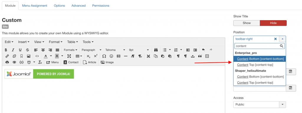
You can publish any module below or/and above component area. For this purpose we created two built-in module positions: Content Top & Content Bottom, just choose them from the list Joomla Position. They are not visible in visual Layout grid, but you can use them in all templates based on Helix Ultimate framework.
Page Builder
WarpTheme using SP Page Builder to build and design the page layouts visually, without having to write any code.
We created 50+ Extra Add-ons for SP PageBuilder and these add-ons included in the template (pro) for FREE. See more detail about 50+ extra add-ons here https://warptheme.com/extra-addons-pagebuilder/
SP Page Builder 3 is a revolutionary product of flexible drag & drop page building for Joomla. If you are new with SP Page Builder, you can read full documentation below.
Installation
Install SP Pagebuilder Free version into your existing Joomla site or start with one of our thematic demo websites (SP Page Builder already installed for Quickstart packages).
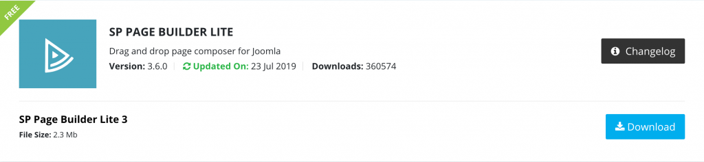
Download the free SP Page Builder Lite version here: https://www.joomshaper.com/downloads/extension/sp-page-builder-free
You need to register free account to download the sp page builder.
Open the Page Builder
There are two ways to open the page builder: Front-end and Back-end.
Back-end Editing
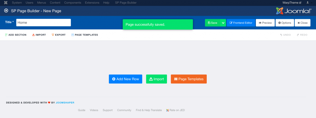
To use the sp page builder, add a new page by clicking SP Page Builder → Pages → New. Enter a title and save the page. You can then start adding new sections and add-ons to your page layout.
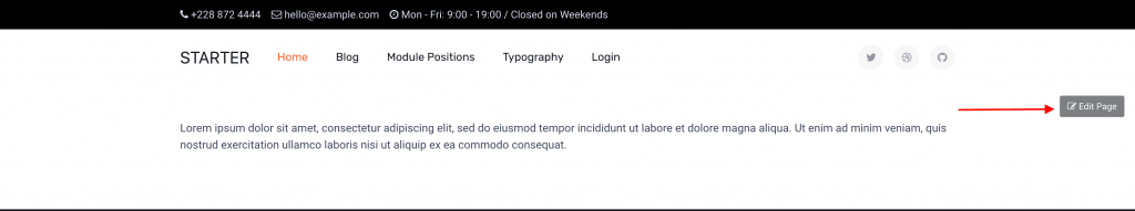
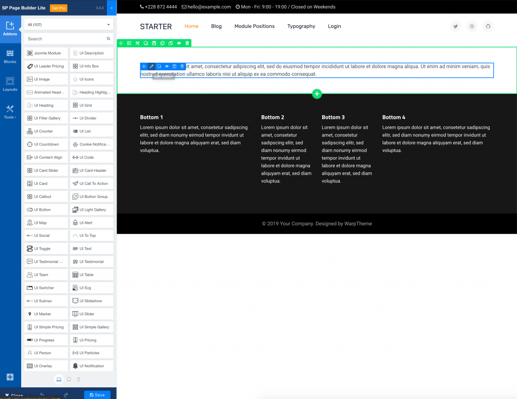
Front-end Editing
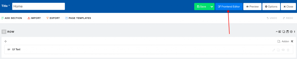
You can also open the sp page builder on the front-end without accessing the Joomla administration area. Log in to the front-end of your site and navigate to the page that created with sp page builder. The Edit Page button is situated in the right top corner.
Or you can access front-end editing directly via back-end editor by clicking Front-end Editor button.
When editing a page in front-end mode, you can access full extra add-ons in the left panel.
Module Builder
Design single module individually by using the sp page builder.
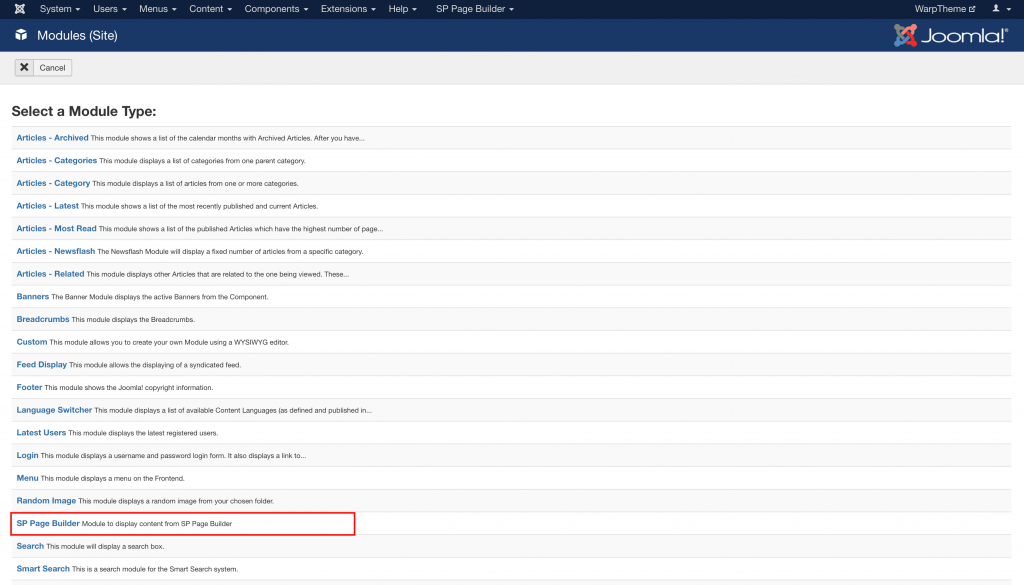
To use the module builder, add a new Joomla module by clicking Extensions → Modules → New → SP Page Builder.
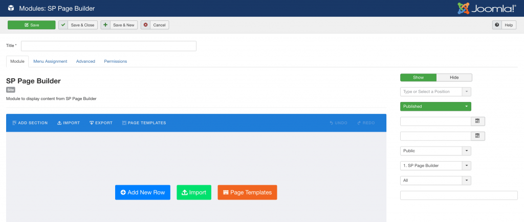
You can then start adding new sections and add-ons to your module layout.
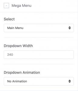
Navigation Settings
The following settings can be found in the Settings → Navigation panel of template.
| Setting | Description |
|---|---|
| Dropdown Width | Dropdown Menu Width value would be to set it to the width of your submenu size content area. By default 240px. |
| Dropdown Animation | MegaMenu offer serveral transition options for your dropdown submenus:No Animation, Fade In, Fade In Up, Fade In Down, Zoom In, Rotate In, Pulse |
Typography Settings
Typography in websites is arguably more important than other design elements since type is the one thing that is consistently rendered across different browsers.
Google Fonts
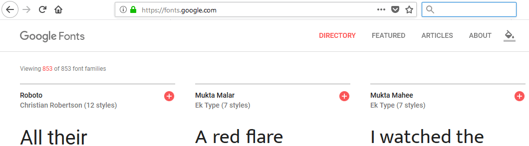
In general typography in Helix Ultimate templates is mainly based on Google Fonts collection (850+ fonts). With so many unique fonts to use, you're bound to find something you like! This settings area allows you to easily choose font(s) from the Google Font Directory to your Joomla! template. You can also assign the Google fonts to specific CSS elements only.
All available Google fonts are released under open source licenses. You can use them in any non-commercial or commercial project. They works on the vast majority of modern mobile operating systems, including Android and iOS (iPhone, iPad, iPod).
Only some of the fonts in the Google Font Directory support full range of subset - multiple scripts (like Latin, Latin Ext, Cyrillic, and Greek for example). Notice, not all fonts are fully support your native language diacritical marks (signs).
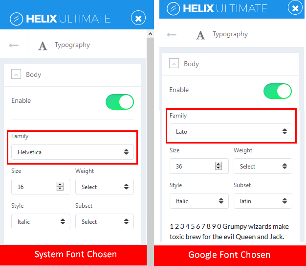
Arial, Verdana, Georgia..
Beside Google Fonts you can choose widely-supported cross-platform fonts: Arial, Tahoma, Verdana, Helvetica, Times New Roman, Trebuchet MS and Georgia. “Web Safe” fonts mean that they will look perfect no matter the browser you are viewing them from. Also, these fonts are very popular and pre-installed on operating system: Windows, iOS or Linux. They are not loaded during loading a website, no delays because of that. You can save bandwidth and keep fast loading pages.
Default Font
If none of Typography option will be enabled, the default fonts are used from Bootstrap 4. Helix Ultimate use “native font stack” for optimum text rendering on every device and OS.
This font-family is applied to the <body> and automatically inherited globally throughout Bootstrap 4.
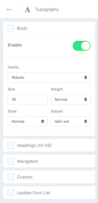
Body
Enable or Disable using Fonts integration. Which gives you the ability to assign default System Font (Arial, Tahoma, Helvetica, Georgia etc.) or the Google font to whole Body of your website. Choose Font Size, Font Weight, Style and Subset (for Google Fonts only).
Headings (h1-h6)
Enable or Disable using Fonts integration. Which gives you the ability to assign default System Font (Arial, Tahoma, Helvetica, Georgia etc.) or the Google fonts to specific Headings (h1-h6) used inside your website content. Choose Font Size, Font Weight, Style and Subset (for Google Fonts only).
Navigation
Enable or Disable using Fonts integration. Which gives you the ability to assign default System Font or the Google font to main navigation of your website. Choose Font Size, Font Weight, Style and Subset (for Google Fonts only)
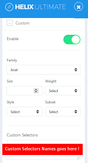
Custom
From here you can choose default System Font (Arial, Tahoma, Verdana, Georgia etc.) or Google Font for custom CSS Selectors (class, ID, element). A CSS selector can contain more than one simple selector. Just enable option, choose font settings and in field below insert name(s) separated by comma.
Update Font List
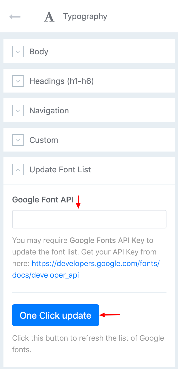
This feature allows you to refresh the list of available Google fonts. So if there are any new ones, this button allows you to quickly update fonts with just one click, and they will be automatically added in to Helix Framework database. Which allows you to use them after update.
Blog Settings
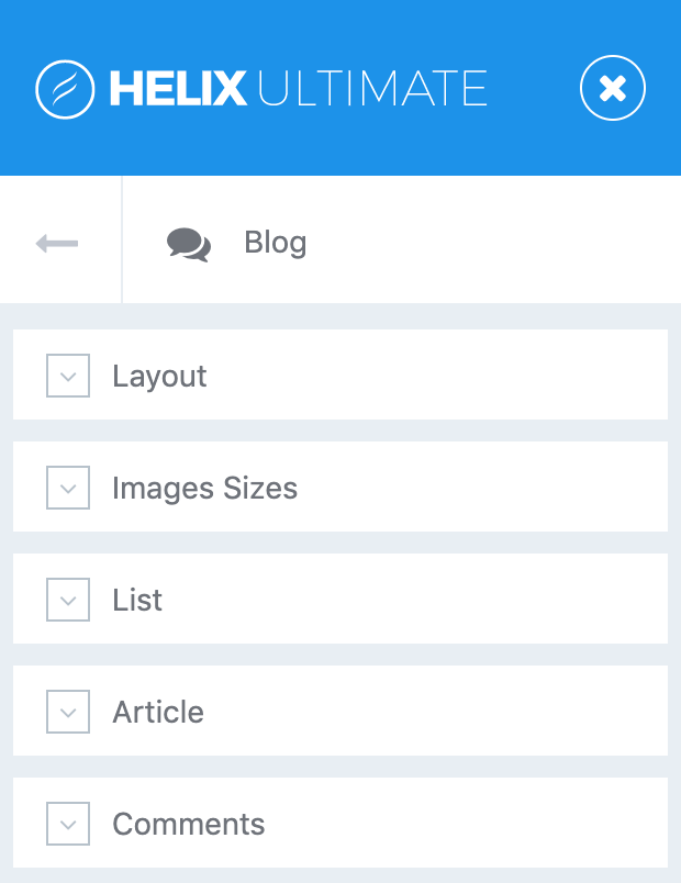
Customize the blog and articles of your Joomla website.. The following settings can be found in the Template Settings → Blog panel.
Note Make sure to browse to the blog in the preview on the right to see the changes immediately.
Layout
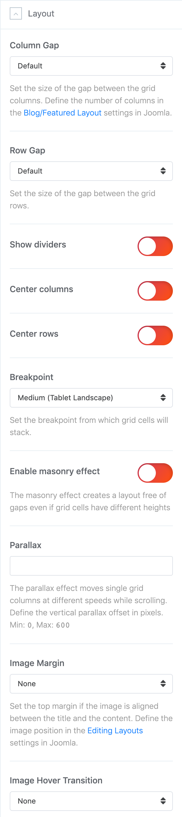
Use the following options to style the blog layout.
| Setting | Description |
|---|---|
| Column Gap | Set the size of the gap between the grid columns. |
| Row Gap | Set the size of the gap between the grid rows. |
| Show dividers | Show the divider between blog column items |
| Center columns | Center the blog columns. |
| Center rows | Center the blog rows. |
| Breakpoint | Set the breakpoint from which the grid items will stack. |
| Masonry | Enable masonry effect and create a layout free of gaps even if grid items have different heights. |
| Parallax | Enable parallax effect and move single grid columns at different speeds while scrolling. Define the vertical parallax offset in pixels. |
| Image Margin | Set the top image margin. |
| Image Hover | Enable the hover transition for image on hover. |
Note The number of columns displayed on the blog overview page can be defined in the Article Manager Options in Joomla under Blog/Featured Layout. Mind that setting the number of columns in the Menu Item will override the option from the Article Manager.
Use the following options to style the article title, link heading and margin.
Content
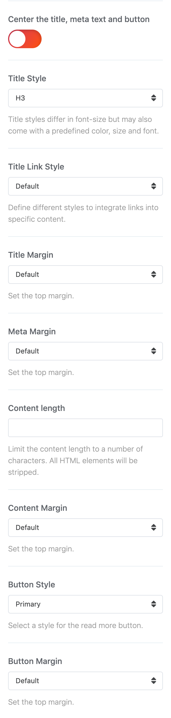
Use the following options to style the post title, meta text, content and link in the blog overview.
| Setting | Description |
|---|---|
| Alignment | Center the title, meta text and button. |
| Title Style | Set the title style. |
| Title Link Style | Define different styles to integrate links into specific content. |
| Title Margin | Set the top title margin. |
| Meta Margin | Set the top meta margin. |
| Content Length | Limit the content length to a number of characters and add the "Continue Reading" button. |
| Content Margin | Set the top content margin. |
| Content Alignment | Center the content on the blog overview page only. |
| Button | Set the style for the "Continue Reading" button. |
| Button Margin | Set the top button margin. |
Image
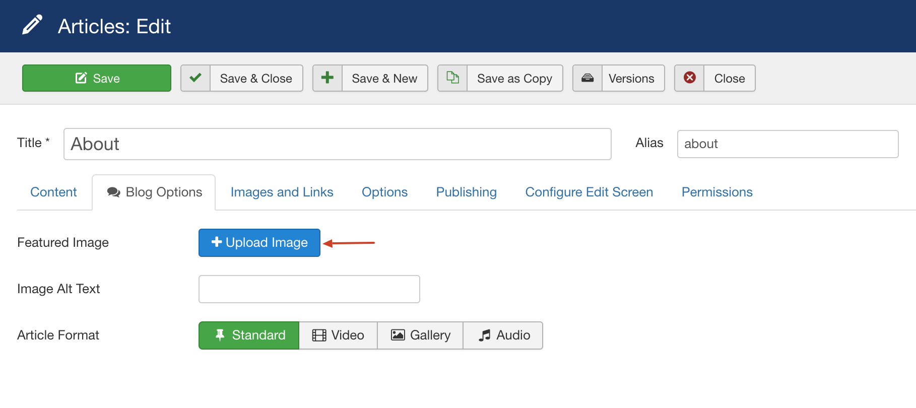
Note The following options are available for articles that using blog image options only(Article → Blog Options → Featured Images).
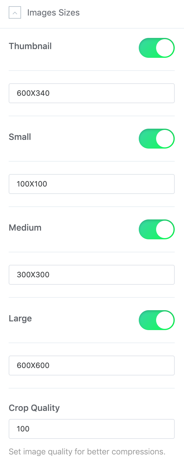
Upload Joomla article image using Helix Ultimate blog options.
List
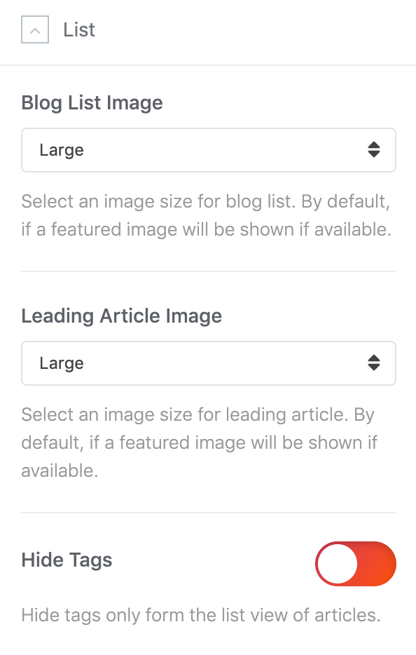
| Setting | Description |
|---|---|
| Blog List Image | Select an image size for blog list. By default, if a featured image will be shown if available. |
| Leading Article Image | Select an image size for leading article. By default, if a featured image will be shown if available. |
| Hide Tags | Hide Joomla article tags only form the list view of articles. |
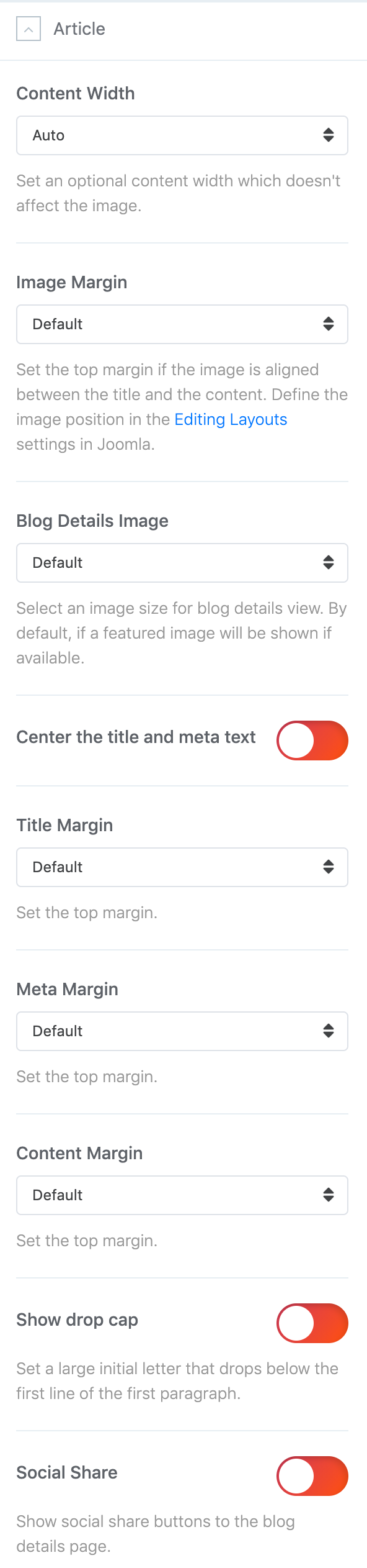
Article Settings
Customize the articles layout of your Joomla website.
| Setting | Description |
|---|---|
| Content Width | Set an optional content width which doesn't affect the image. |
| Image margin | Set the top margin if the image is aligned between the title and the content. Define the image position in the Editing Layouts settings in Joomla. |
| Blog Details Image | Select an image size for blog details view. By default, if a featured image will be shown if available. |
| Alignment | Center the title and meta text. |
| Title/Meta/Image/Content Margin | Set the top margin. |
| Drop Cap | Set a large initial letter that drops below the first line of the first paragraph. |
| Social Share | Show or Hide social share buttons (Facebook, Twitter, LinkedIn, Google+) above content of single article. |
| Disable Modules | This option will disable all modules from the left or right sidebar from article details page. |
| Author Info | This option will show user bio as author information along with author Gravatar if the profile plugin is enabled. |
| Enable Open Graph | This option will add open graph content to the article so that social media like Facebook & Twitter can show correct image for the article. Disable this option if you want to use 3rd party open graph extension. |
| Reading Time Progress Bar | Show reading progress bar in blog details page. |
| Related Articles | Show related articles in article details page based on category and tags. |
| Comments | This build-in option allows you to add IntenseDebate Comments system, Facebook comments and / or Disqus Comments to your site. |
Custom Code
You can easily customize Helix Ultimate Framework with your own custom code, for example: CSS, JavaScript, Metatags, links and verification code by using the custom fields in that section of settings. Inserting custom code before your Joomla website’s </head> and/or </body> tags is a common requirement for a variety of scripts and services (e.g. Google Analytics).
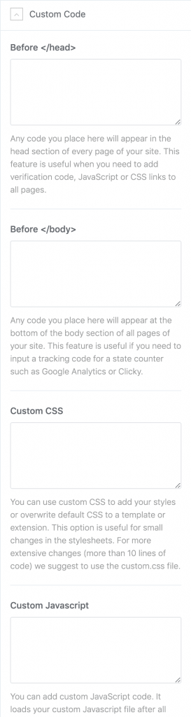
Custom Css
Learn how to add your own css customizations that way all your changes will be kept when updating your theme.
There are two options to add custom css code for Helix Ultimate based templates:
1. Add custom css via template settings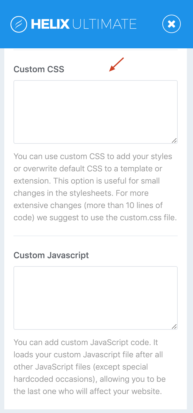
Open the theme customizer, go to Custom Code → Custom css and paste the css code into the field.
2. Add custom css by creating a custom.css file.You can add your own CSS by creating a custom.css file inside the /css folder(by default custom.css file doesn’t exist). That way all your changes will be kept when updating your theme.
Advanced Settings
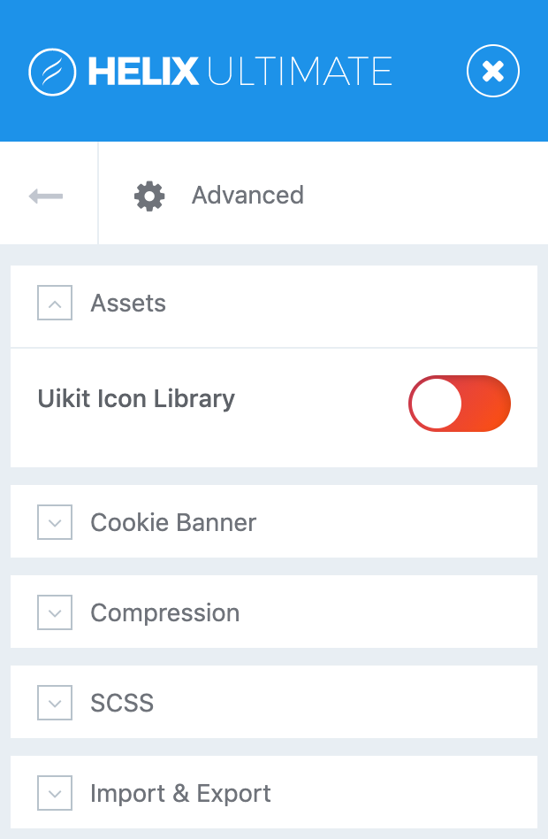
Assets
Enable this options to use the Uikit Icon library.
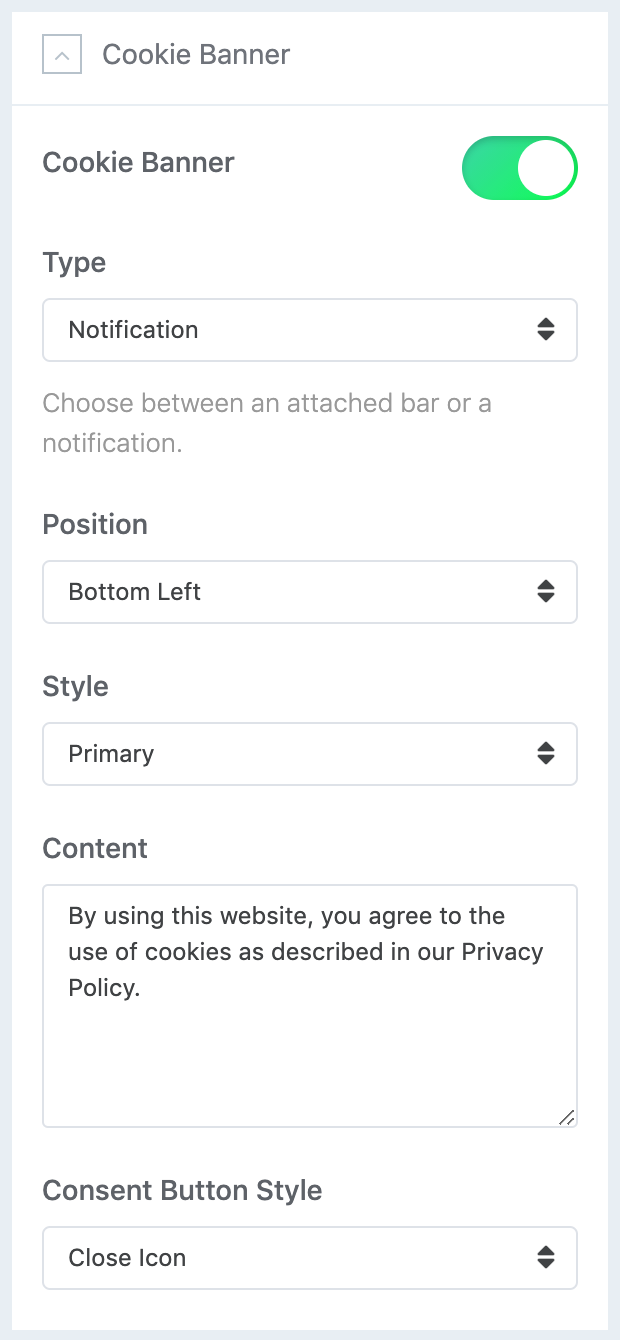
Cookie Banner
Show a banner to inform your visitors of cookies used by your website.
| Setting | Description |
|---|---|
| Type | Choose between an attached bar or a notification. |
| Position | Choose the position of the cookie banner. |
| Style | Choose the style of the cookie banner. |
| Content | Enter the cookie consent message. |
| Consent Button Style | Choose the consent button style. |
| Consent Button Text | Enter the consent button text. |
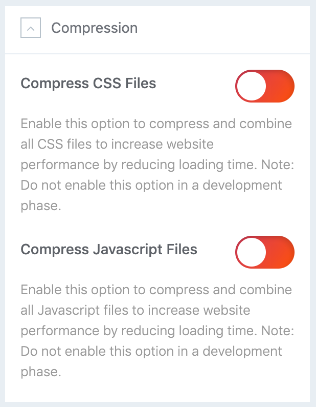
Compression
| Setting | Description |
|---|---|
| Compress CSS Files | Enable this option to compress and combine all CSS files to increase website performance by reducing loading time. |
| Compress Javascript Files | Enable this option to compress and combine all Javascript files to increase website performance by reducing loading time. |
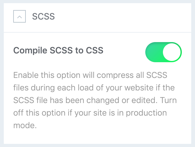
SCSS
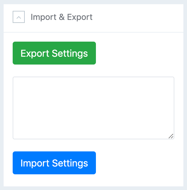
Import & Export
Mega Menu Builder
A Mega Menu is the name given to a large panel of content which is displayed below a menu item when the user hovers over the menu item. Mega Menus can contain sub menu items and modules. We all know how it helps a site be more navigable.
With Helix Ultimate you are able to build such mega menus on your site easily. Helix Ultimate mega menu builder offers you different layouts to give diverse looks of your menus. Styling menus has been made easier for your convenience. Add as many menu items as you need.
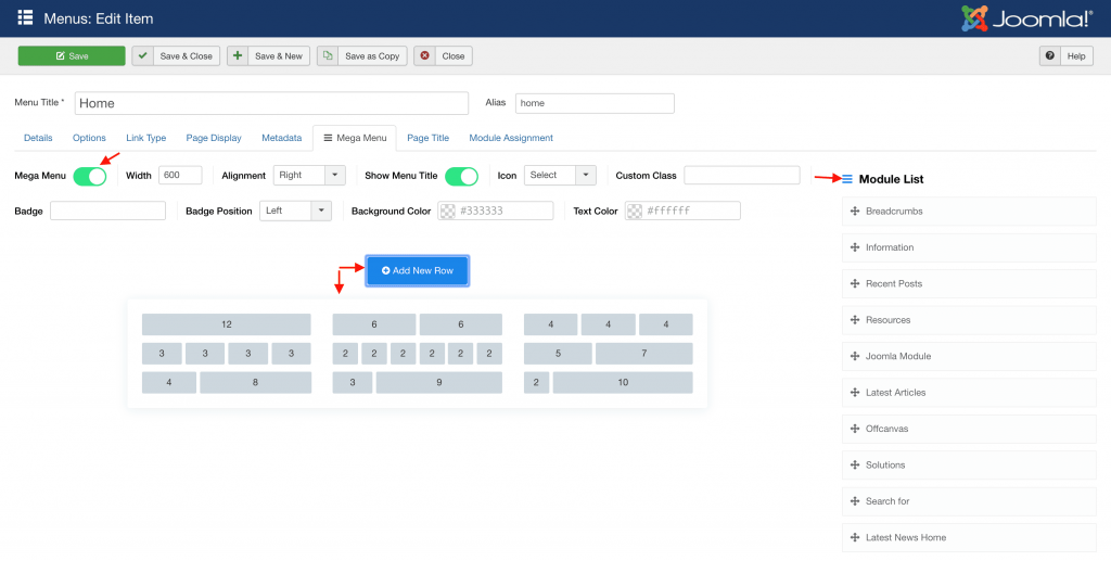
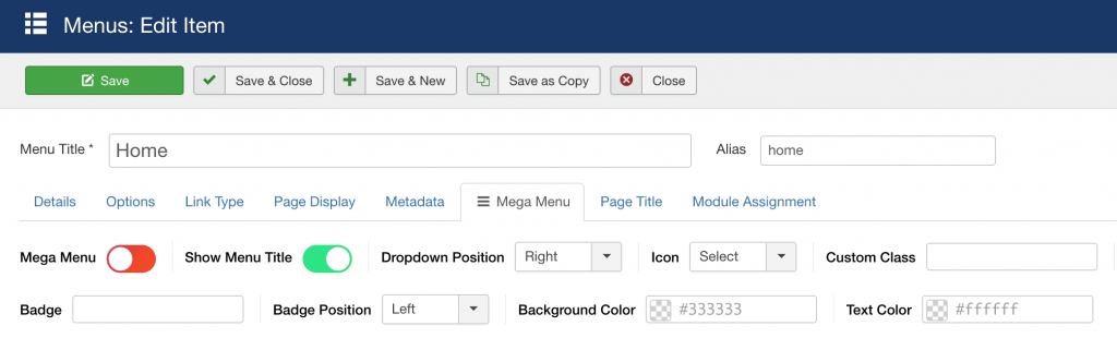
Inside each menu item you can find new tab "Mega Menu" - It came from Helix Ultimate Framework. Inside this tab, you can find several switchers, responsible for additional features.
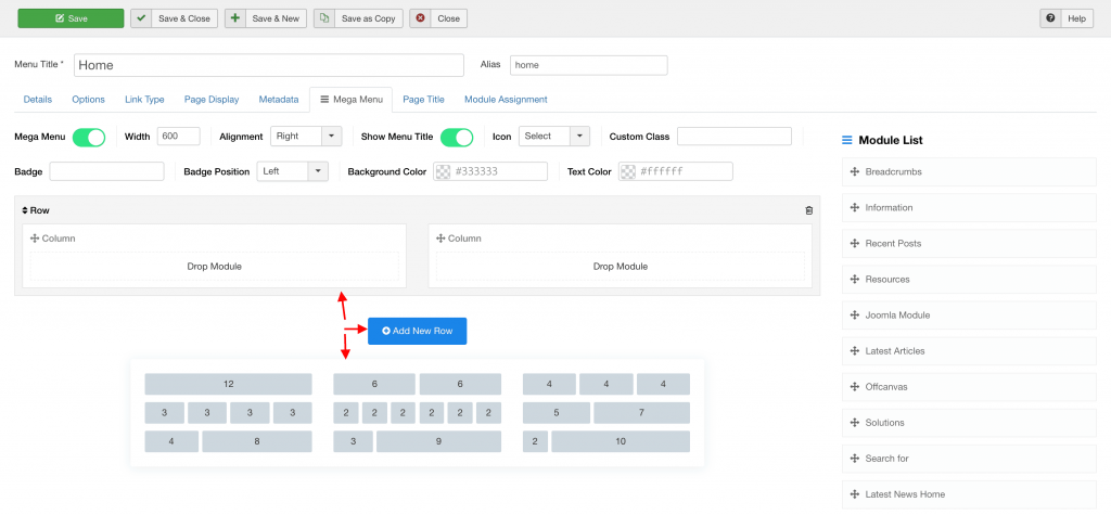
Mega Menu
To enable/disable advanced Mega Menu options. It is simple way to create highly customized and creative mega menu configurations. You can add and use row and column based menus, also drag and drop the modules to the menu positions from the modules list.
| Setting | Description |
|---|---|
| Width | Allows you to choose total width of submenu area. |
| Alignment | Choose submenu area alignment to the right, left, center, or set full width. |
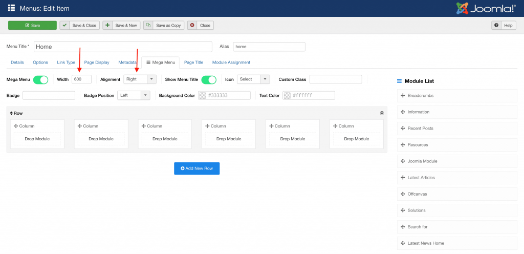
How to use Mega Menu to build columns for menu items:
- Click “Add New Row” button
- Select Menu layout: single row or rows with columns, you have 9 options to choose from.
- Then click “Save” button from top bar to refresh/rebuild content.
- After refreshing you should be able to see submenu items, if were added before. Using drag and drop function in Mega Menu, you can easily arrange columns, move elements or modules into another position, from one column into another.
- In addition, you can also select existing module(s) from the right sidebar and put into column.
- Trash icon - allows you to remove undesired row.
- Close “X” icon - allows you to remove undesired element.
- Remember to save setting after all changes (“Save” or “Save & Close”).
| Setting | Description |
|---|---|
| Show Menu Title | By default enabled, it allows you to hide Menu Title from menu, but alias in system will stay. It's good method to create hidden menu item for short url. This may be useful also when you want to show only icon instead full menu item name, for Home or Search position. |
| Dropdown position | It allows you to change dropdown submenu position, to the right or to the left side. |
| Menu Icon | Mega Menu allows you to set an icon for each menu item in your menu. |
| Custom Class | This field is needed in the case when your template has a particular menu location and it needs adjustment. |
| Badge | With Helix Ultimate, we give you the system to highlight your menu item(s) with name badges (for example with word “sale” or "new"). |
Helix 3 Migration
Requirements If you are using the template based on Helix 3 Framework and the new update using Helix Ultimate Framework, you can follow this tutorial to implement the new features.
Again, this tutorial is used for the theme that ported from old Helix 3 framework to Helix Ultimate. We are working to move all Helix 3 based themes to Helix Ultimate, you will receive an email notification about the upgrade instruction for these themes soon.
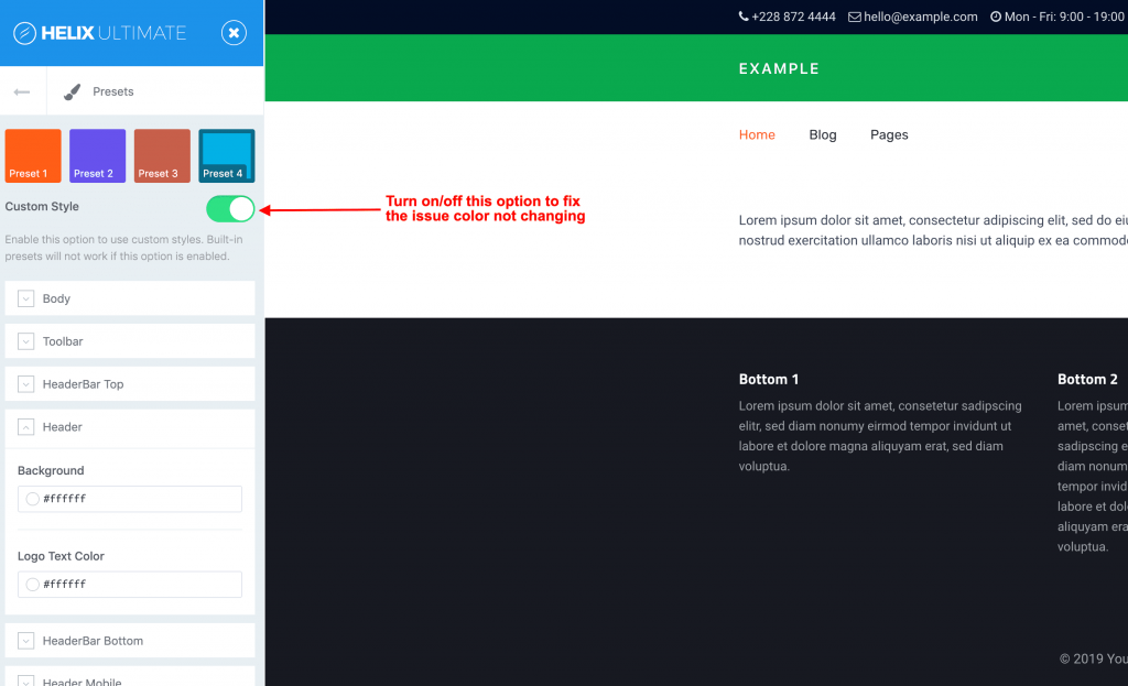
Preset Customization Issue
In some cases, the Custom Style not working while changing the color value or switching from predefined preset to custom style, in this case, you can turn off/on the custom style to solve the issue.
- Getting started
- Overview
- Installation
- Updating
- Changelog
- Basic
- Logo
- Toolbar
- Header
- Mobile
- Page Title
- Body
- Footer
- Contact Info
- Coming Soon
- Error Page
- Presets
- Style Customizer
- Layout Builder
- Overview
- Rows
- Columns
- Builder
- Page Builder
- Module Builder
- Navigation
- Settings
- Typography
- Typography Settings
- Blog
- Layout
- Article
- Custom Code
- Settings
- Custom Css
- Advanced
- Settings
- Cookie Banner
- Mega Menu Builder
- Settings
- Migration/Upgrade
- Helix3 Migration
- Troubleshooting
- Custom Presets