Tagged: Agency, joomla, responsive
Hello again,
Agency theme.
section: sp-page-title
Quickstart installation didn’t install this sp-page-title section. Is this achieved using modules or pagebuilder?
responsive: sp-page-title
Also, view on desktop is perfect.

But view on mobile, not so much.
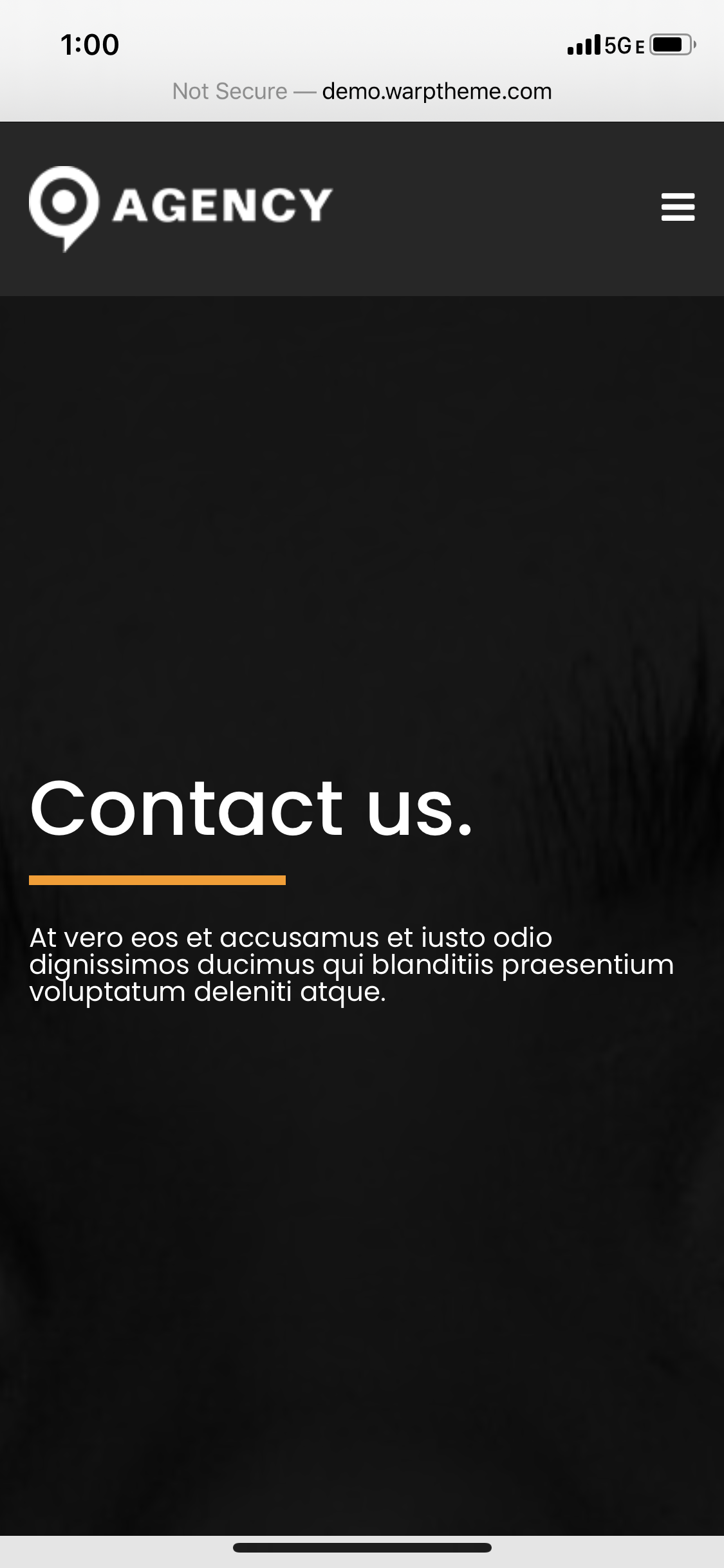
It would seem mobile view zooms in to the center-top.
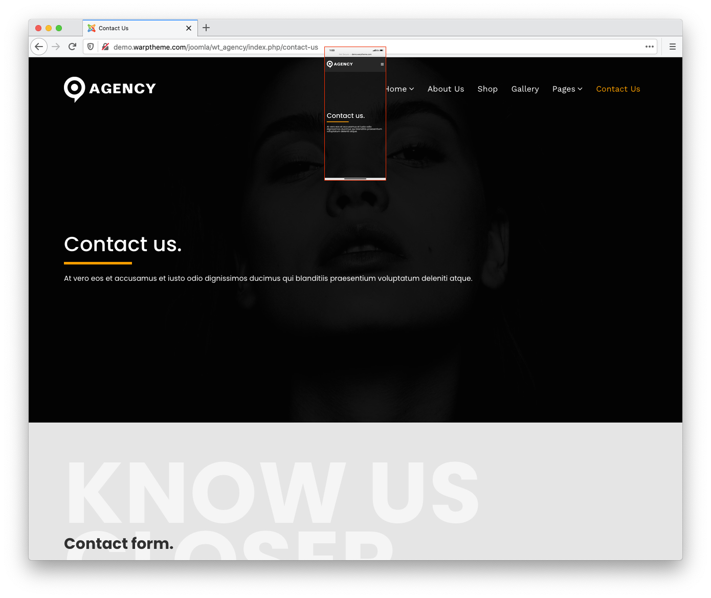
To around 5% into the background image.

How would I go into zooming out a little on mobile?
Now, while in the subject..
-
This reply was modified 5 years, 8 months ago by Ch1n1t0.
responsive: testimonials
View on desktop.

View on mobile.

Thank you in advance.
Nothing? 🙁
Hi there,
I remember that I already replied the same issue via ticket or email. We are working for the Next major Helix Ultimate 2 update for all Helix3 based theme. The next Agency version already fixed the responsive for Page Title via template options.
You can add custom css code to replace the padding for mobile device.
Example:
@media (max-width: 767px) {
    .sp-page-title {
    position: relative;
    padding: 145px 0 125px 0;
}
.sp-page-title h3 {
    line-height: 1.4;
}
}
just add the css code into custom.css file.
Testimonial Issue: You can open the Home page via Quix -> scroll down to Testimonial sections -> settings icon -> General tab -> click the desktop icon setting to change the responsive padding for mobile/tablet devices.
Please see https://imgur.com/cv4RdeT
Thank you
Not getting the desired results, guess I’ll wait for the update.
Thank you anyways!
Hi there,
You can wait for the update or submit a private message here https://warptheme.com/support/ with your site info. I will help you correct it.
Thank you
You must be logged in to reply to this topic.