Template Overview
Nitro is a business consulting Joomla Template suited for financial advisers, coaches, agencies, realtors, and more businesses and experts. It has 100% responsive design and tested on all major browsers and devices. Theme based on Helix Ultimate Framework, Sp Page Builder 3, and over 50+ Extra Addons for SP PageBuilder included.
Template Features
- 02 Layouts: Wide Layout and Boxed Layout
- 02 Header styles
- Article Post Formats
- Front-end editing
- SP page builder 3
- Over 50+ Extra Addons for SP PageBuilder included
- Fully Responsive
- Sticky menu feature
- Custom 404 Page and Offline Page
- RTL Language Ready
- Cross browser compatibility
- Light and fast loading
- SEO Friendly
Getting Started
When you purchase our Joomla! template, you’ll then be taken to the Downloads page. Click on the “template” file name to download or you can check back anytime by going to Customer Area page.
After downloading our product you’ll find the following files/folders within:
- nitro_pro_j3x_2.0.0.zip
- The stand-alone Joomla! template installation package.
- nitro_quickstart_j3.zip
- A quick-launch Joomla! 3.x installation package that contains all the sample data, images and most extensions to replicate the live demo.
Overview
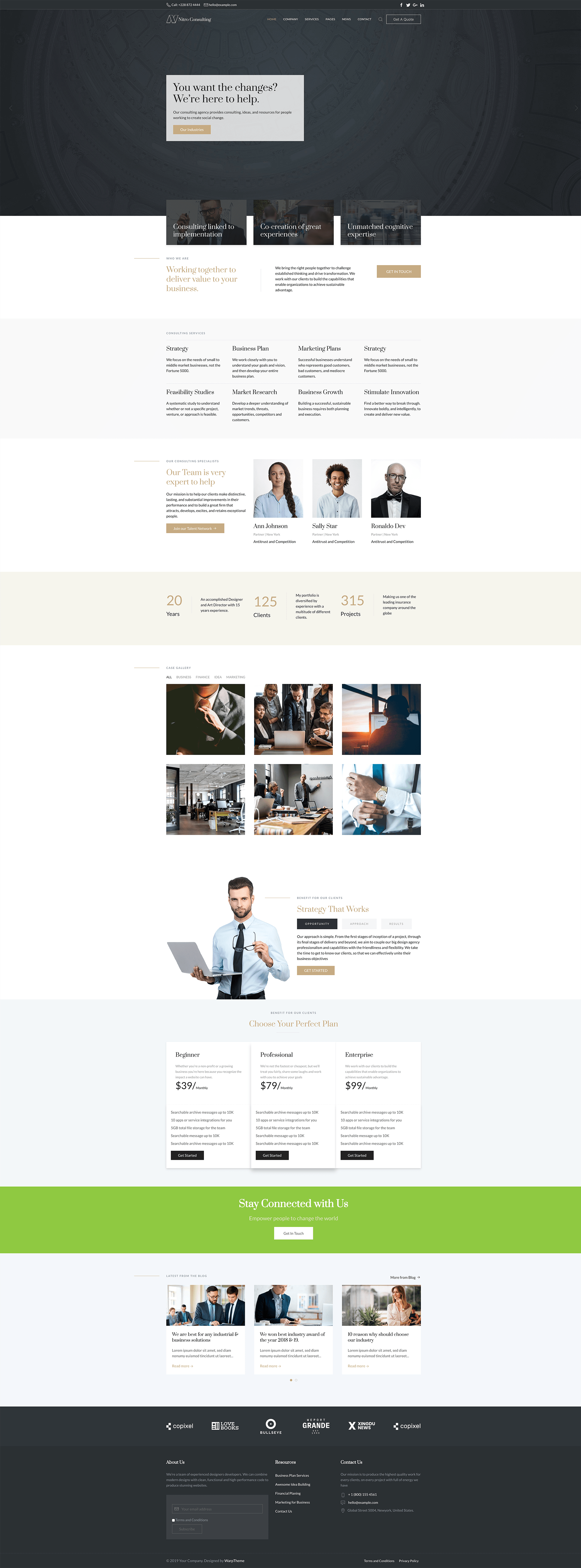
Home Default
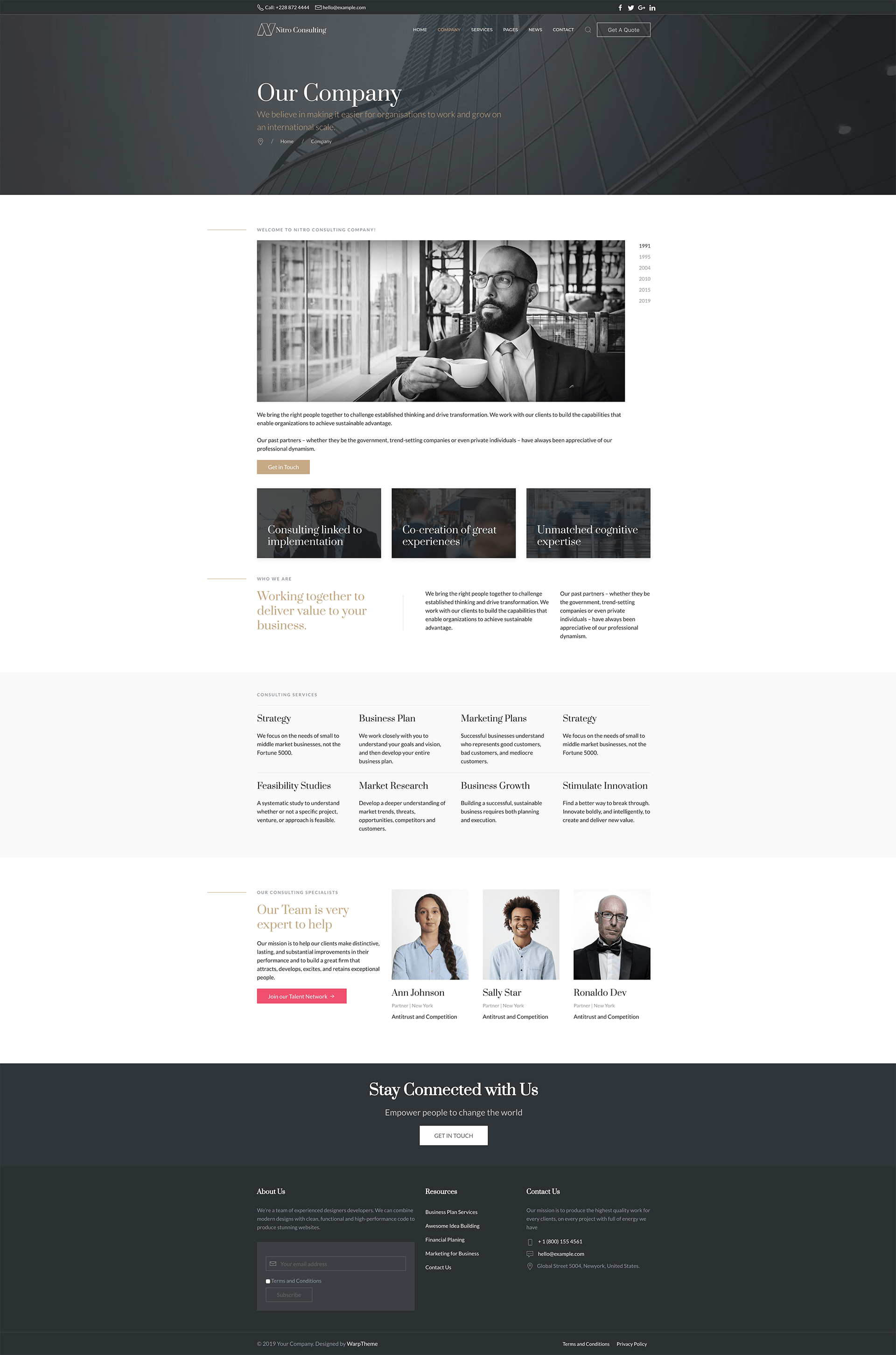
Company Page
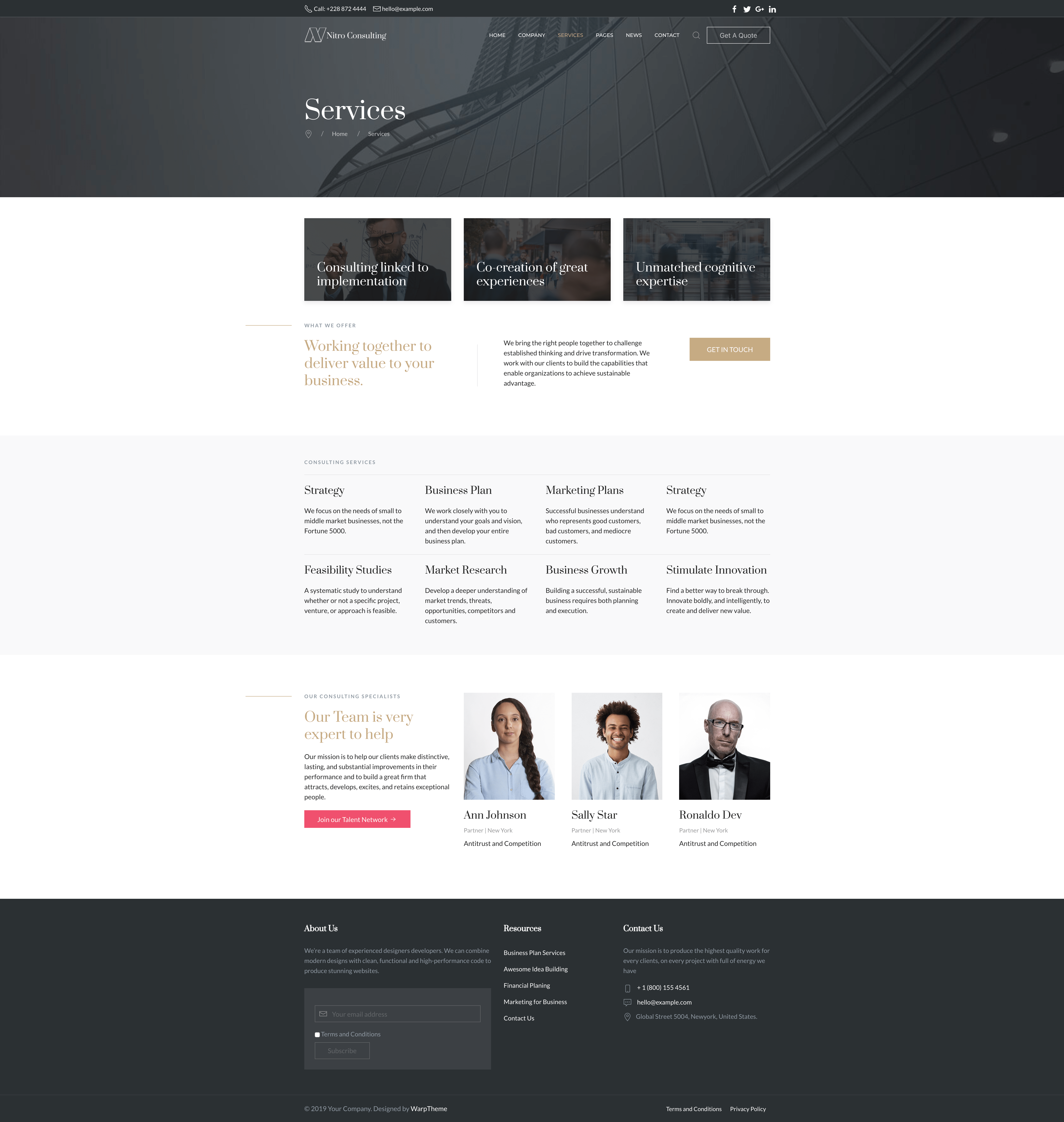
Services
Template Installation
The section will help you with steps to install Nitro II template - Quickstart and Manual installation.
Quickstart installation
The quickstart allows you to replicate Nitro II demo to your server. It means, after installing the quickstart, you will have a site exactly the same as the demo site.
Download Nitro II quickstart package →, upload to your server and extract it.
Step 1 - Configuration: add Site name, Admin email, Admin username and password
Step 2 - Database: select database type, host name, database username, password, database name & table prefix
Step 3 - Overview: select sample data to install.
Step 4 - Remove/Rename "installation" folder: for security purpose, you need to rename or remove the "installation" folder
Note Once this final step is complete you’ll have a fresh install of Joomla, along with the template and all the settings and content needed to match the demo, including sample article contentVideo Tutorials
How to install a Quickstart package of a Joomla template
Manual Installation
Download Nitro II template installation package →, upload to your server and extract it.
Step 1 - Log in to your Joomla! backend e.g. http://www.mysite.com/administrator and navigate to the Extension Manager.
Step 2 -: On the Install section, click on ‘browse’ on the Package File field and locate and select your [template].zip template package file. Click on ‘Upload & Install‘. Once the template has installed successfully you will get a success notification.
Demo Pages
Editing Home page
Log in Joomla Administrator -> Sp Pagebuilder -> Pages
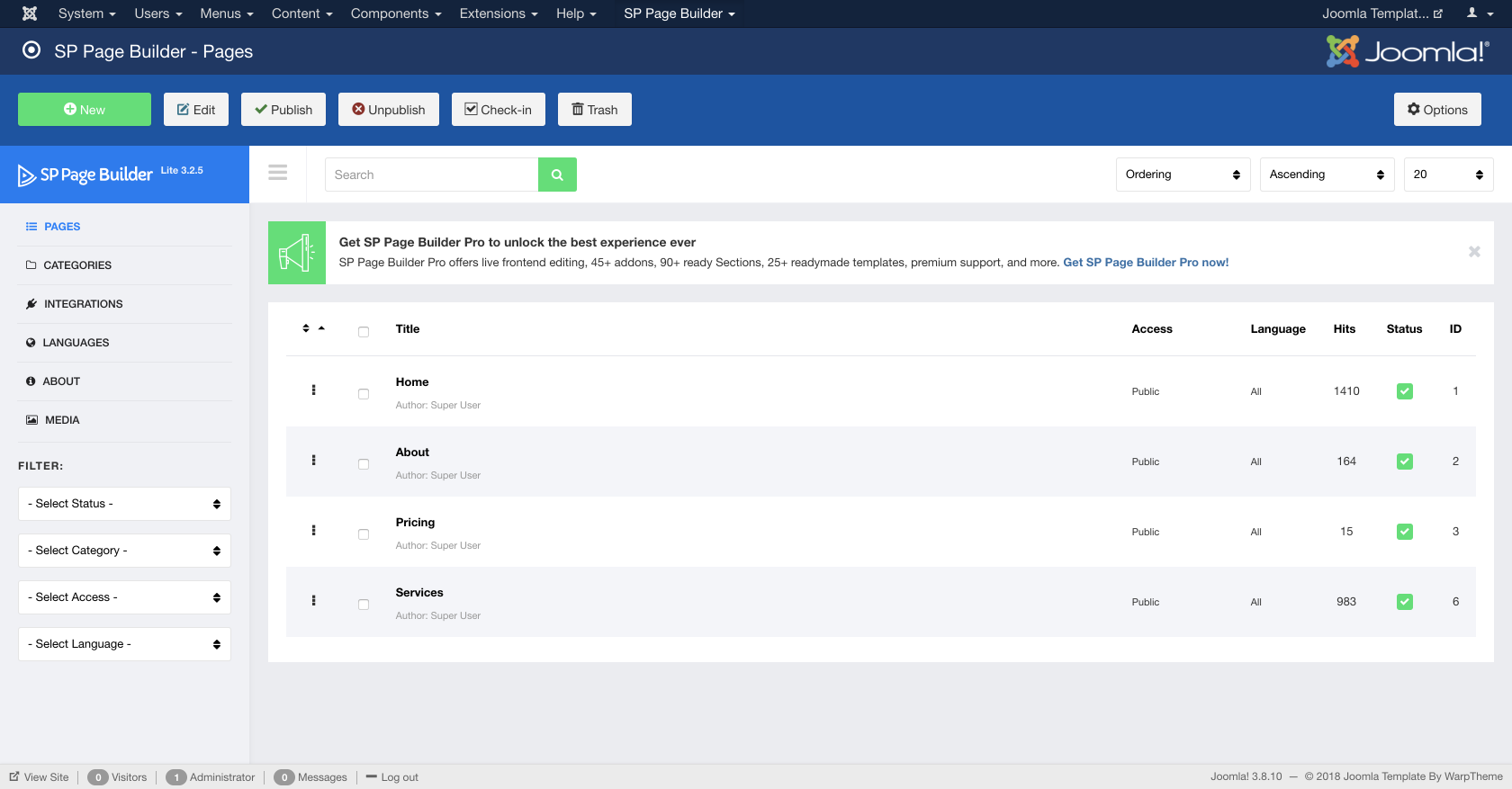
Select Home article to edit the home content
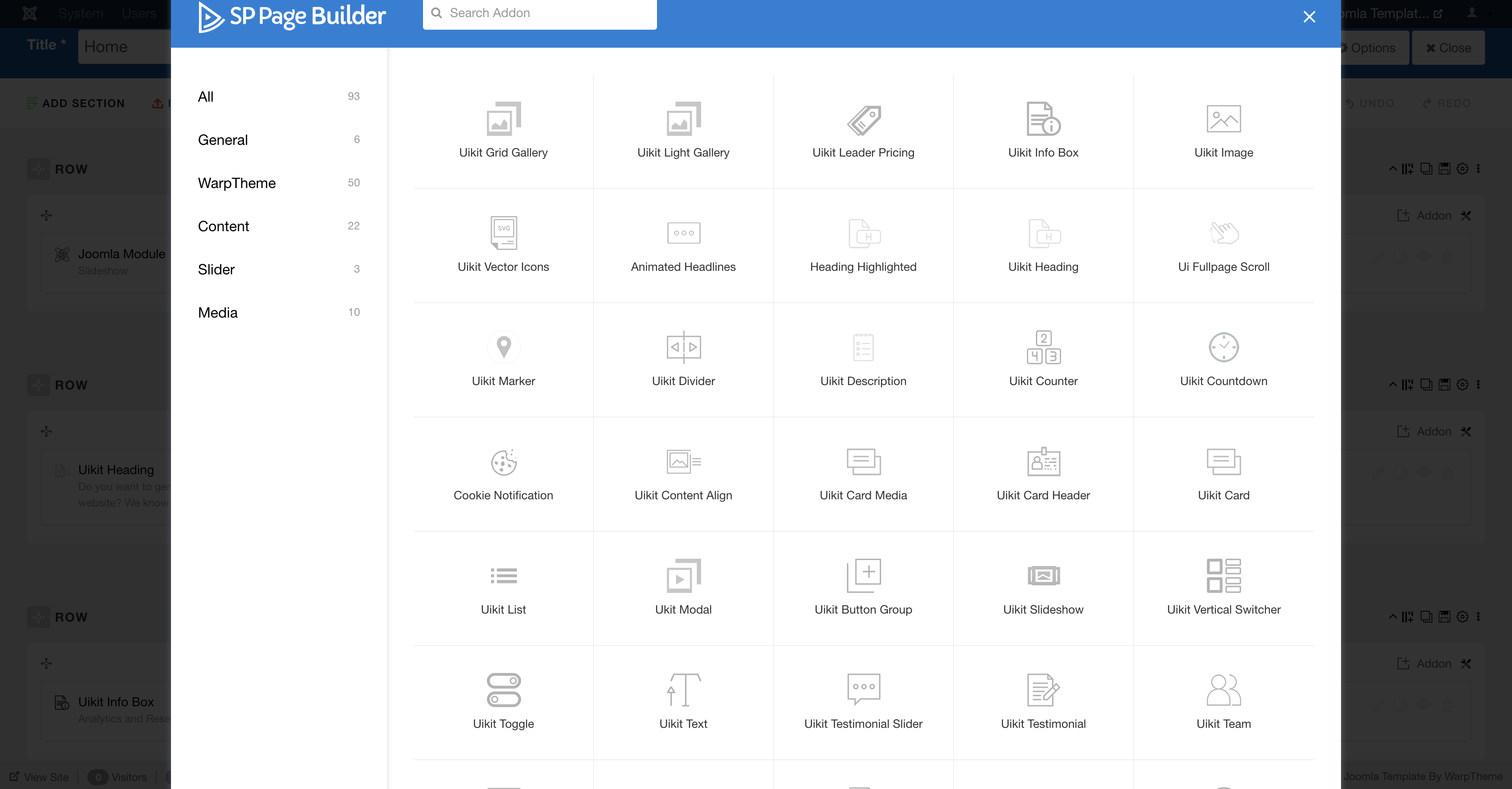
Add any type of content to your page with over 50+ extra add-ons. You can even load any Joomla modules without leaving the builder. Whatever you are trying to build, the Sp page Builder has an element that can help make your dream a reality.
Template Configuration
Helix Ultimate
Basic Settings
In this section, you get the following settings options.
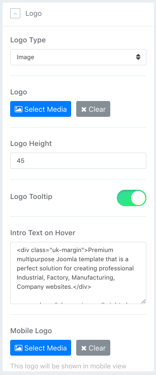
Logo
Here you can set/upload a logo for your site (image or text). You can adjust the logo height as well. Also, you get an option to upload a dedicated mobile logo in this section. Now you can also add SVG logos to your site as we integrated the system in Helix Ultimate. Building a fast loading site is a lot easier now.
Header
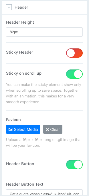
Choose the header height, decide whether the header will be sticky or not, and upload a favicon using this section.
Body
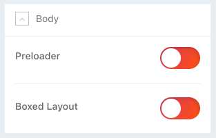
In the Body section, you can turn the website preloader on or off. If you turn on the preloader, a spinning circle will be shown while loading your site.
Here you can also switch between boxed and wide site layouts. When you turn on the Boxed Layout option, you get several other relevant options (e.g. Background Image, Background Repeat, Background Size, Background Attachment, and Background Position) to customize the boxed layout appearance.
Footer
If you want to show a copyright notice on your website footer, turn on this option. Select the appropriate module position for the copyright notice (e.g. footer1, footer2). If you want to show some features along with the copyright notice module, choose the ordering using the Feature Position menu. Just below the Feature Position drop-down menu, you get a text box to put the footer copyright text.
Tip! Use {year} to get auto-updated year.
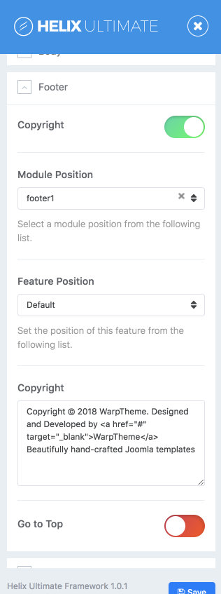
Go to Top
Go to Up/Top is a button on the bottom-right area - it allow your website visitors to easily scroll back to the top of the page with one click of the button. This gives your website better navigation and also adds a more professional look to your current layout. . Displays a button only when user scrolls down the page. Not having this button in your website could leave a negative impact on your visitors. You can turn on the Go to Top feature from here.
Social Icons
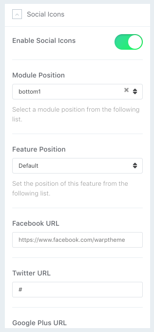
Helix Ultimate lets you display social media profile links with icons on your site. Here you can switch this option on/off, and customize links.
Contact Info
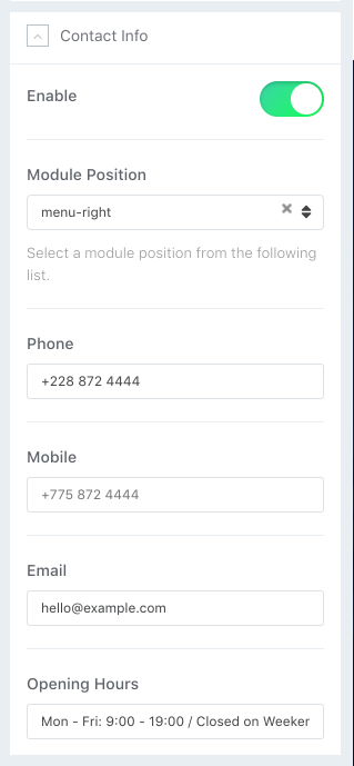
Turn this feature ‘ON’ to display your contact information on your website using Helix Ultimate. When you turn ON this feature, you get the information fields and module positions selection menu.
Coming Soon
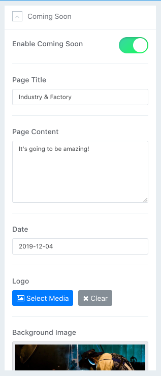
With Helix Ultimate, you can display a customized maintenance mode page (e.g. under maintenance, coming soon, site offline or so on) on the frontend of your site when your site is under construction. You can craft this page as the way you want. Setting up the expected time and date to be back is also possible. Use the Coming Soon option to go to a coming soon/maintance mode on your site. Add a page title, page contents, date, logo, background image and social icons on your coming soon page. You don’t need to add a custom page for this, rather, Helix Ultimate will show the coming soon/maintenance page once you simply turn this option on from Helix Ultimate template option.
Error Page
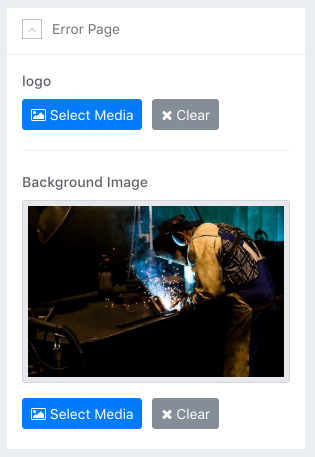
A website may face several errors like 404 and so on. You can create a custom page for these errors. Use the Error Page option to do so. Upload a custom background image and a logo to display on the error page(s).
On error page you can publish any module, just choose "404" as a module position for it.
Presets Settings
The Presets tab gives you the ability to quickly and easily configure color settings related to the appearance of the Helix-powered template. This includes being able to switch between pre-configured presets and custom color sets.
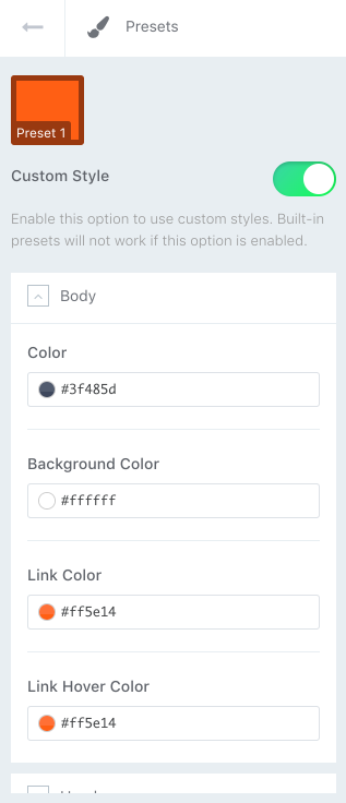
The Preset Selector gives users the ability to quickly switch between Presets, used for whole template style, with a pre-designed color palette and style settings.You can enable “Custom Style” and choose there your own main colors. Notice, built-in presets will not work if this option is enabled.
For some areas you can define those also from Layout tab, separately for each Row (section). If you want to define more colors or use extra CSS3 effects you have to use custom CSS to override default font color, background colors or other elements.
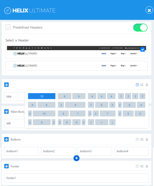
Layout Builder
Layout Manager allowing you to build flexible layout based on module positions. Layout Builder is one of the unique features of Helix Ultimate which allows anyone to customize the existing template in almost any shape without code customization.
Layout Grid
Helix Ultimate Layout is based on 12 column layout from Bootstrap 4. It includes a powerful mobile-first flexbox grid system for building layouts of all shapes and sizes.
You can choose columns pre-set or set your own grid. The grid system is responsive, and the columns will re-arrange depending on the screen size.
- In current version of Helix Ultimate you can use Predefined Headers. We’ve added 2 built-in header variations to Helix Ultimate that will enrich the scope and versatility of your sites created with the framework.
- Each Row can have its own column structure and unique settings.
- Icon with arrows allows you to change positions of rows by moving them up or down.
- Use plus icon to add new Row, then choose column structure and select module position(s) used there. We also suggest to insert short ID name for the new Row.
Row Options
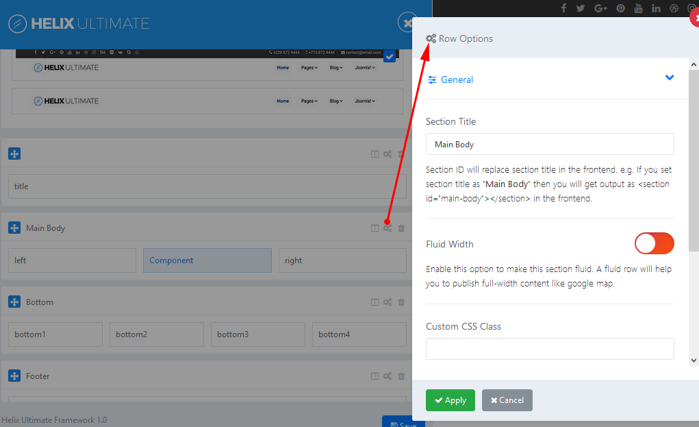
In Row Options you can:
- Insert section title (should be short, without extra languge native marks)
- Set Fluid Width
- Add Custom CSS Class Name
- Define Row Style: margin, padding, text color, link color, link hover color, background color and choose background image.
- Responsive settings - allows to control of visibility of rows. You can hide Row on selected devices, related with screen resolution:
- Hidden on Smartphone - screen width less than 576px
- Hidden on Largen Smartphone - screen width equal to or greater than 576px
- Hidden on Tablet - screen width equal to or greater than 768px
- Hidden on Smaller Desktop - screen width equal to or greater than 992px
- Hidden on Desktop - screen width equal to or greater than 1200px
Columns Options
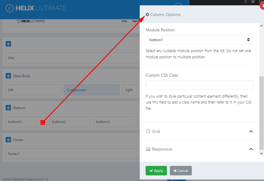
- Make Component Area - Enable this option to make this column as a Component area. If you already selected component area for another column then unselect that one first then select this one. Joomla message section will also be loaded inside this column. Only one column in whole layout can be used for showing component.
- Module Position - Select any suitable module position from the list (below). Do not set this same module position to multiple position. Each should have unique name. Below is the list of all available module positions, which you can use in columns:
- title
- top1
- top2
- top3
- logo
- menu
- search
- slide
- user1
- user2
- user3
- user4
- left
- right
- feature
- slider
- position1
- position2
- position3
- position4
- position5
- position6
- position7
- position8
- content-top
- content-bottom
- bottom1
- bottom2
- bottom3
- bottom4
- breadcrumb
- footer1
- footer2
- comingsoon
- offcanvas
- pagebuilder
- 404
- debug
Above and below component area there are two module positions: content-top and content-bottom which can be used to publish there any module.
- Custom CSS Class - If you wish to style particular content element differently, then use this field to add a class name and then refer to it in your CSS file.
- Grid - allows to control of responsive layout, it’s based on Bootstrap 4 grid system. There are five grid breakpoints, one for each responsive breakpoint. Grid breakpoints are based on minimum width media queries.
- Responsive settings - allows to control of visibility of columns. You can hide columns on selected devices, related with screen resolution:
- Hidden on Smartphone - screen width less than 576px
- Hidden on Largen Smartphone - screen width equal to or greater than 576px
- Hidden on Tablet - screen width equal to or greater than 768px
- Hidden on Smaller Desktop - screen width equal to or greater than 992px
- Hidden on Desktop - screen width equal to or greater than 1200px
Typography Settings
Typography in websites is arguably more important than other design elements since type is the one thing that is consistently rendered across different browsers.
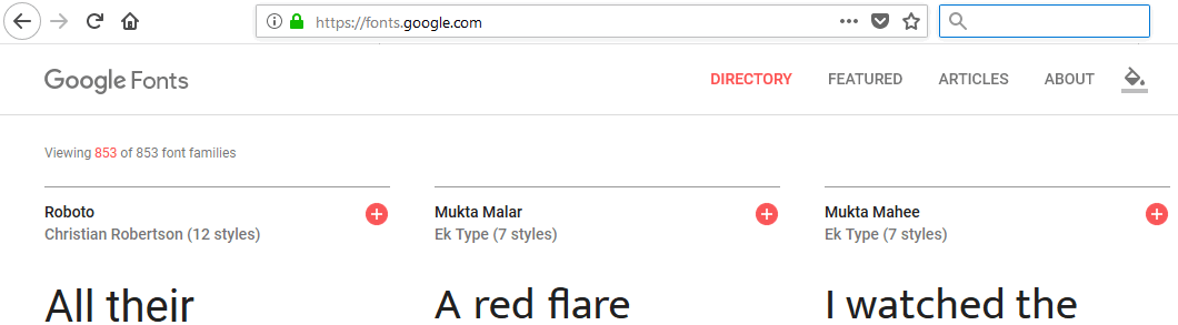
Google Fonts
In general typography in Helix Ultimate templates is mainly based on Google Fonts collection (850+ fonts). With so many unique fonts to use, you're bound to find something you like! This settings area allows you to easily choose font(s) from the Google Font Directory to your Joomla! template. You can also assign the Google fonts to specific CSS elements only.
All available Google fonts are released under open source licenses. You can use them in any non-commercial or commercial project. They works on the vast majority of modern mobile operating systems, including Android and iOS (iPhone, iPad, iPod).
Only some of the fonts in the Google Font Directory support full range of subset - multiple scripts (like Latin, Latin Ext, Cyrillic, and Greek for example). Notice, not all fonts are fully support your native language diacritical marks (signs).
Arial, Verdana, Georgia..
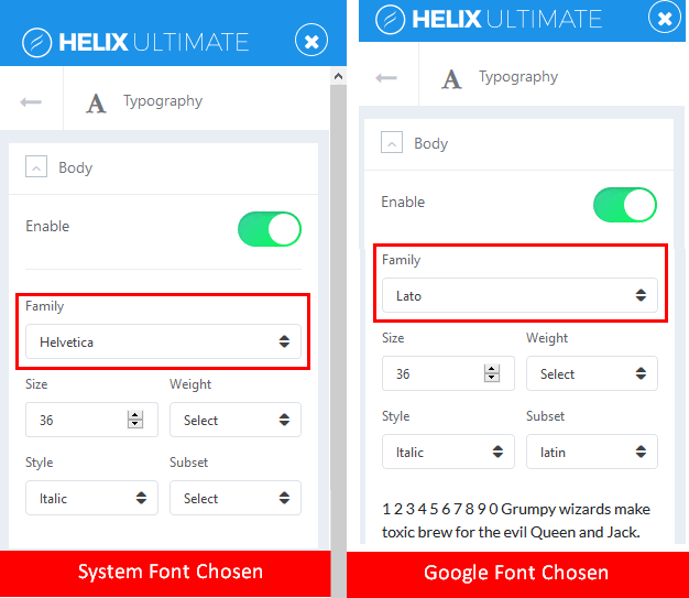
Beside Google Fonts you can choose widely-supported cross-platform fonts: Arial, Tahoma, Verdana, Helvetica, Times New Roman, Trebuchet MS and Georgia. “Web Safe” fonts mean that they will look perfect no matter the browser you are viewing them from. Also, these fonts are very popular and pre-installed on operating system: Windows, iOS or Linux. They are not loaded during loading a website, no delays because of that. You can save bandwidth and keep fast loading pages.
Default Font
If none of Typography option will be enabled, the default fonts are used from Bootstrap 4. Helix Ultimate use “native font stack” for optimum text rendering on every device and OS.
This font-family is applied to the <body> and automatically inherited globally throughout Bootstrap 4.
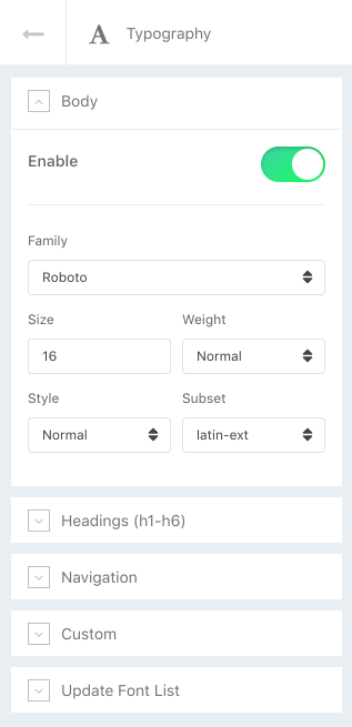
Body
Enable or Disable using Fonts integration. Which gives you the ability to assign default System Font (Arial, Tahoma, Helvetica, Georgia etc.) or the Google font to whole Body of your website. Choose Font Size, Font Weight, Style and Subset (for Google Fonts only).
Headings (h1-h6)
Enable or Disable using Fonts integration. Which gives you the ability to assign default System Font (Arial, Tahoma, Helvetica, Georgia etc.) or the Google fonts to specific Headings (h1-h6) used inside your website content. Choose Font Size, Font Weight, Style and Subset (for Google Fonts only).
Navigation
Enable or Disable using Fonts integration. Which gives you the ability to assign default System Font or the Google font to main navigation of your website. Choose Font Size, Font Weight, Style and Subset (for Google Fonts only)
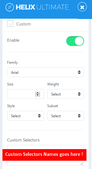
Custom
From here you can choose default System Font (Arial, Tahoma, Verdana, Georgia etc.) or Google Font for custom CSS Selectors (class, ID, element). A CSS selector can contain more than one simple selector. Just enable option, choose font settings and in field below insert name(s) separated by comma.
Update Font List
This feature allows you to refresh the list of available Google fonts. So if there are any new ones, this button allows you to quickly update fonts with just one click, and they will be automatically added in to Helix Framework database. Which allows you to use them after update.
Blog Settings
This area of settings allows you to enable some appearance elements (Image Sizes) as much a social comments, Author Info and social share buttons.
Images
Used to set image size and resolution (“Blog Option” tab only) used inside different article views.
Crop Quality
It allows you set image quality for better compressions for images size resolution. Applicable for JPG images only.
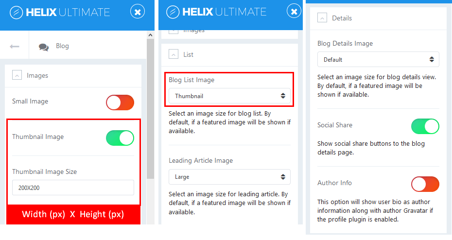
Blog List Image
Select an image size for Category Article Blog view. By default, if a featured image will be shown if available.
Leading Article Image
Select an image size for leading article. By default, if a featured image will be shown if available.
Blog Details Image
Select an image size for single article details view. By default, if a featured image will be shown if available.
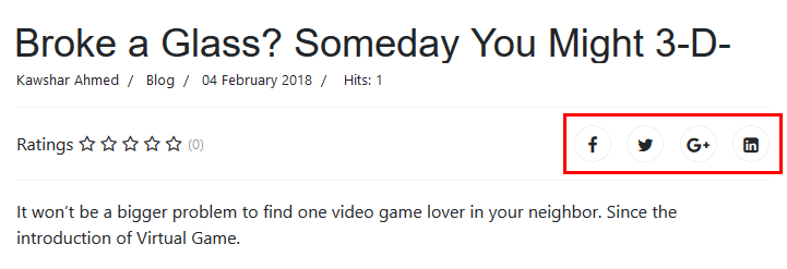
Social Share
Show or Hide social share buttons (Facebook, Twitter, LinkedIn, Google+) above content of single article. By default in top right corner.
Author Info
This option will show user bio as author information along with author profile image taken from Gravatar if the profile plugin is enabled. By default, images are presented at 64px by 64px. Relation is based on Joomla user email. What happens when an email address has no matching Gravatar image? By default, you would get blue box with gravatar logo inside.
Comments
This build-in option allows you to add IntenseDebate Comments system, Facebook comments and / or Disqus Comments to your site. Feature-rich comment system complete with social network integration allows your readers to log in via a preferred social network and add comment under article. All you have to do is choose and set correct Facebook Application ID, IntenseDebate Account or Disqus Username/Subdomain. You can use only one selected social comments system or disable it and use your own based on extra comments component or plugin.
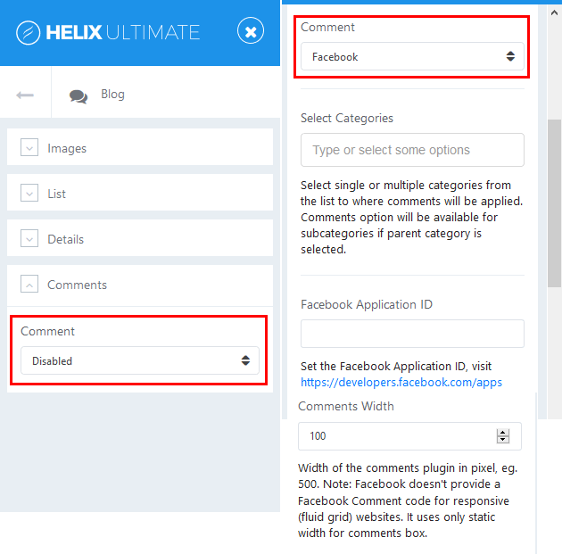
Important! Disqus Comments have three membership plans, and in basic one Ads (advertising) and sponsored comments are (or may be) displayed.
- Select Categories - select single or multiple categories from the list to where comments will be applied. Comments option will be available for subcategories if parent category is selected.
- Comments Width - select width of the comments area in pixel, eg. 500. Note: Facebook doesn't provide a Facebook Comment code for responsive (fluid grid) websites. It uses only static width for comments box.
- Comments Count - show or hide comments count on blog view or frontpage.
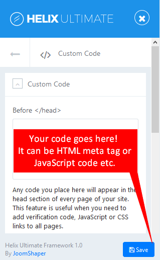
Custom Code
You can easily customize Helix Ultimate Framework with your own custom code, for example: CSS, JavaScript, Metatags, links and verification code by using the custom fields in that section of settings. Inserting custom code before your Joomla website’s </head> and/or </body> tags is a common requirement for a variety of scripts and services (e.g. Google Analytics).
Before < / head >
Any code you place here will appear in the < head > section of every page of your site. This feature is useful when you need to add verification code, extra Meta Tags, HTML Links Tags and other metadata. The head of an HTML document is the part that is not displayed in the web browser when the page is loaded.
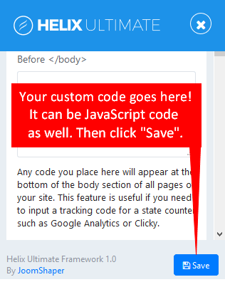
Before < / body >
Any code you place here will appear at the bottom of the body section of all pages of your site. This feature is useful if you need to input a tracking code for a state counter such as Google Analytics or Clicky.
Custom CSS
You can use custom CSS to add your styles (code tweaks) or overwrite default CSS from a template or extension. This option is useful for small design changes. This is only for CSS code, do not use HTML or PHP code here.
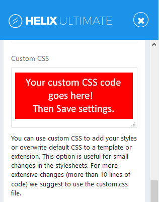
For more extensive design changes (more than few lines of code), you can add css code into custom.css file instead. By default custom.css file located at joomla/templates/template_name/css/custom.css
Remember that CSS cascades in reverse, meaning rules that appear later always take precedence over rules that appear earlier. So any CSS applied to a separate sheet will override the page’s default code.
Those methods should help you to create custom sites that stay exactly how you want them to, no matter what new updates roll out.
Custom JavaScript
Use this field to inject custom JavaScript to whole website. It loads your custom Javascript code after all other JavaScript files (except special hardcoded occasions), allowing you to be the last one who will affect your website.
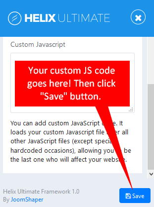
For longer custom JavaScript code we suggest to use the custom.js file instead. By default this file doesn’t exist, you have to create a new file inside /js folder of template (joomla/templates/template_name/js/custom.js)
Advanced Settings
This section of Helix Ultimate settings allows you to reduce size of loaded template files. By speeding up template, you offer a better experience for your customers, improve your page speed (and Google search engine ranking).
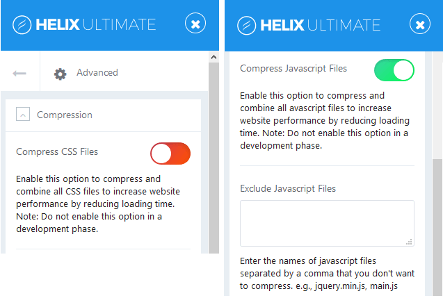
Compress CSS Files
Enable this option to compress and combine all CSS files to increase website performance by reducing loading time. Note: Do not enable this option in a development period.
Compress JavaScript Files
Enable this option to optimize JavaScript is to improve your site performance by compress all JavaScript files into one - so that the total size and number of requests will be decreased. Note: Do not enable this option in a development period. In some cases enabling this option can damage some animation effects. In that case, you have to Exclude Javascript Files. In next field you have to enter the names of javascript files separated by a comma that you don't want to compress. e.g., jquery.min.js, main.js.
Compile SCSS to CSS
Enable this option will compress all SCSS files during each load of your website if the SCSS file has been changed or edited. Turn off this option if your site is in production mode.
SCSS (Sassy Cascading Style Sheets) is fully compatible with the syntax of CSS, while still supporting the full power of Sass. This means that every valid CSS stylesheet is a valid SCSS file with the same meaning.
Export & Import
This feature is useful only if you want to transfer basic template setting between templates, for example, Font selection, Layout settings, Color Preset chosen etc. It can not be used for transfer demo data like articles, nor module content.
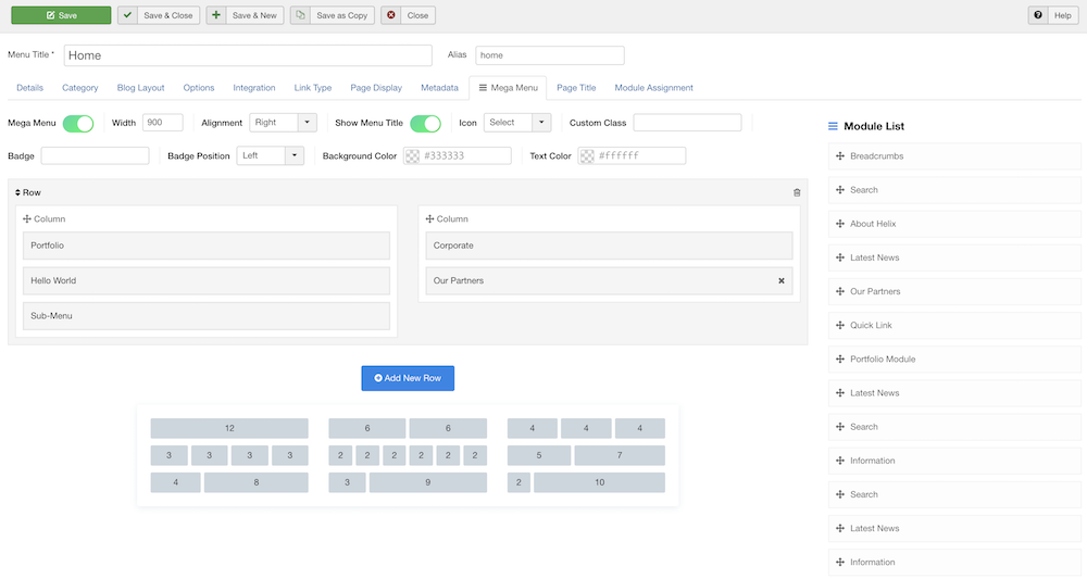
Mega Menu Builder
A Mega Menu is the name given to a large panel of content which is displayed below a menu item when the user hovers over the menu item. Mega Menus can contain sub menu items and modules. We all know how it helps a site be more navigable.
With Helix Ultimate you are able to build such mega menus on your site easily. Helix Ultimate mega menu builder offers you different layouts to give diverse looks of your menus. Styling menus has been made easier for your convenience. Add as many menu items as you need.
Inside each menu item you can find new tab "= Mega Menu" - it came from Helix Ultimate Framework. Inside this tab, you can find several switchers, responsible for additional features.
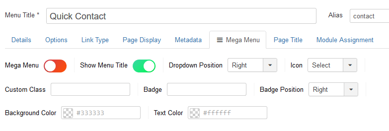
Mega Menu
To enable/disable advanced Mega Menu options. It is simple way to create highly customized and creative mega menu configurations. You can add and use row and column based menus, also drag and drop the modules to the menu positions from the modules list.
- Width - allows you to choose total width of submenu area.
- Alignment - choose submenu area alignment to the right, left, center, or set full width.
General tip: building a two or three columns sub-menu is easy process - all starts from Menu Manager, where you have to add all those sub menu items. For main submenu headers you can use "Menu Heading" or "External Links" menu type.
How to use Mega Menu to build columns for menu items:
- Click “Add New Row” button
- Select Menu layout: single row or rows with columns, you have 9 options to choose from.
- Then click “Save” button from top bar to refresh/rebuild content.
- After refreshing you should be able to see submenu items, if were added before. Using drag and drop function in Mega Menu, you can easily arrange columns, move elements or modules into another position, from one column into another.
- In addition, you can also select existing module(s) from the right sidebar and put into column.
- Trash icon - allows you to remove undesired row.
- Close “X” icon - allows you to remove undesired element.
- Remember to save setting after all changes (“Save” or “Save & Close”).
Show Menu Title
By default enabled, it allows you to hide Menu Title from menu, but alias in system will stay. It's good method to create hidden menu item for short url. This may be useful also when you want to show only icon instead full menu item name, for Home or Search position.
Dropdown position
It allows you to change dropdown submenu position, to the right or to the left side.
Menu Icon
Mega Menu allows you to set an icon for each menu item in your menu. The use of icons beside menu items titles is a fantastic alternative that favors a quick visual option identification; and even the use of icons without text to accompany is viable. You can use font icons based on Font Awesome v4.7, it means that you have huge collection of icons to choose from. By default the icon will be displayed to the left of the menu item text. To remove the icon, select the “Select” name, then save settings.
Custom Class
This field is needed in the case when your template has a particular menu location and it needs adjustment. You can place here any necessary custom class name which is already defined inside your Custom CSS code section. You can add more than one class name hee, but they have to be separated with space. Notice! No dots, comma or hash mark here.
Badge in menu items
Want to highlight your most important menu item(s) redirecting to any special page, service, product or announcement? With Helix Ultimate, we give you the system to highlight your menu item(s) with name badges (for example with word “sale” or "new"). Draw your visitors’ attention to any menu item you want.
- Badge Position - choose badge name position to the right or to the left.
- Background Color - use this option to select the background color for the badge item only.
- Text Color - use this option to select the color for the badge item only. Accessibility tip: use different color than used for background color to keep necessary contrast.
Credits
This template uses the following images, javascript libraries, icons, plugins, modules, components, or other files as listed below. All the content relating to products, services and events are fictional and are designed to showcase a live site. All images, icons, and photos are copyrighted to their respective owners.
- Sp Page Builder Extension Download
- Helix Ultimate Framework by Joomshaper
- Stock images from billionphotos and Pexels