Template Overview
Interior is one page interior design joomla template which specially made for Interior Design services. Interior help you to build beauty and modern website in no time. Interior is powered with Helix 3, Page Builder with over 50+ elements.
Template Features
- Compatible with latest versions: Joomla 3.8+
- Powerful Helix 3 Framework
- Drag & Drop Layout Builder and Page Builder Integration
- Unite Revolution Slider (Save $29) included.
- Quix Page Builder PRO with over 50+ elements (Save $39) included.
- Support for RTL languages.
- Fluid and Boxed Layout
- Optional Page Title Options.
- Sticky Header with Mainmenu.
- Mega Menu Builder & Off-Canvas Menu.
- Quickstart Package included!
- Clean and Modern Design
- Cross Browser Compatible
- 600+ Google Fonts with update button
- Social Icons
- Social Share
- Integrated Social Comments
- Custom Coming Soon & 404 Page.
- Documentation included.
- 24/7 Support
Getting Started
When you purchase our Joomla! template, you’ll then be taken to the Downloads page. Click on the “template” file name to download or you can check back anytime by going to Customer Area page.
After downloading our product you’ll find the following files/folders within:
- wt_Interior_pro_j3x_installation_1.0.0
- The stand-alone Joomla! template installation package.
- WT-Interior-Joomla3x-Quickstart-1.0.0
- A quick-launch Joomla! 3.x installation package that contains all the sample data, images and most extensions to replicate the live demo.
02 Layouts
One Page Fullwidth Layout : View Demo Multi Page Layout : View Demo
Overview
Home Page with 4 color options:Style 1
Style 2
Style 3
Style 4
Template Installation
The section will help you with steps to install Interior template - Quickstart and Manual installation.
Quickstart installation
The quickstart allows you to replicate WT Interior demo to your server. It means, after installing the quickstart, you will have a site exactly the same as the demo site.
Download WT Interior quickstart package →, upload to your server and extract it.
Step 1 - Configuration: add Site name, Admin email, Admin username and password
Step 2 - Database: select database type, host name, database username, password, database name & table prefix
Step 3 - Overview: select sample data to install.
Step 4 - Remove/Rename "installation" folder: for security purpose, you need to rename or remove the "installation" folder
Step 5 - Clear Quix Caches: After installing the quickstart package, access Joomla administrator -> Quix -> Pages -> Click "Clear Cache" button to delete the page caches for Quix. To void the issue blank page after restoring the quickstart for new domain you should clear the cache for Quix 🙂

Video Tutorials
How to install a Quickstart package of a Joomla template
Manual Installation
Download WT Interior template installation package →, upload to your server and extract it.
Step 1 - Log in to your Joomla! backend e.g. http://www.mysite.com/administrator and navigate to the Extension Manager.
Step 2 -: On the Install section, click on ‘browse’ on the Package File field and locate and select your [template].zip template package file. Click on ‘Upload & Install‘. Once the template has installed successfully you will get a success notification.
Demo Pages
Editing Home page
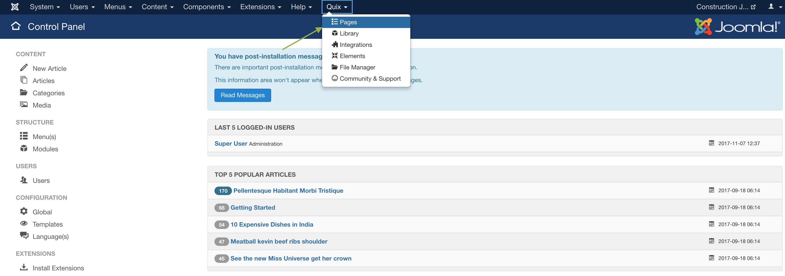
Log in Joomla Administrator -> Quix -> Pages
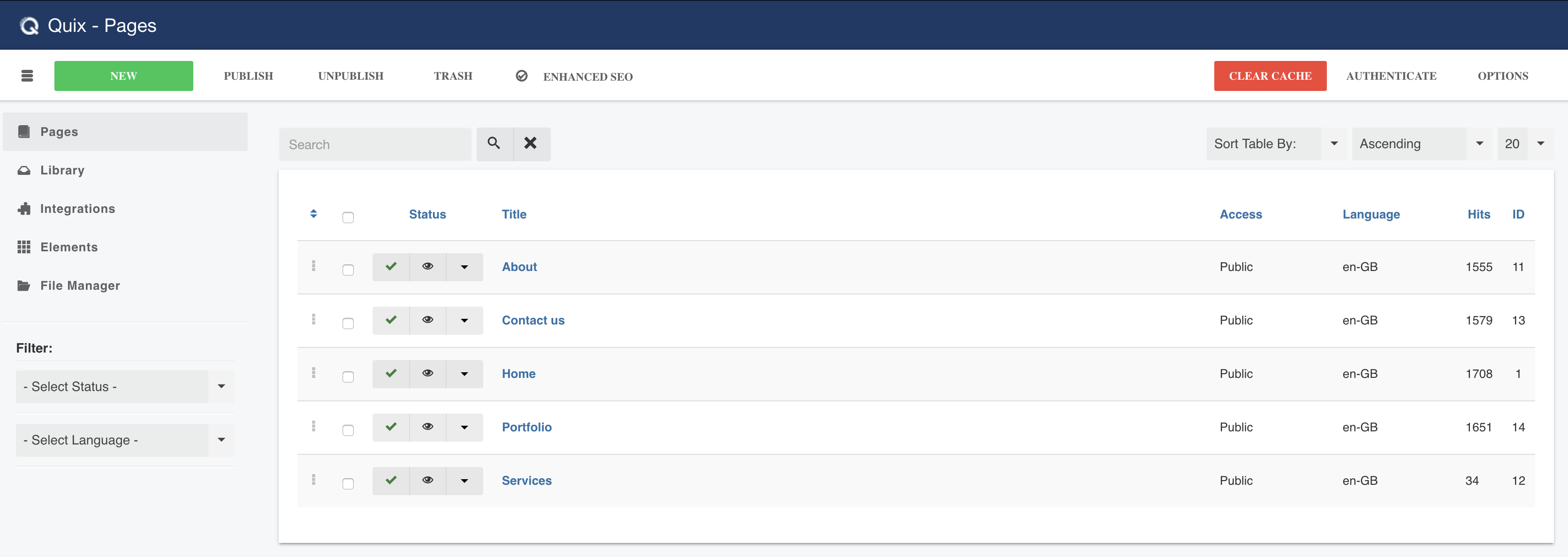
Select Home article to edit the home content
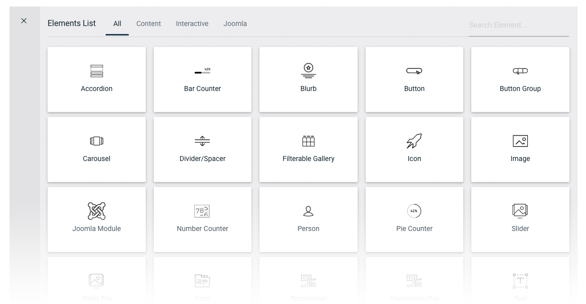
Add any type of content to your page with Quix’s large collection of builder elements. You can even load any Joomla modules without leaving the builder. Whatever you are trying to build, the Quix Builder has an element that can help make your dream a reality.
Quix Overview
There are three main building blocks: Sections, Rows, and Elements. Using these things in unison allows you to create a countless amount of page layouts. The basic hierarchy of these elements is as follows:
Sections
Sections are used to create the top-level areas on your website. Sections are made up of rows and columns. See more about rows and elements below.
Rows
Rows sit inside of Sections, and you can place any number of rows in a section. You can add any number of columns in a row and resize the column size. Once you define a Row and created column structure, you can then place elements into the column. There is no limit to the number of elements you can put in a column.
Elements
Elements are the main visual block that makes up your website. Every element that Quix has can fit into any column width, and they are all full responsive in nature.
Getting Started
Upon clicking New button on Quix list pages, you will be, presented with the main Quix Builder interface.
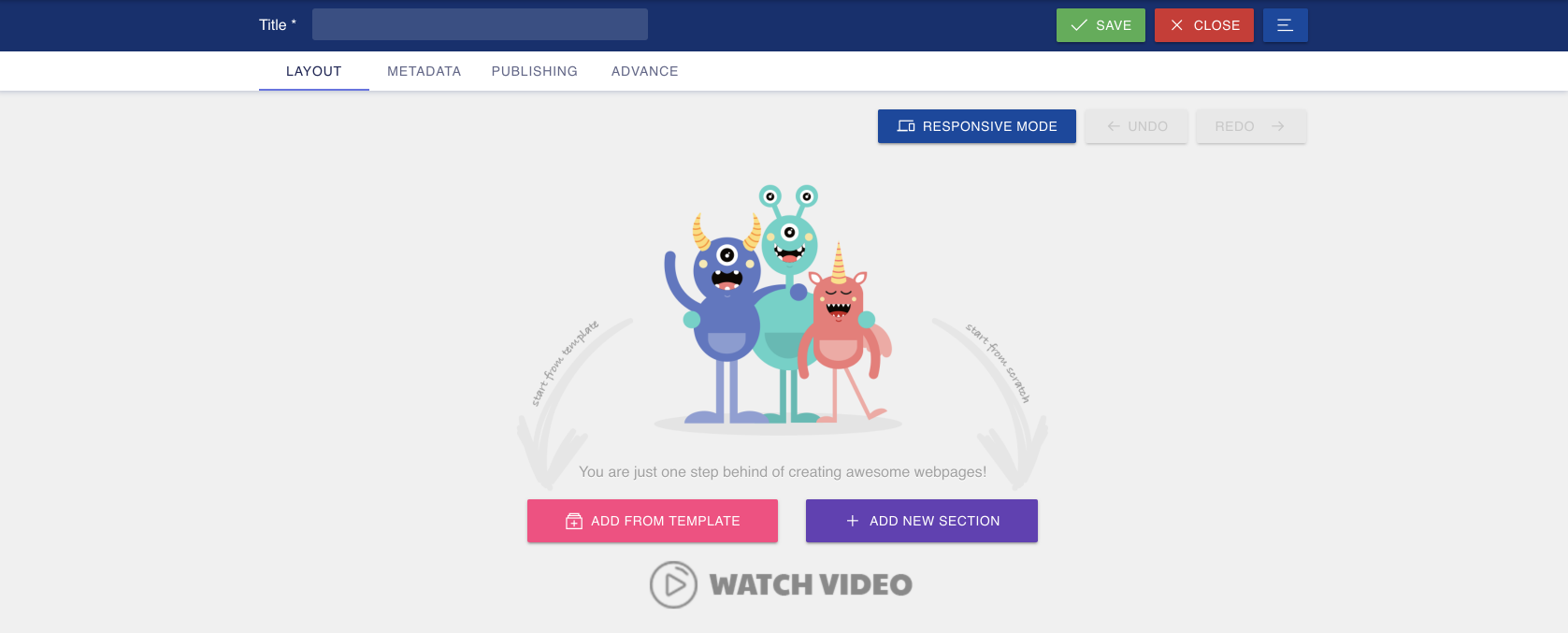
Title - You must provide a title for your page. You cannot save the page unless you provide any page title.
Save - You can save the page by clicking save button, or you can use Quix keyboard shortcuts to save the page.
Close - Close the page and get back to the list page.
Preview - This button will only visible when you save the page. By clicking this button, a new browser tab will open with the preview of this page.
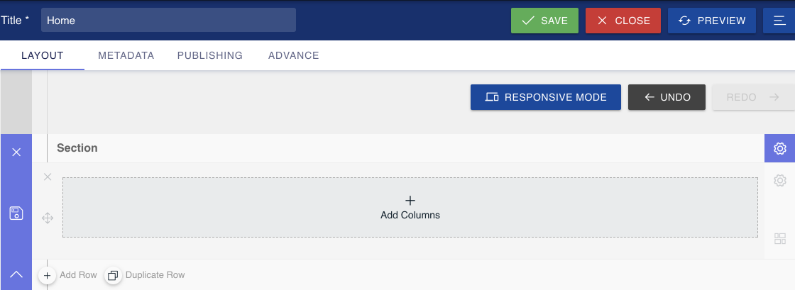
Menu - By clicking menu button, you will see 3 options:

Save To Collection - At any time you can save a layout that you have built to your Quix Collection to be used at a later time. This option is great for using a layout on another page, section of a page, or even another website built with Quix. Collection provide shortcode that can use inside 3pd component as well. For more information about using the Quix Collection, be sure to check out our detailed tutorial on the subject.
Load From Collection - You can also load a layout that you have saved in the past. Quix comes with a lots of pre-made layout, could be a great choice when you first building a website with Quix.
Export/Import - Quix portability system allow you to export your layout and import them to another website built with Quix. Theme developer could ship many page layout with their themes with Quix export option.
Section Options
Every time you add a section you will need to define its properties. By clicking the section setting icon at the top right corner you will be taken to the Section Settings.
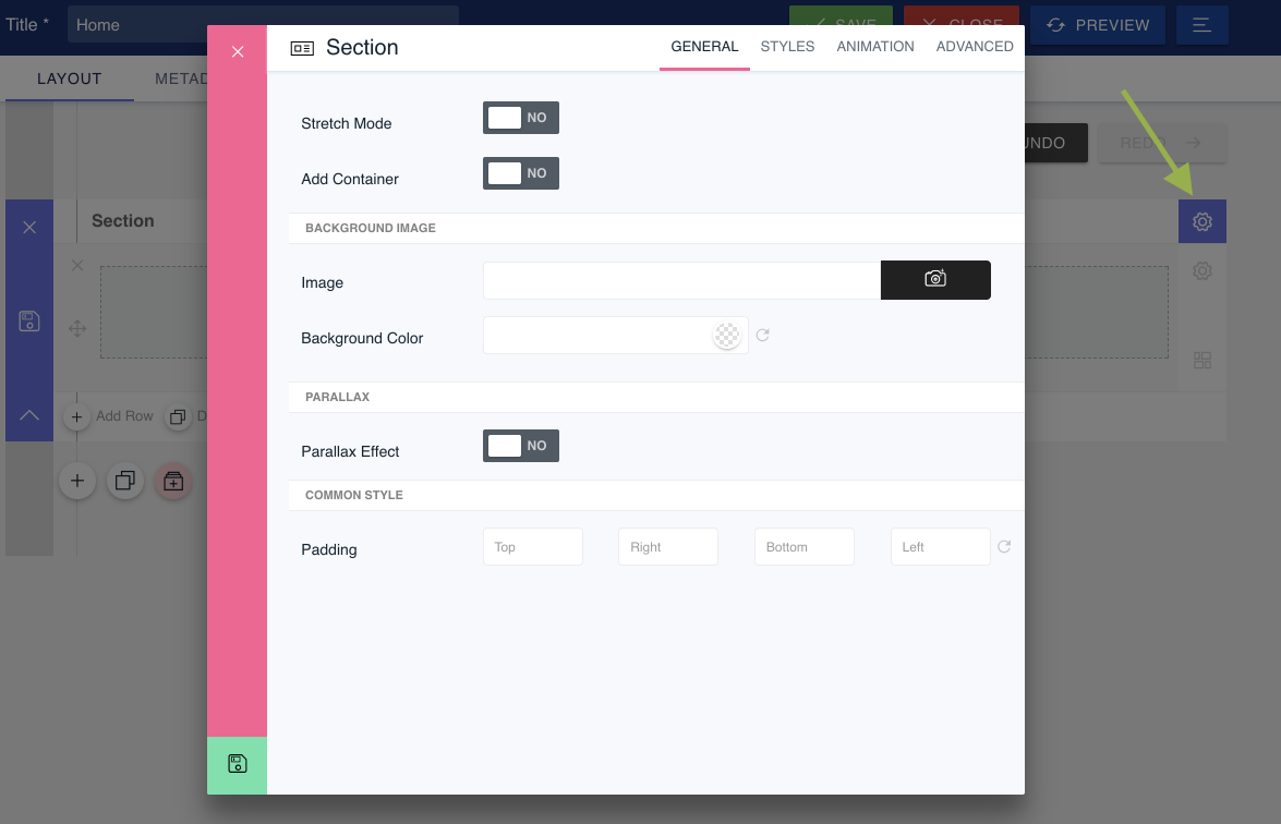
Container Mode - Container ensure proper alignment and padding of grid system.
- Stretch With Container- Section stretched to browser width and add container(fixed-width) class.
- Stretch Without Container- Section stretched to browser width and container(full-width) class.
- Add Container - Add container(fixed-width) class into the section.
- No Container - No container class added.
Background Image - If defined, this image will be used as the background for this Section. To remove a background image, simply delete the URL from the settings field.
- Image Repeat - The background-repeat property sets if/how a background image will be repeated.
- Image Position - The background-position property sets the starting position of a background image.
- Image Size - The background-size property specifies the size of the background images.
Background Color - If you would simply like to use a solid or transparent color background for your section, use the color picker to define a background color.
Parallax Effect - Enabling this option will give your background images a fixed position as you scroll. Keep in mind that when this setting is enabled, your images will scale to the browser height.
Custom Padding - Adjust padding to specific values, or leave blank to use the default padding.
Label - Help you to indentify your section in backend. Give a meaningful label so you can understand later.
Id - An automatic ID already assigned for the section. An ID can be used to create custom CSS styling, or to create links to particular sections of your page.
Class - Enter optional CSS classes to be used for this module. A CSS class can be used to create custom CSS styling. You can add multiple classes, separated with a space.
Adding Row and Adjusting Column
After saving your section settings you will need to define column structure for row. You can add as many row with different column structure in a section. By clicking ‘Add Columns’ you will be able to choose from a selection of row types.
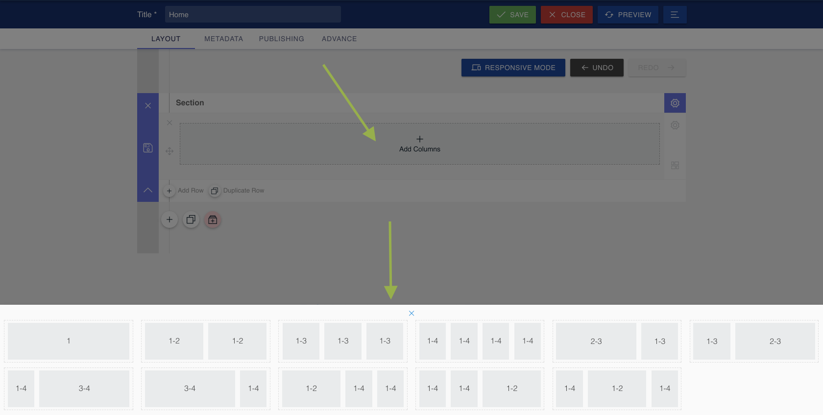
Rows also have lots of options that you can use to customize their appearance and alter the structure of the layout. You can change row type anytime by click Change Layout icon bottom right of the row.
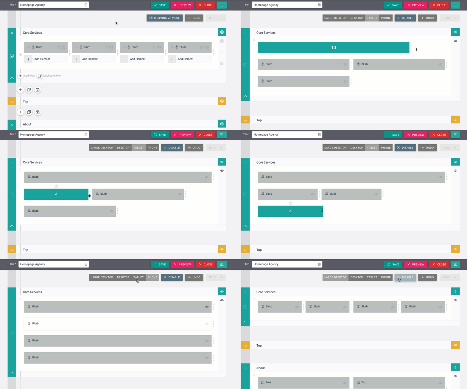
Columns are based on 12 grid system and you can adjust column grid by dragging the column divider icon.
Create One Page menu items
Simple steps to create One page menu items with smooth scrolling.Go to Main Menu create new menu item like About, Menu Item Type choose External URL
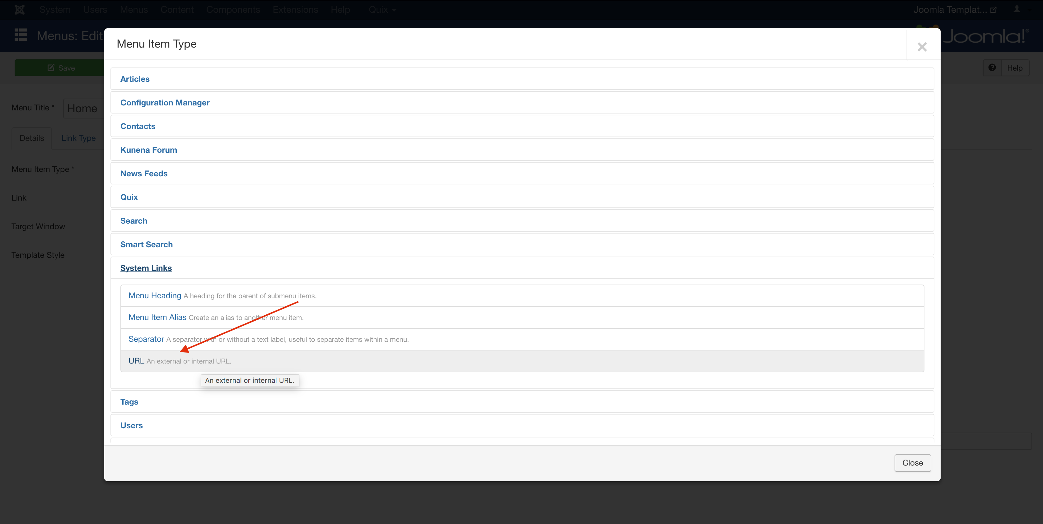
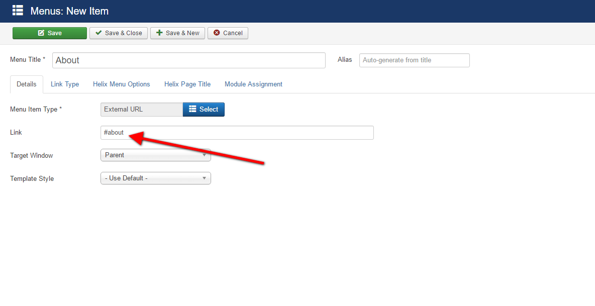
The next step we will add the section ID to linking the menu item to special section which defined using quix page builder.
Install Quix Joomla Page builder https://www.themexpert.com/quix-pagebuilder , create new page (example Home) then add few sections here. Now we will add the section "about".
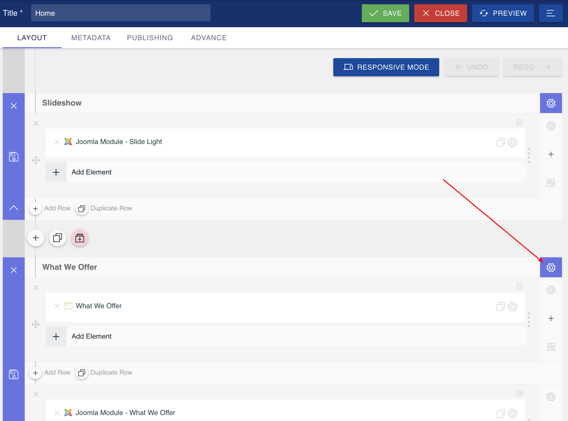
Go to Home page, click "section settings" icon
Tab "Advanced" -> ID -> Now add the section id, example "about"
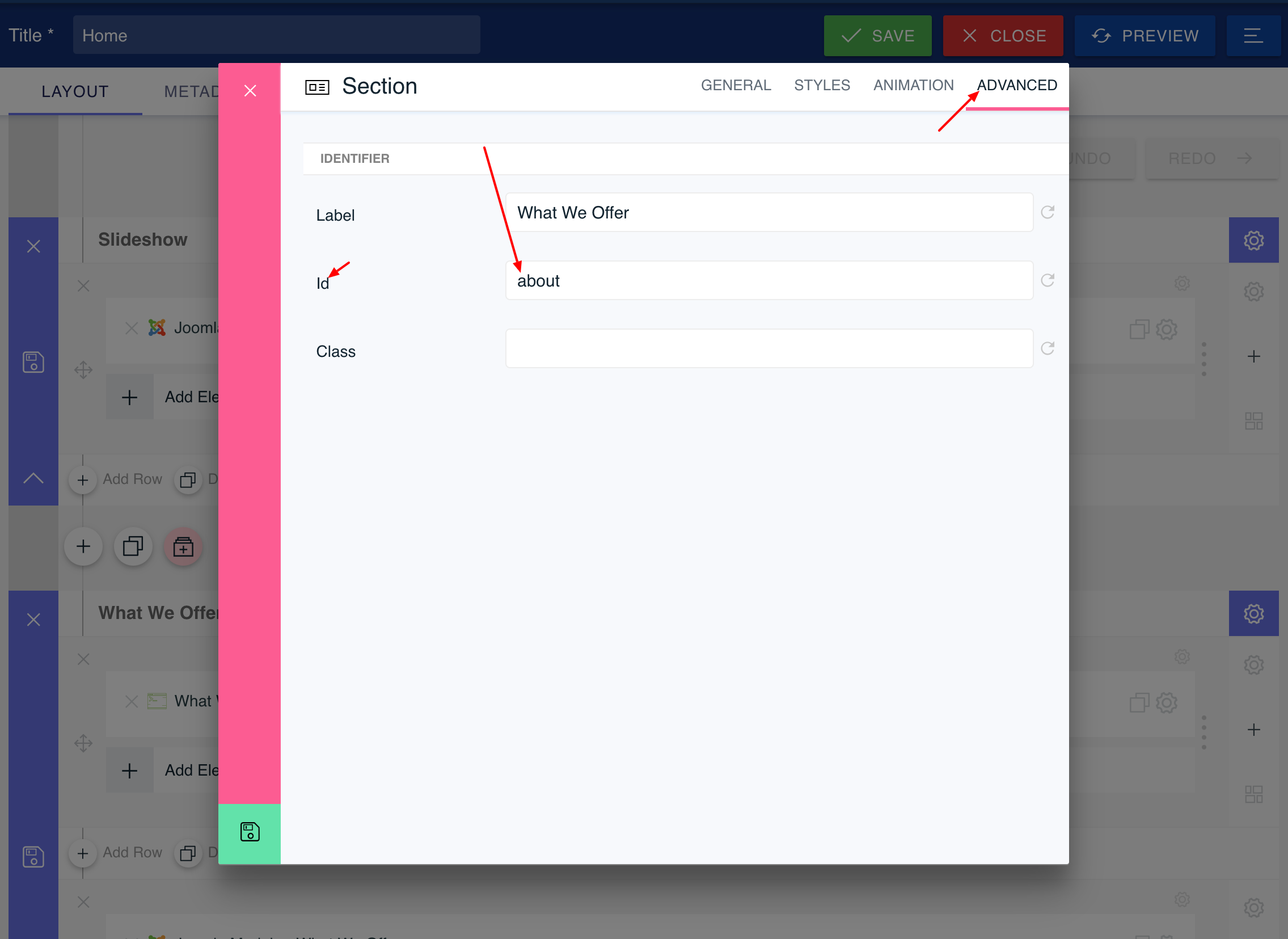
Click save and check the result at front-end, you will see the smooth scrolling when navigating from menu item about the the section "About". Do the same steps for any sections you wish to choose as a section ID for menu items
Template Configuration
Typography

Main typography in Helix3 templates is mainly based on Google Fonts collection. This settings area allows you to easily add fonts from the Google Font Directory to your Joomla! template. All available fonts are released under open source licenses. You can use them in any non-commercial or commercial project. The Google Fonts API works on the vast majority of modern mobile operating systems, including Android and iOS (iPhone, iPad, iPod).
Typography in Helix3
"Update Font List" feature - allows you to refresh the list of available Google fonts. So if there are any new ones, this button allows you to quickly update fonts with just one click, and they will be automatically added in to Helix3 Framework database. Which allows you to use them quick.

Typography settings allows you to choose font and its settings for popular HTML tags: body, h1, h2, h3, h4, h5, h6 and navigation. Subsets (like Latin Extended, Vietnamese are also no problem - just choose the character sets you want. Of course if they are available for selected font set. All settings are from template settings, so you have got now a simple and efficient way to embed Google fonts of your choosing to your website with a few clicks of your mouse.

Google has been supplying the community with a large collection of web-based fonts for quite a few years. Right now, the Google Directory has hundreds of great fonts, and the selection is steadily growing. One of unique Helix3 feature is Live Font Preview during choosing from list 800+ of available fonts. Remember integrating good looking font(s) into a Joomla website can improve the appearance, increases trust for your website, but may slow down a website as well.
Like any other asset, font files have to be downloaded to a site visitor's computer before they can be displayed. Fonts served by the Google Fonts API are automatically compressed for a faster download, and once downloaded are cached in the browser and reused by any other web page that uses the Google Fonts API. In general, you should be aware of the size of the font files you are serving on your site or page. We recommend embedding only the families, styles, and scripts needed.

If google font will be disabled (No) then default font set : "Helvetica Neue", Helvetica, Arial, sans-serif - will be used instead. Those are popular and universal fonts included in bootstrap framework.
Presets
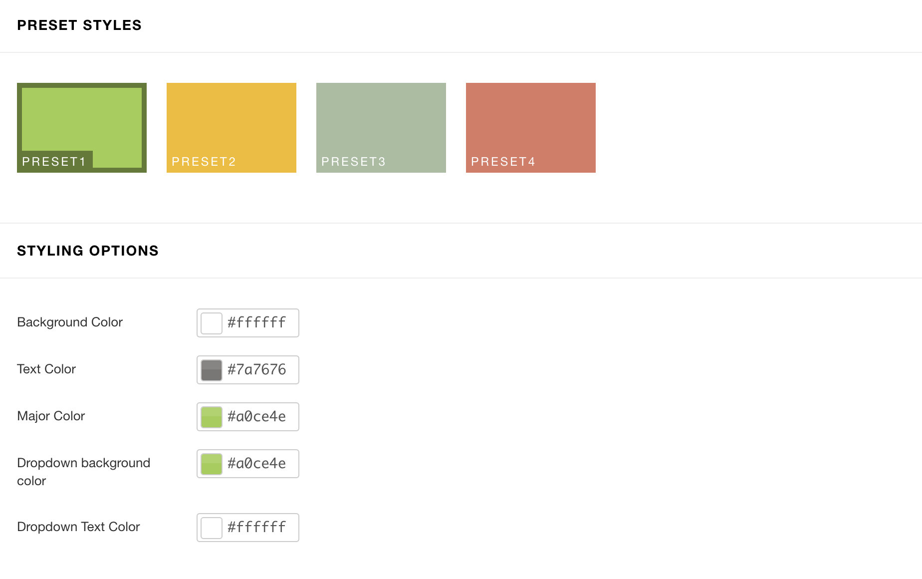
Our template supported 04 preset colors styles by default, you can change the color via template settings -> tab Preset
Layout
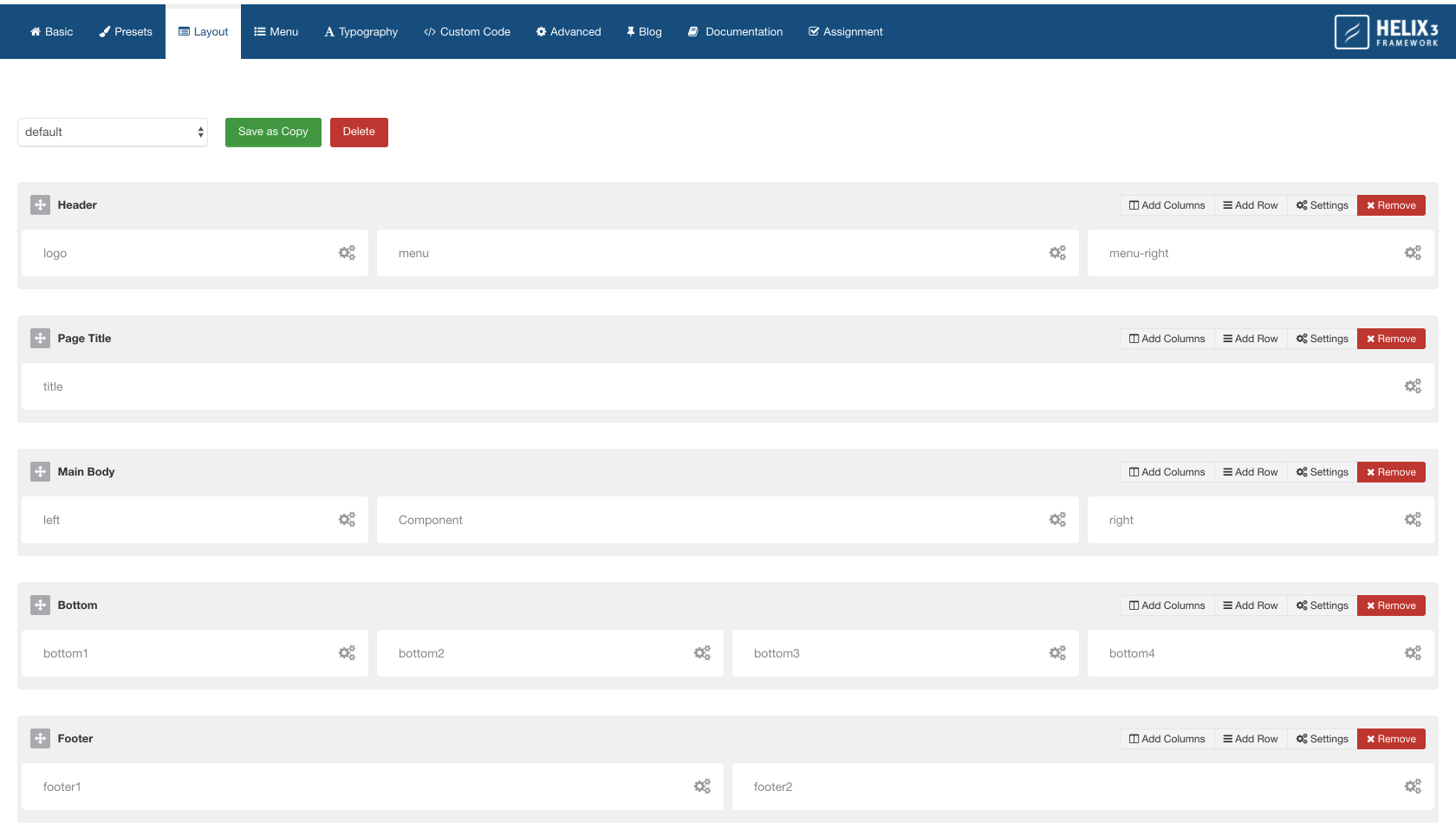
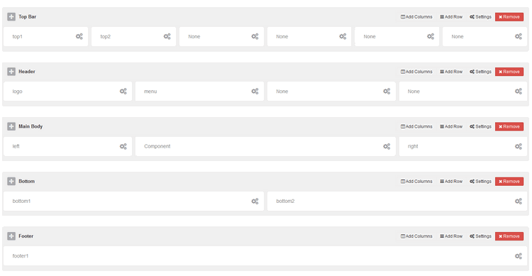
The following screen-shot highlights the default layout module positions that we used in current template. By using Layout builder in Helix3 users will be able to move positions or change their size. Our in-build layout builder from template settings provide the opportunity to add new positions, columns, rows wherever you need as much as moving elements.
Sticky Menu and Boxed Layout
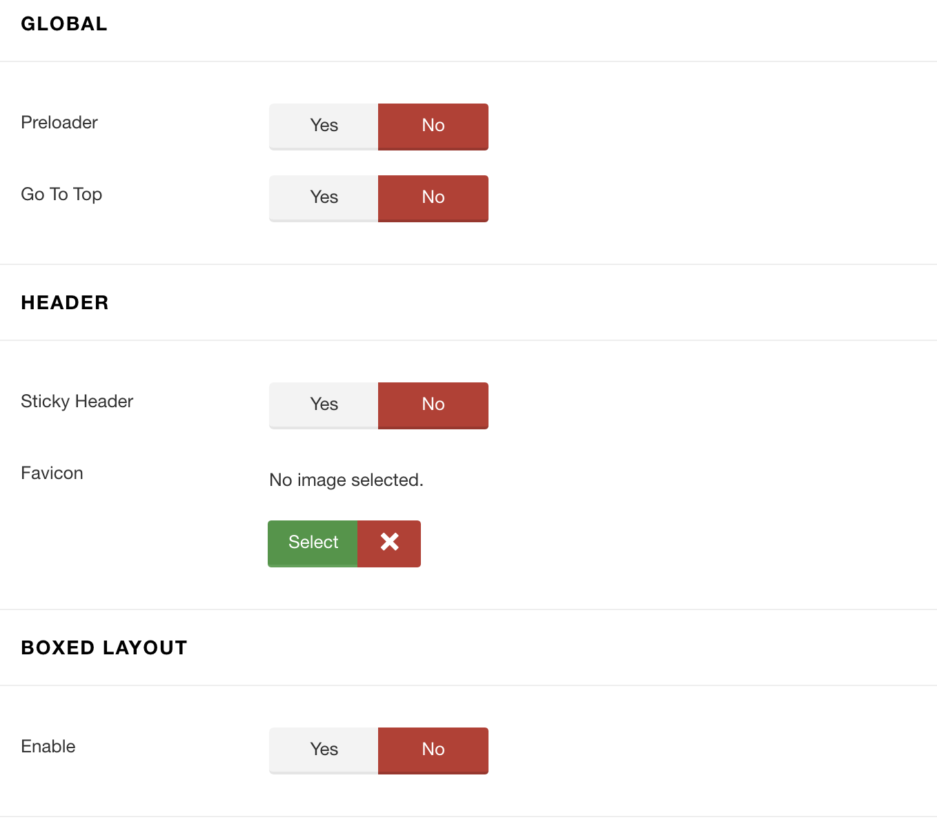
Preloader : Helix3 offer 7 animation effects (Circle, Double Loop, Wave, Clock, Static logo) in preloader. Once the content of the page is loaded, the preloading screen will show small animation object. Compatible with all major browsers. You can also choose color of animated object and background color under animation.
Go To Top : It that allows visitors to scroll smoothly to the top of the page. It's a little detail which enhances navigation experience on website with long pages. This gives your website better navigation and also adds a more professional look to your current layout.
Favicon : Upload a 16px x 16px .png or .gif image that will be your favicon.
Sticky Header : Enable to get the header content area to stay visible at the top of the screen as you scroll through that content. Header tend to contain navigation and this may improve UX of website.
Favicon : Upload a 16px x 16px .png or .gif image that will be your favicon.
You can enabled sticky menu feature and boxed layout by following the screenshot bellow
Change Logo
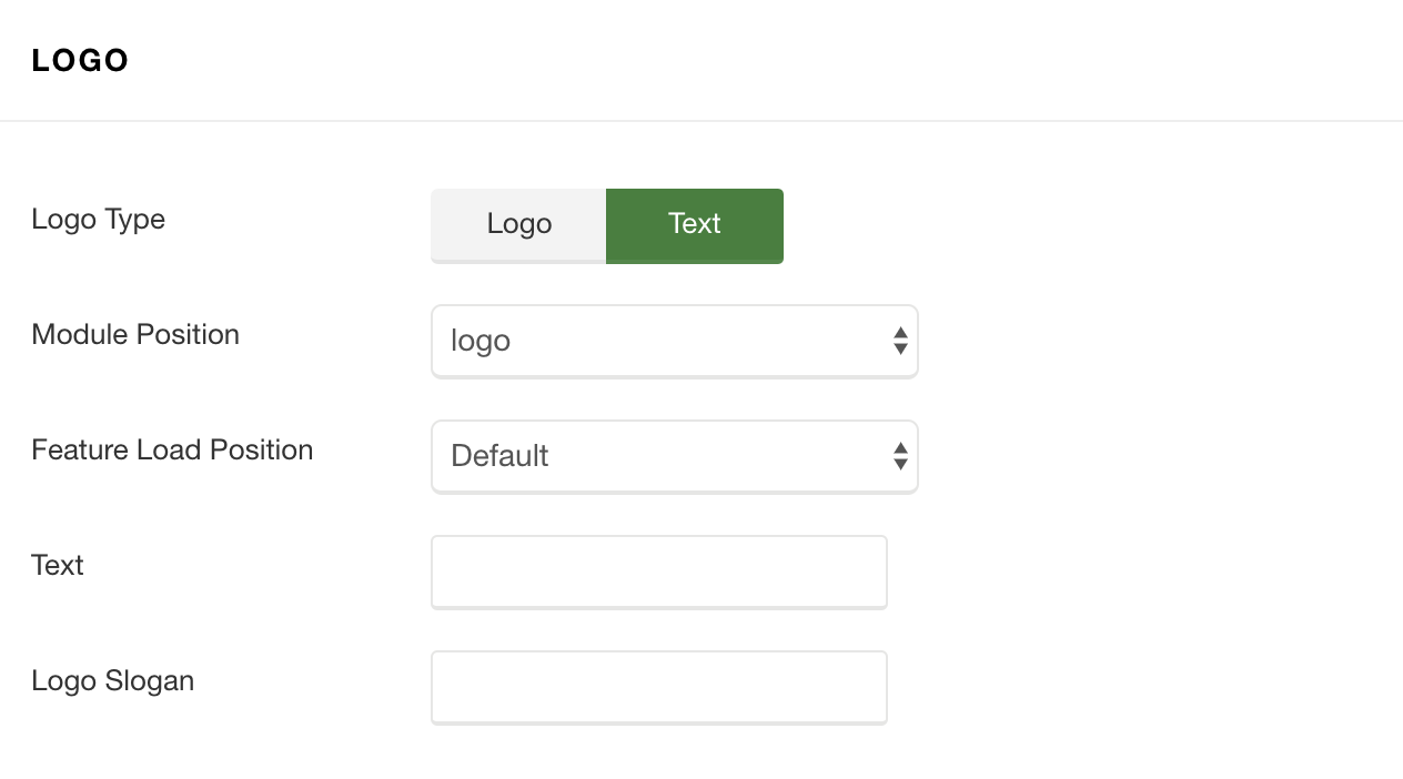
The Logo feature controls the output of the template’s main logo. You can set the logo type as Image or text type.
This logo will be shown in mobile view instead of default logo. Leave blank if you do not want to show different logo for mobile devices.
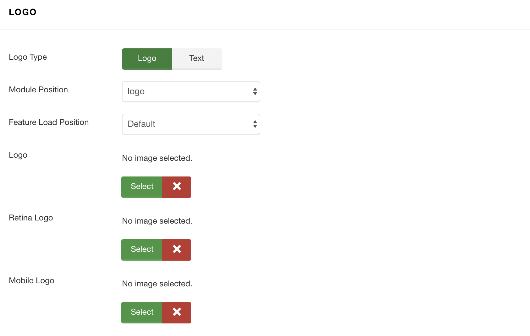
You can also specify the logo text and logo slogan, if you select logo type as Text:
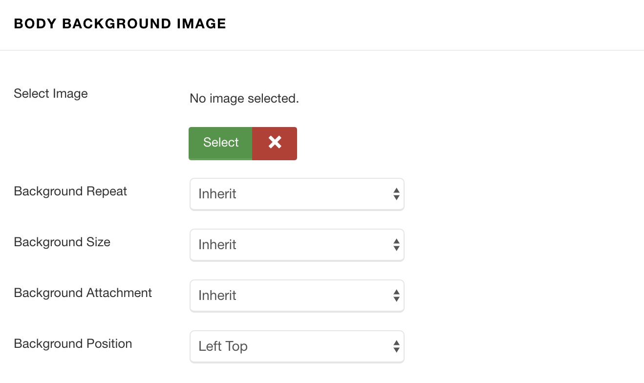
Body Background
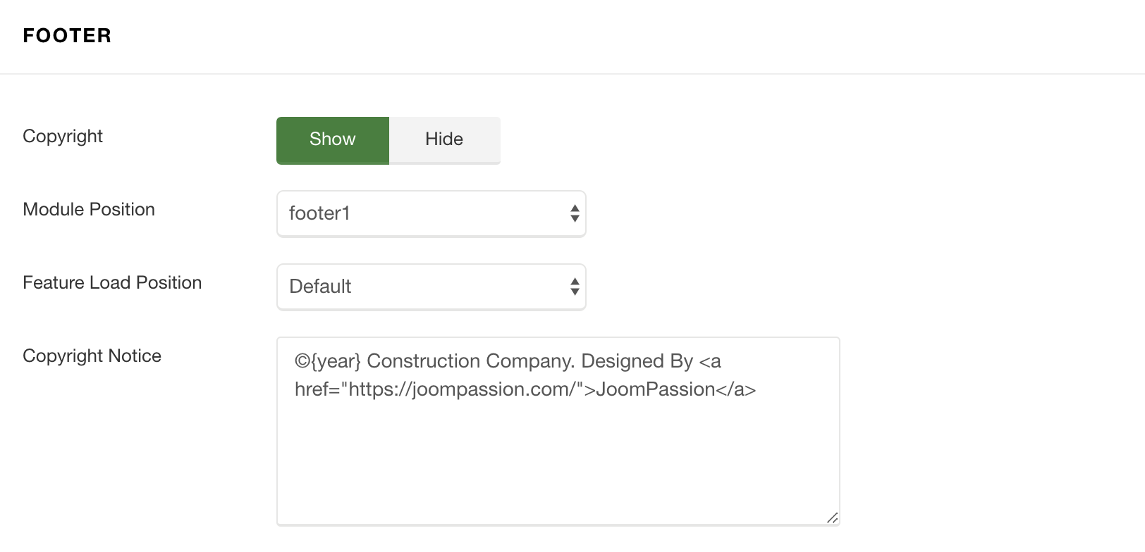
Footer Information
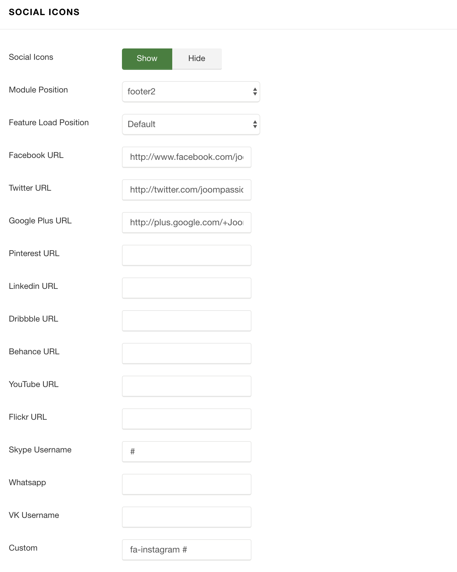
Social Settings
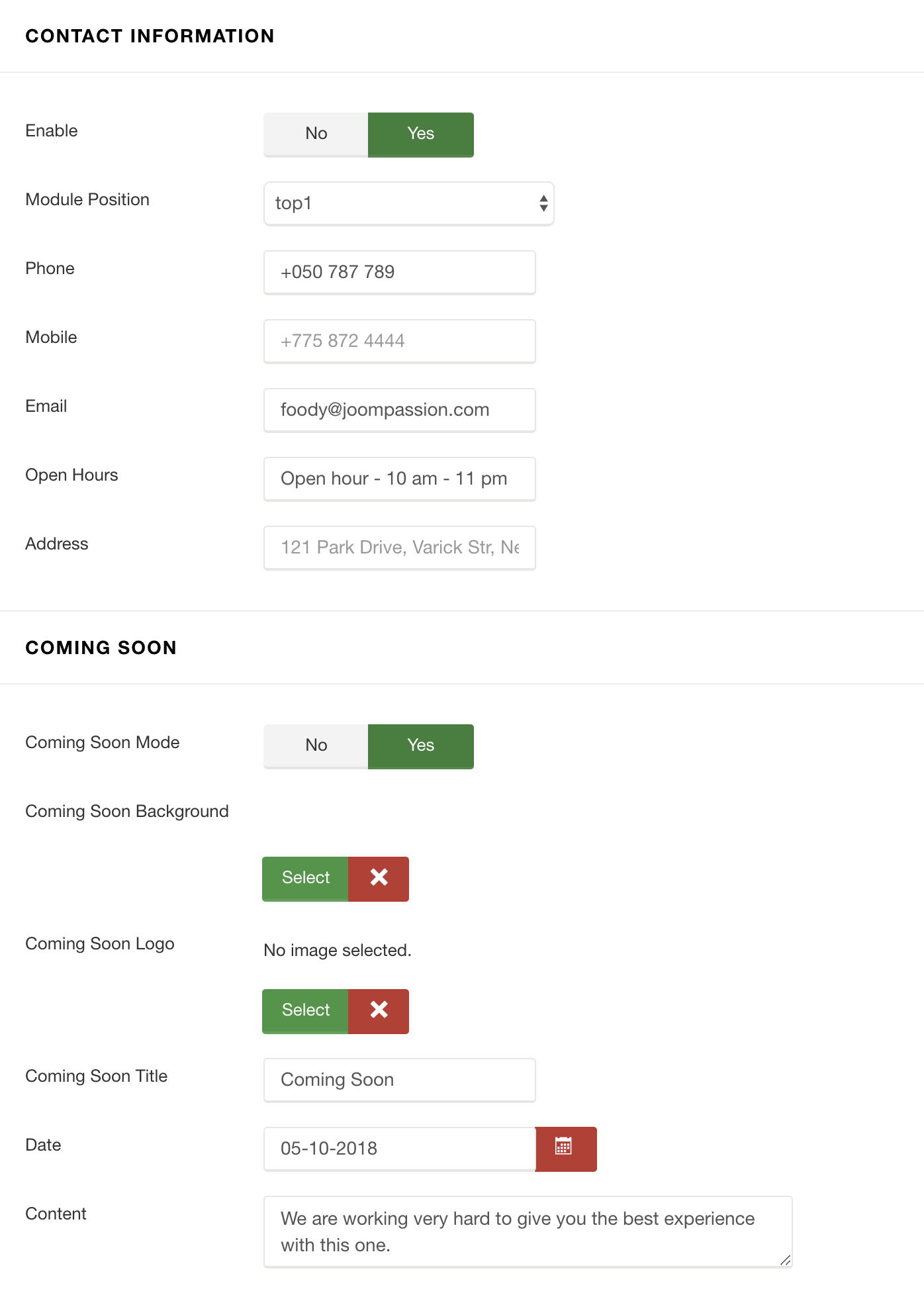
Contact and Coming soon Settings
Menu Settings
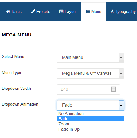
Mega Menu is an easy to use menu tool for creating beautiful, customized menus for your site, also with modules inside. That also boosts SEO and user engagement. Here in template settings you have access to 4 options only, more advanced settings are “hidden” in Menu Manager inside each menu item – so please check also there.
Select Menu
It allows you to choose menu from available in your system. If you’re planning to build multilingual site in Joomla 3.4 – you have to create clone of current template for each addcional language and choose here a Main Menu for each of them.
Menu Type
By default there are enabled two separate menus: Mega Menu and Off Canvas Menu. You can use both or only of of them – as you want or need.

Off Canvas is indeed a external menu module – so if you want to use this area you have to create a menu module, set it properly. Remember to choose “offcanvas” module position for them.
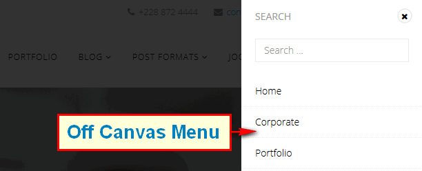
What is more important in this sidebar menu you can also publish not only menu modules but also for example Search module, it also have to had a “offcanvas” position chosen in Module Manager.

Dropdown Width
Dropdown Menu Width value would be to set it to the width of your submenu size content area. By default 240px.
Dropdown Animation
MegaMenu offer four transition options for your dropdown submenus:
- Fade (default)
- Zoom
- Elastic
- Twist
- Fade in Up
- Drop In
- No Animation
This is the transition that occurs when the submenu is opened. To have the submenu appear with no transition, set this to None (No Animation).
MegaMenu Generator
Helix3 MegaMenu Generator
Helix3 has a built-in mega menu that can be enabled in the main menu. One of new and unique features of Helix3 is new MegaMenu Generator. It can be used after first saving of menu item or in current menu items. But first check what you have it inside before that clicking.
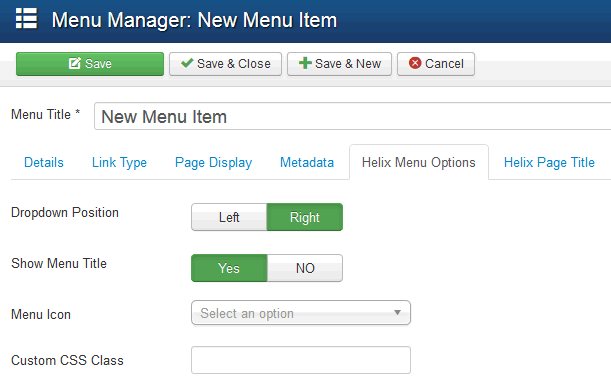
- Dropdown Position – allows you choose align (left/right) dropdown position.
- Show Menu Title – allows you to hide menu item title, this may be useful when you want to show only icon instead full title like for Home position.
- Menu Icon – the use of icons beside menu items is a fantastic alternative that favors a quick visual option identification; and even the use of icons without text to accompany is viable. You can use font icons based on Font Awesome v4.3, it means that you have big collection of 519 icons to choose from.
- Custom CSS Class – allows you to add Custom CSS Class(es) to this menu item.
Adding module into menu
Once Menu item is saved you can check this tab again. You should notice a new advanced Helix MegaMenu Options. From here, you can select a module and drop inside this menu item as a submenu.
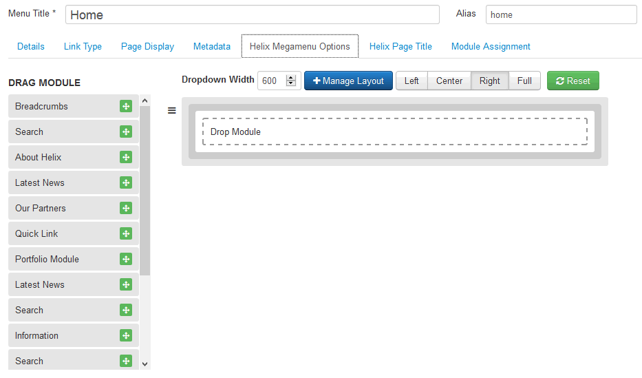
You can use module from list of published in Module Manager. It means that if you want to add a new one into menu, it must be listed there as a published, position name is not required to work.
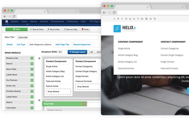
Menu Layout Management
You can choose column layout, which allows you to set menu items in selected positions. To get this feature use “Manage Layout” option (blue button).

Using: Left, Center, Right and Full buttons you can control appearance of dropdown submenu.
Two and Three Columns SubMenu
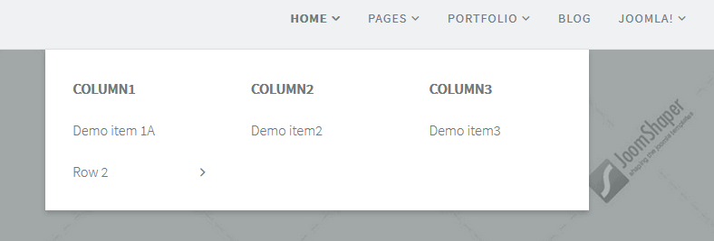
Building a two or three columns SubMenu is quite easy process – all starts from Menu Manager, where you have to add all those sub menu items. Here is example structure to get 3 columns menu for Home.
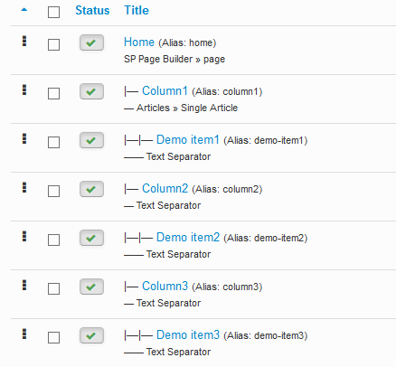
Of course we suggest to use your own menu items types for real items like Single Article or chosen Component view. And Text Separator is great for showing titles of menu sections. Remember that in Helix MegaMenu Options you have to refresh appearance of menu structure to get final result – like in following example.
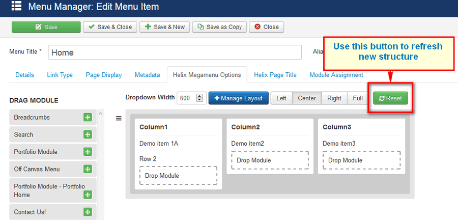
And the final result should be similar to following example.
Layout Manager Settings
Layout Manager allowing you to build flexible and beautiful layout based on module positions. Layout Builder is one of the unique features of Helix3 which allows anyone to customize the existing template in any shape without having any programming language! In the layout builder we used 6 columns. Those 6 columns covered the whole width of our layout. If you want to create 4 columns then have to use wider blocks for every column.
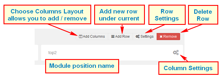
Using Layout Manager is easy to master, learn. Following icons legend should help you understand which icons are responsible for what feature/setting. We suggest to make a copy of current layout to keep it for later in case if you would delete all rows and you forget how they were placed at the beginning.
Each layout which you create can be saved and used later for example in template copy.
Column Settings
- Make Component Area – Enable this option to make this column as a Component area. If you already selected component area for another column then unselect that one first then select this one. Joomla message section will also be loaded inside this column. Only one column in whole layout can be used for showing component (!).
- Module Position – Select any suitable module position from the list. Do not set one module position to multiple position. Each such have unique name.
- Hide on Mobile/Tablet/Desktop – Allows you to choose where this block should be displayed and where shouldn’t be. For example some module position can be displayed only on deskop/laptops computer but not on smartphones nor tablets.
- Custom CSS Class – If you wish to style particular content element differently, then use this field to add a class name and then refer to it in your css file.
Note! Do not forget to save column settings on popup window – save button is at the bottom, also general template must be saved after changes.
Advanced Settings
This section of Helix3 settings allows you to reduce size of loaded template files. By speeding up template, you offer a better experience for your customers, improve your page speed (and therefore, possibly, your search engine ranking) and make your CMS appear more stable and professional.
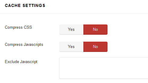
Compress CSS
In order to reduce the number of requests from a browser to the server to render a page, and to take advantage of browser caching, this tag also does some advanced processing of the stylesheets. It generates uniquely named css file which are then returned to the browser, and allowed to cache on the browser.

Note! Custom CSS field is not compressed when you’re using this option. It will help you to keep control about small changes.
Compress JavaScript
Also optimize JavaScript is to improve your site performance by compress JS files into one – so that the total size and number of requests will be decreased.

When the optimization option is enabled, the optimized JS file package will be auto generated when a page is viewed in the first time. After enabling this option please check whole website. In some cases it may generate conflicts between this compress option and some third-party extensions, so then leave this one off or use third, following option if you know which file shouldn’t be compressed.
Exclude JavaScript files to be optimized
You may want to exclude some JavaScript files and folders from compression by using this option. To exclude JS files that you don’t want to optimize, just add the file name, if you have many files, please separate them with comma.

Compile LESS to CSS option – Helix 3 is developed with LESS system built-in. When customize your site, we suggest you to work with LESS files. All your changes in the LESS files will be compiled into the final CSS files. It will override previus changes
Blog Settings
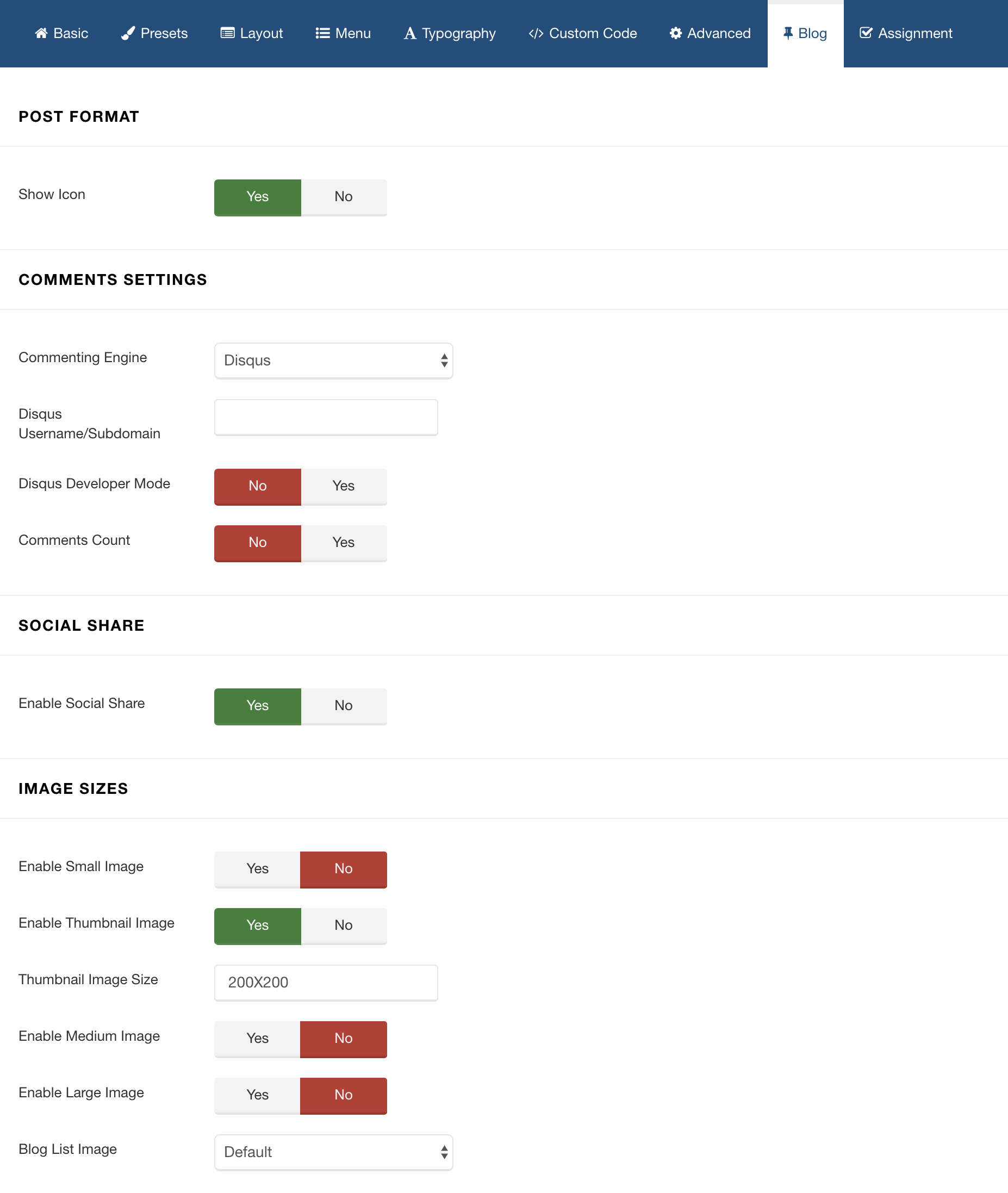
This area of settings allows you to enable some apperance elements (icons in posts) as much a social comments and social share buttons.
Show Type Post Icon(s)
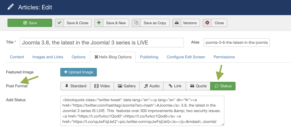
Each Joomla article can have option to use Post formats it means use addcional illustration icon, which can show about what type of article (post) is that content.
Front-end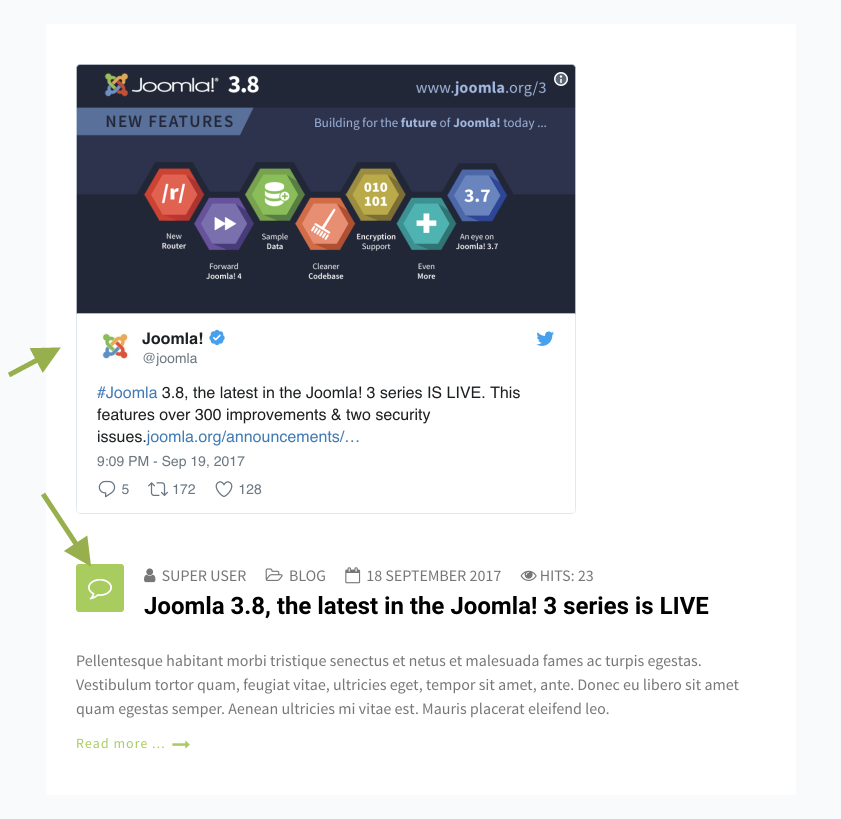
Back-end
Comments Settings
This build-in option adds IntenseDebate Comments system, Facebook comments and / or Disqus Comments to your site. All in one tool. You don’t have to install any addcional plugin anymore to get this feature. Social allows your readers to log in via a preferred social network and add comment under article.
All you have to do is choose and set correct Facebook Application ID, IntenseDebate Account or Disqus Username/Subdomain. Sorry, but right now you can use only one selected social comments system or disable it for all content.
Social Share buttons
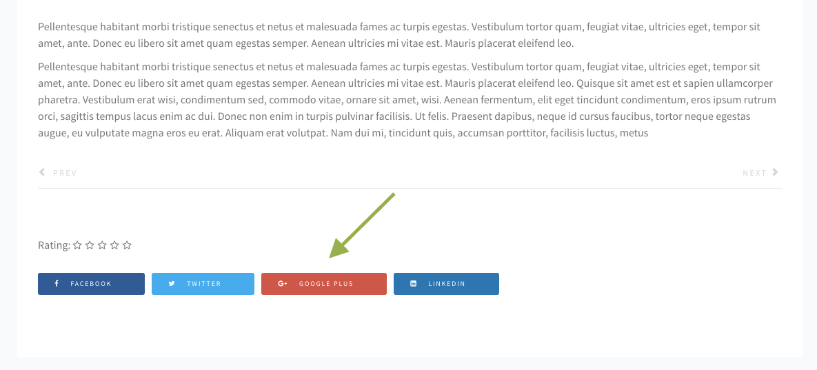
You can also enable Social Share buttons under each article. Current version have improved social share alignment. In future (upcoming) version we will add more social share buttons.
Credits
This template uses the following images, javascript libraries, icons, plugins, modules, components, or other files as listed below. All the content relating to products, services and events are fictional and are designed to showcase a live site. All images, icons, and photos are copyrighted to their respective owners.
- Quix Page Builder Extension Download
- Helix 3 Framework by Joomshaper
- Stock images from billionphotos and Pexels


