Introduction
This document covers the installation and use of this template and often reveals answers to common problems and issues - we encourage you to read this document thoroughly if you need an in-depth guide on how to use the template.
If you have any questions that are beyond the scope of this document, feel free to ask via ticket support system: WarpTheme Ticket System
To get access to the ticket system, create an account on this page: Create an AccountTemplate Features
- 03 Layouts: Onepage, MultiPages Layout and Boxed Layout
- 04 pre-built color schemes
- Custom 404 Page, Custom Coming Soon Page
- Unite Revolution Slider included
- Fully Responsive
- Extended style for Kunena 5 template
- Sticky menu, Go to Top and Preloader feature
- RTL Language Ready
- Light and fast loading
- SEO Friendly
Built on Helix 3 Framework with Drag and Drop layout feature
Getting Started
When you purchase our Joomla! template or WordPress Theme, you'll then be taken to the Downloads page. Click on the "template/theme" file name to download or you can check back anytime by going to Purchase History page.
After downloading our product you’ll find the following files/folders within:
Joomla! Template Packages
wt_finadvisor_pro_j3x_installation_1.0.0.zip- The stand-alone Joomla! template installation package.
WT-Finadvisor-Joomla-Quickstart-1.0.0.zip- A quick-launch Joomla! 3.x installation package that contains all the sample data, images and most extensions to replicate the live demo.
Demo appearance
Style 1 Default

Style 2

Style 3

Style 4

Installation
This section covers how to install the template. There are two ways in which you can install the template:- Using Quickstart Package(recommended for new website install)
- A demo package is a full Joomla installation package, which includes the template and sample data responsible for the layout and setup of our demo. This is great, if you don't want to start from scratch or just to have a peek at how everything is put together.
- Single template installation package
- Installing the template/theme in an existing Joomla site.
Joomla 3 Quickstart Install Requirements
Before starting with the install it’s important that you ensure that your hosting covers the minimum requirements for Joomla! 3.x or WordPress 4.x(We highly recommend SiteGround to host your Joomla! or WordPress site), as the quickstart package for WarpTheme templates/themes will always include the latest compatible version of the CMS:
- PHP 5.3.1 or higher – 5.4+ is recommended;
- MySQL 5.1 (or higher) or PostgreSQL 8.3.x
- Apache 2. x or higher
- XML and Zlib support: Your host’s PHP installation should support XML and Zlib functionality.
- PHP Magic Quotes GPC setting should be off. If this setting is currently on, your web host should be able to correct this.
- Upload the
[template]_quickstart.zipto your server using your preferred FTP software and unpack the contents to your server. A good FTP that we use is Filezilla. In most cases you will unpack it under the public_html folder, www root folder (windows hosting) or the root folder of your server. - Access your site on the browser e.g
http://www.mysite.comand this should direct you to the installation prompt of your Joomla! installation. - Follow the Joomla! installation prompts as you would a normal Joomla! installation. In this step, we assume that you have some very basic Joomla! experience.
- Once the installation is complete, delete the installation folder and your site should look exactly like the demo version.
Video Tutorials
How to install a Quickstart package of a Joomla templateQuickstart Installation
Step 1: Copy the Quickstart pack to the localhost Step 2: Start the installation by visiting the localhost address Step 3: DONE!
Single template method - for existing Joomla! installation.
If you have an existing Joomla! installation, these are the steps to follow:
- Log in to your Joomla! backend e.g.
http://www.mysite.com/administratorand navigate to the Extension Manager. - On the Install section, click on ‘browse’ on the Package File field and locate and select your
[template].ziptemplate package file. Click on‘Upload & Install‘. Once the template has installed successfully you will get a success notification. - Navigate to Extensions > Template Manager and you should see the installed template on the list. To activate your template, click on the default column of the template (second column) to make it the default site template.
- You can further customize the look and feel of the template by selecting the template link to access the admin panel of the template.
Create One Page menu items
Simple steps to create One page menu items with smooth scrolling. Go to Main Menu create new menu item like About, Menu Item Type choose External URL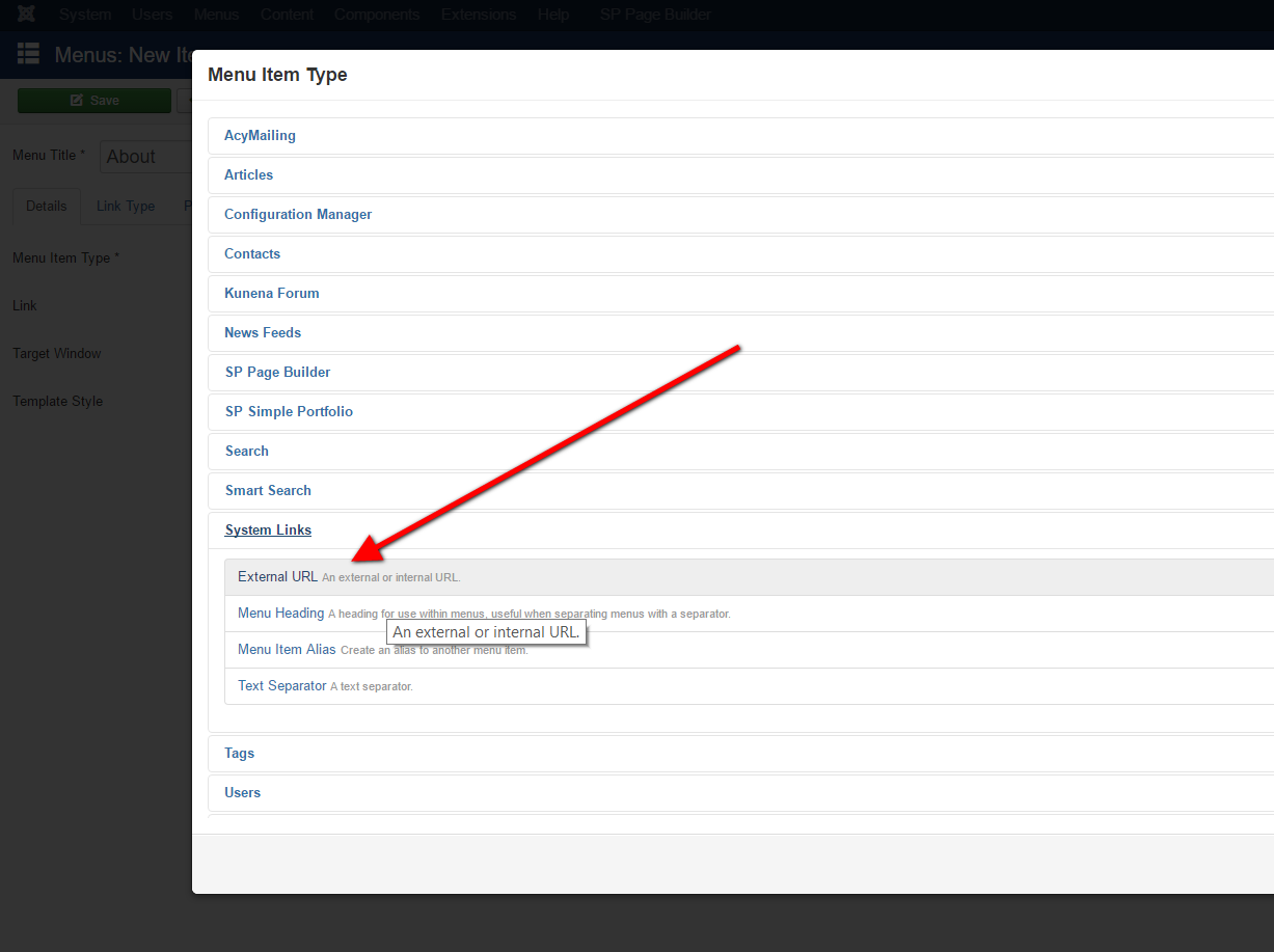 Adding anchor link like so
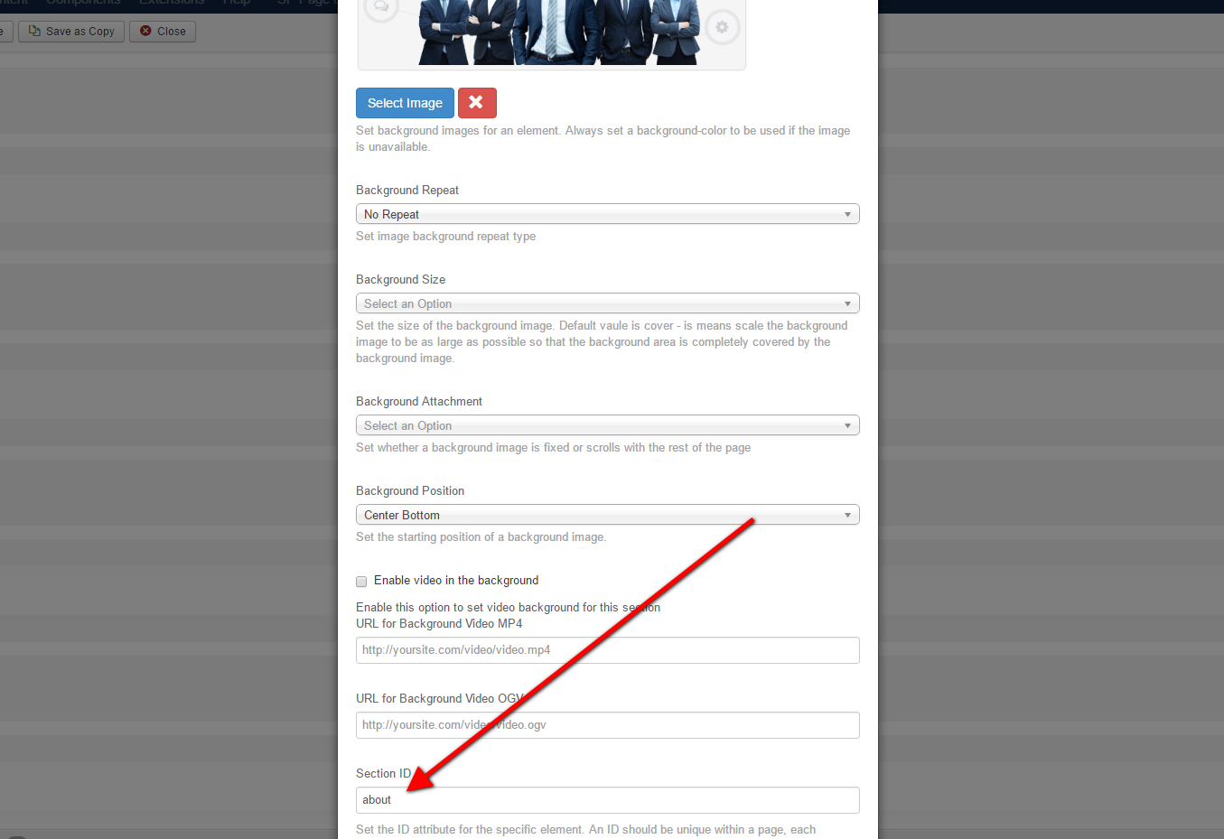
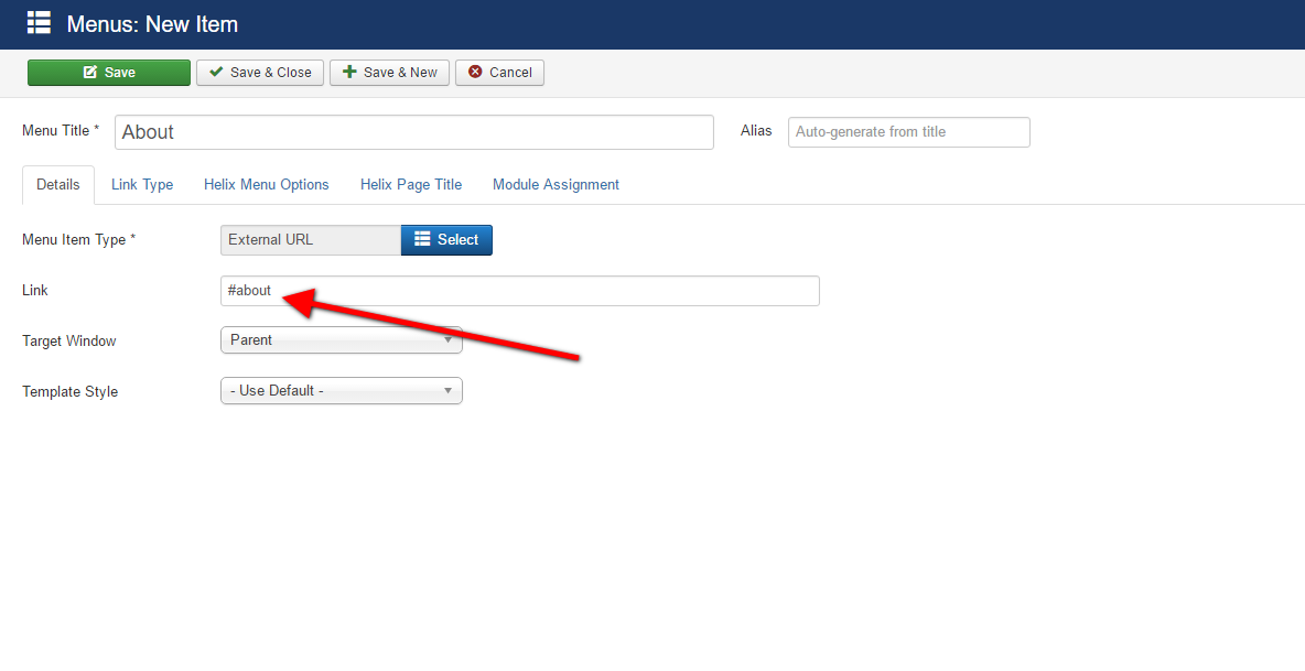 The next step we will add the section ID to linking the menu item to special section which defined using sp pagebuilder.
Install SP Pagebuilder https://www.joomshaper.com/page-builder/ , create new page (example Home) then add few sections here. Now we will add the section "about".
Go to Home article, click "row settings" icon
The next step we will add the section ID to linking the menu item to special section which defined using sp pagebuilder.
Install SP Pagebuilder https://www.joomshaper.com/page-builder/ , create new page (example Home) then add few sections here. Now we will add the section "about".
Go to Home article, click "row settings" icon
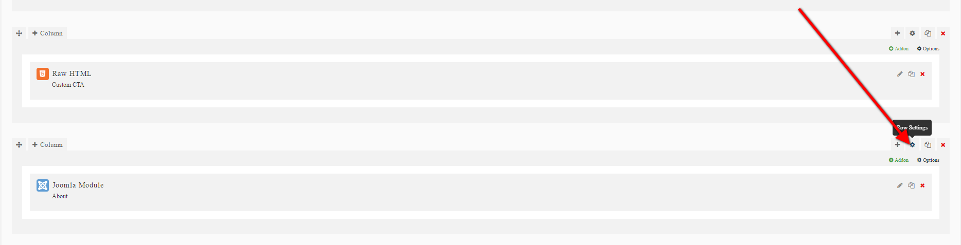 Now add the section id, example "about"
New Features
Bootstrap and Bootstrap RTL updated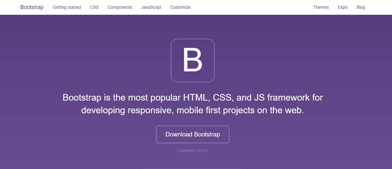 All template are using last stable version of Bootstrap v3.3.7 with over 220 commits and 80 closed issues. This version improved template accessibility, We updated Bootstrap RTL (Right To Left Of Twitter Bootstrap For Persian, Arabic, Urdu and etc.) as well, also to stable version.
New Icons
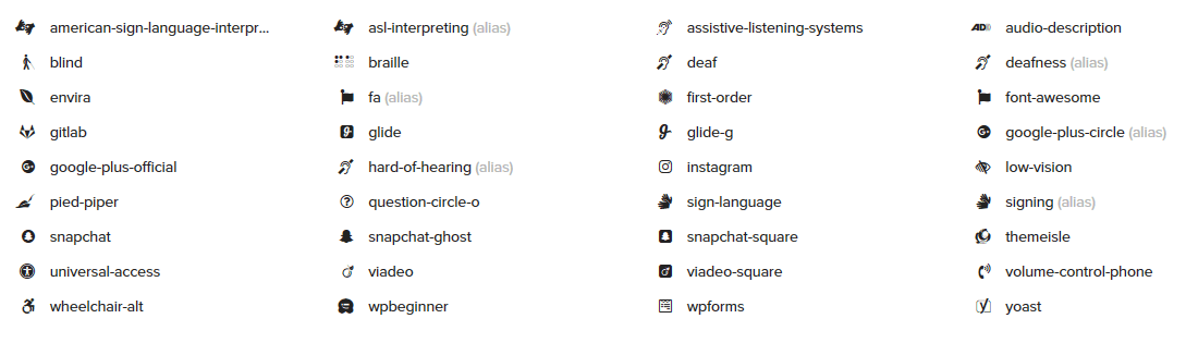
With new updated Font Awesome 4.6.3 library you got 30 shiny new icons and some were updated, which can be used inside template content for pure decoration or visual styling. As you may see, in collection appeared a instagram, snapchat, glide icons which you asked for.
All template are using last stable version of Bootstrap v3.3.7 with over 220 commits and 80 closed issues. This version improved template accessibility, We updated Bootstrap RTL (Right To Left Of Twitter Bootstrap For Persian, Arabic, Urdu and etc.) as well, also to stable version.
New Icons
With new updated Font Awesome 4.6.3 library you got 30 shiny new icons and some were updated, which can be used inside template content for pure decoration or visual styling. As you may see, in collection appeared a instagram, snapchat, glide icons which you asked for.
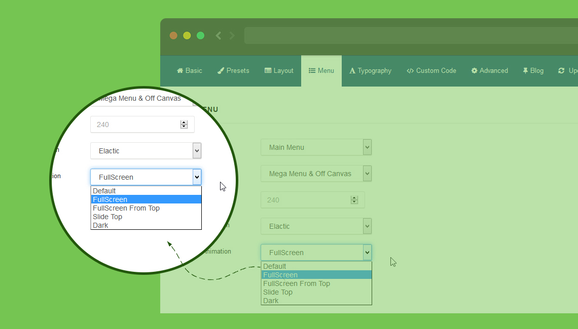
 Menu changes with new dropdown animations and offcanvas animations
New animation types for Dropdown MegaMenu (Elastic, Drop In, Slide down and Twist) and Animation for Off Canvas Menu (Fullscreen, Fullscreen from top, Side right and Dark plus)
Menu changes with new dropdown animations and offcanvas animations
New animation types for Dropdown MegaMenu (Elastic, Drop In, Slide down and Twist) and Animation for Off Canvas Menu (Fullscreen, Fullscreen from top, Side right and Dark plus)
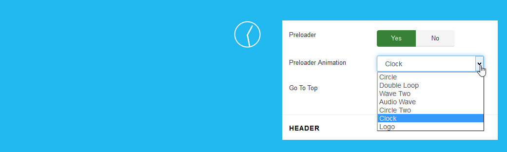
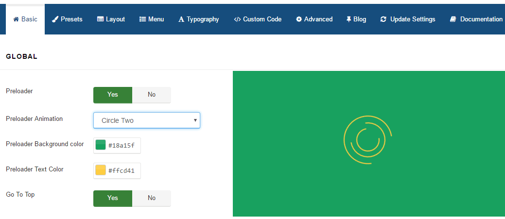
 Preloader Animations
Now Helix3 offer 7 animation effects (Circle, Double Loop, Wave, Clock, Static logo) in preloader. Once the content of the page is loaded, the preloading screen will show small animation object. Compatible with all major browsers. You can also choose color of animated object and background color under animation.
Preloader Animations
Now Helix3 offer 7 animation effects (Circle, Double Loop, Wave, Clock, Static logo) in preloader. Once the content of the page is loaded, the preloading screen will show small animation object. Compatible with all major browsers. You can also choose color of animated object and background color under animation.
Background and color changing option
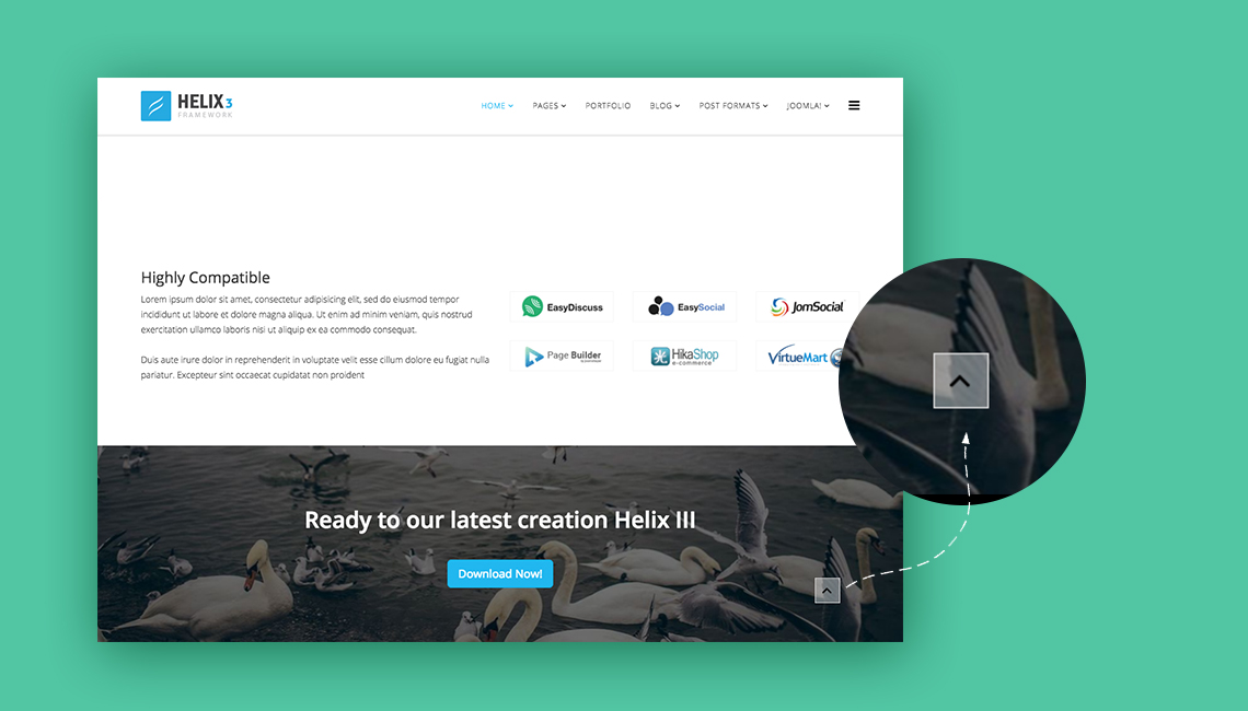
 Go to top arrow
A new icon button (arrow) "Go to up". It that allows visitors to scroll smoothly to the top of the page
Go to top arrow
A new icon button (arrow) "Go to up". It that allows visitors to scroll smoothly to the top of the page
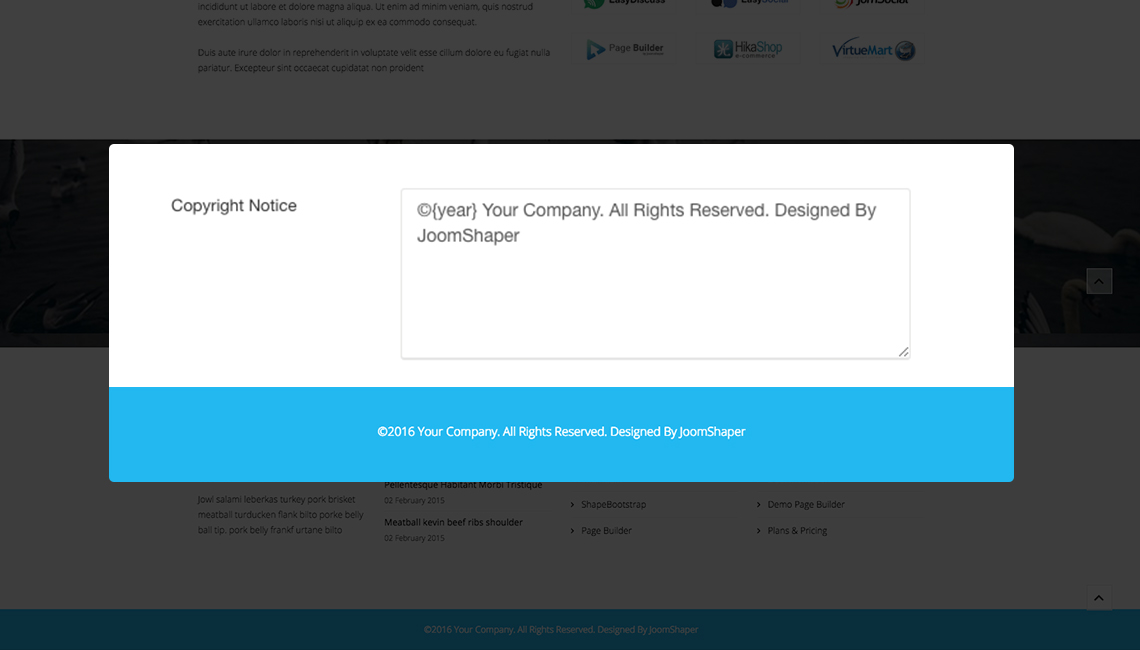
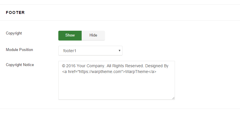
 Auto update date in Copyright Notice
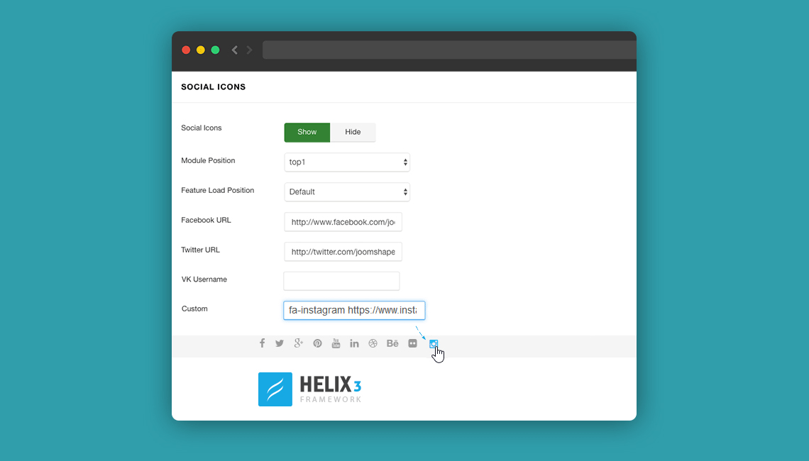
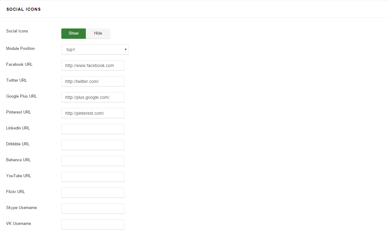
 Custom Social icon
Now you can add your custom social icons to suite your needs
Custom Social icon
Now you can add your custom social icons to suite your needs
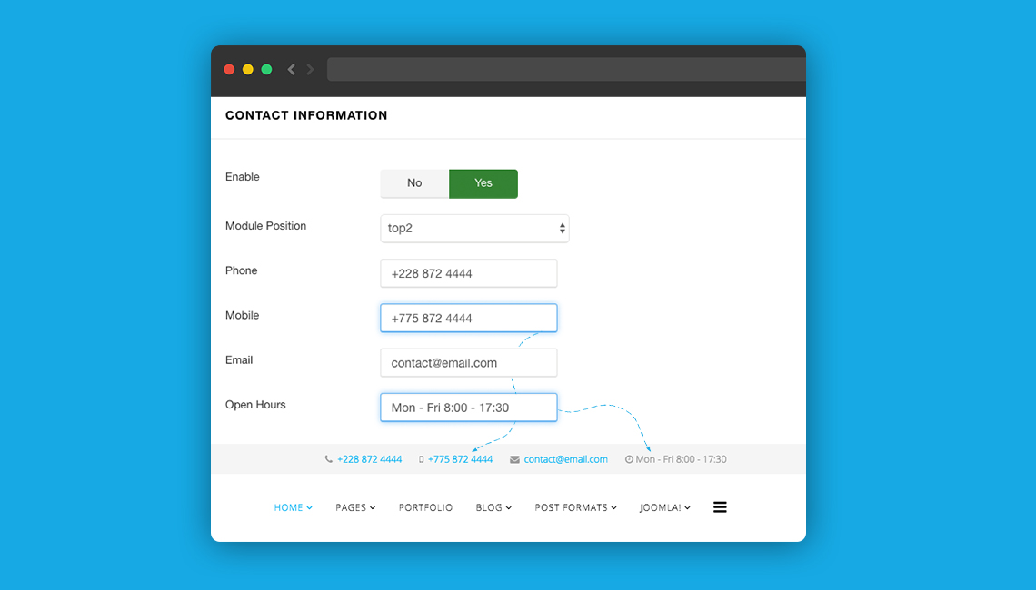
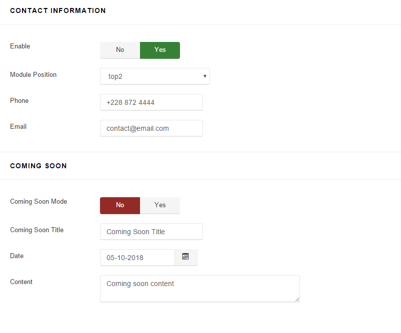
 New Mobile Phone and Open Hours fields for Contact information
We added two new fields in Contact Section: Mobile Phone and Open Hours.
New Mobile Phone and Open Hours fields for Contact information
We added two new fields in Contact Section: Mobile Phone and Open Hours.
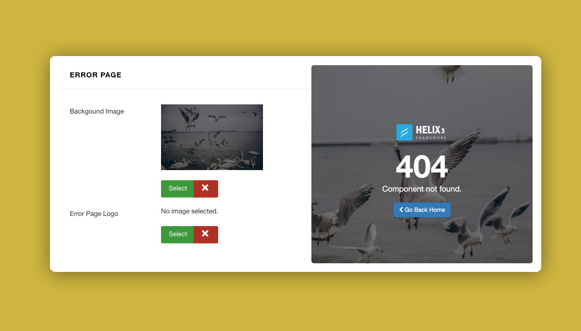
 Customization of Error Page with custom background and logo option
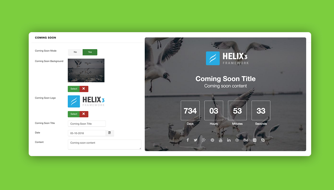
 Customization of Coming Page with custom background and logo option
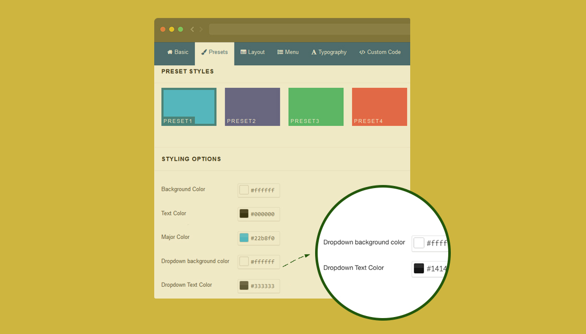
 New Dropdown Menu and Dropdown text option for Preset Styles
Also Preset section got two new options: Dropdown background color and Dropdown Text Color - which should help you with template customization without using a custom CSS file.
New Dropdown Menu and Dropdown text option for Preset Styles
Also Preset section got two new options: Dropdown background color and Dropdown Text Color - which should help you with template customization without using a custom CSS file.
Template Configuration
Typography
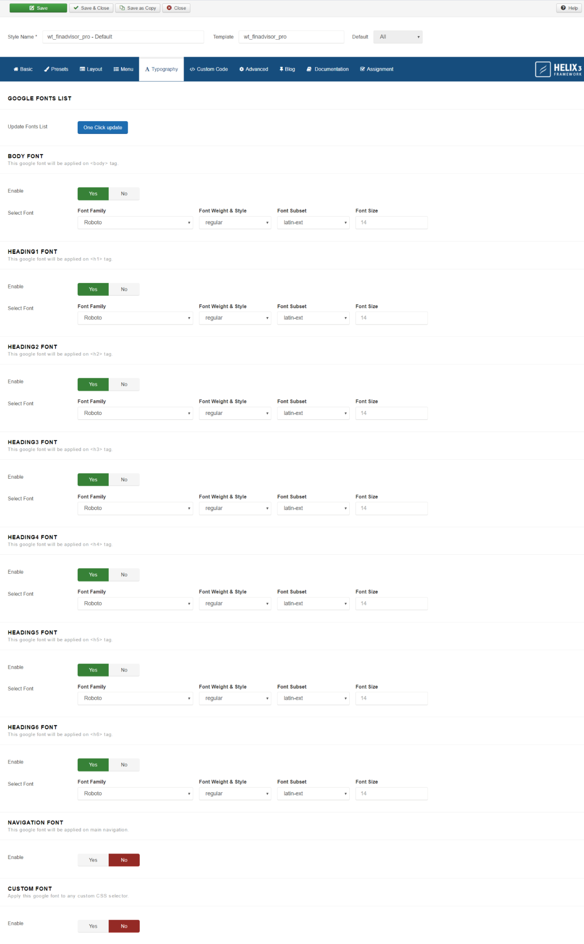
In template demo we used Google Font named: Open Sans, Poppins for whole main typography. Please check the screenshot below for more details
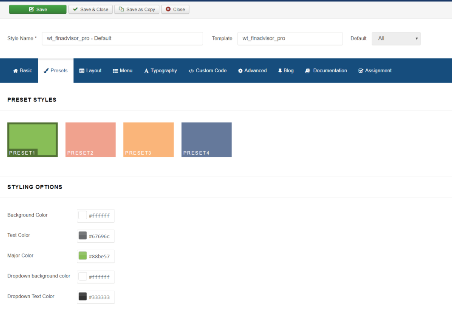
Presets
Finadvisor supported 04 preset colors styles by default, you can change the color via template settings -> tab Preset
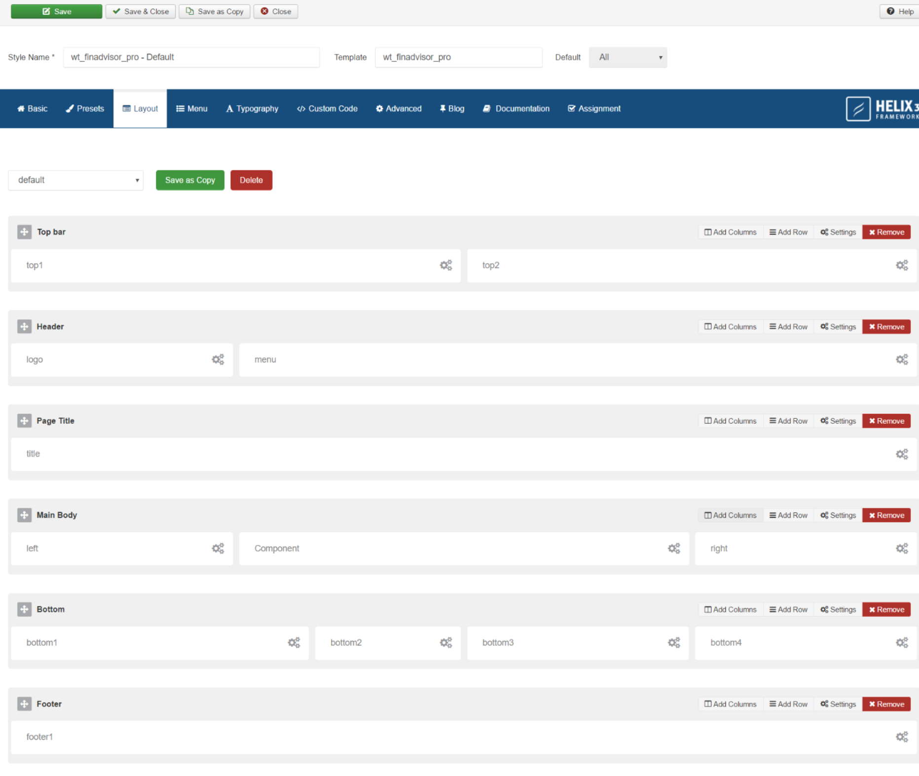
Layout
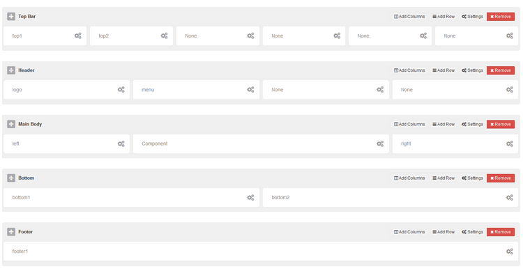
The following screen-shot highlights the default layout module positions that we used in current template. By using Layout builder in Helix3 users will be able to move positions or change their size. Our in-build layout builder from template settings provide the opportunity to add new positions, columns, rows wherever you need as much as moving elements.
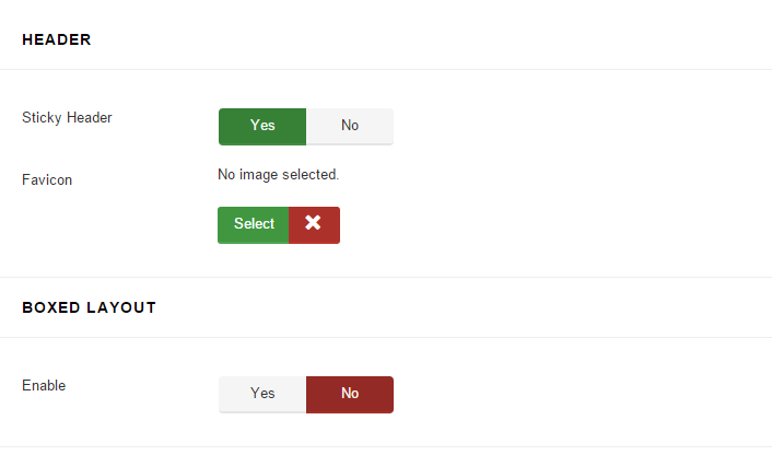
Sticky Menu and Boxed Layout
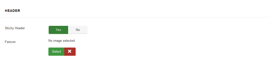
Sticky Header : Enable to get the header content area to stay visible at the top of the screen as you scroll through that content. Header tend to contain navigation and this may improve UX of website.
Favicon : Upload a 16px x 16px .png or .gif image that will be your favicon.
You can enabled sticky menu feature and boxed layout by following the screenshot bellow
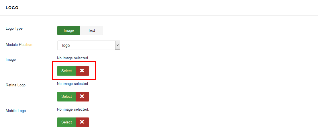
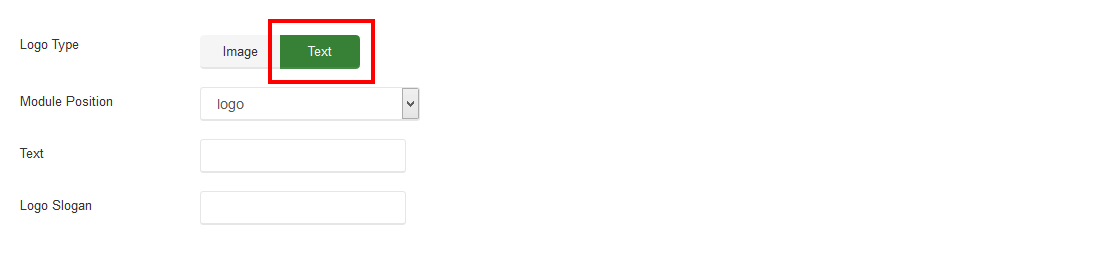
Change Logo
The Logo feature controls the output of the template's main logo. You can set the logo type as Image or text type.If you select logo tyle as Image, click the Select button to upload your logo:
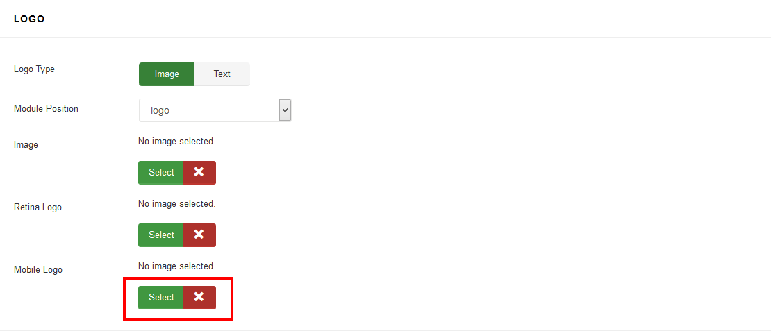
This logo will be shown in mobile view instead of default logo. Leave blank if you do not want to show different logo for mobile devices.
You can also specify the logo text and logo slogan, if you select logo type as Text:
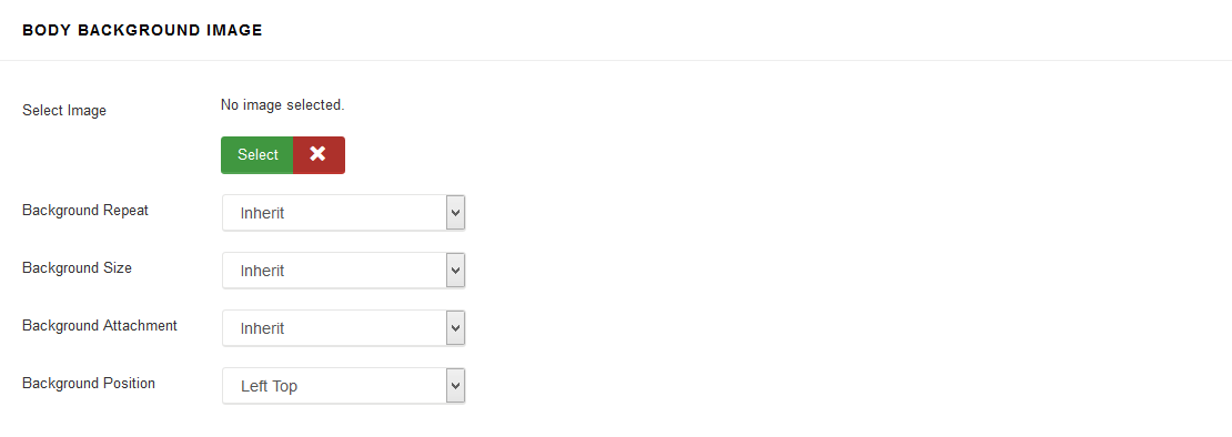
Body Background
Footer Information
Social Settings
Contact and Coming soon Settings
Menu Settings
Mega Menu is an easy to use menu tool for creating beautiful, customized menus for your site, also with modules inside. That also boosts SEO and user engagement. Here in template settings you have access to 4 options only, more advanced settings are "hidden" in Menu Manager inside each menu item - so please check also there.
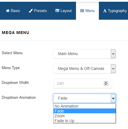
Select Menu
It allows you to choose menu from available in your system. If you're planning to build multilingual site in Joomla 3.4 - you have to create clone of current template for each addcional language and choose here a Main Menu for each of them.Menu Type
By default there are enabled two separate menus: Mega Menu and Off Canvas Menu. You can use both or only of of them - as you want or need.
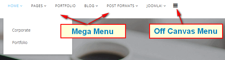
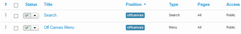
Off Canvas is indeed a external menu module - so if you want to use this area you have to create a menu module, set it properly. Remember to choose "offcanvas" module position for them.
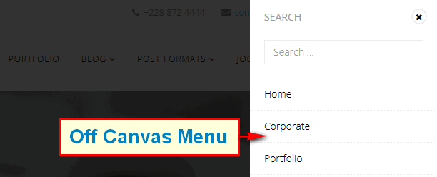
What is more important in this sidebar menu you can also publish not only menu modules but also for example Search module, it also have to had a "offcanvas" position chosen in Module Manager.
Dropdown Width
Dropdown Menu Width value would be to set it to the width of your submenu size content area. By default 240px.Dropdown Animation
MegaMenu offer four transition options for your dropdown submenus:- Fade (default)
- Zoom
- Fade in Up
- No Animation
This is the transition that occurs when the submenu is opened. To have the submenu appear with no transition, set this to None (No Animation).
MegaMenu Generator
Helix3 MegaMenu Generator
Helix3 has a built-in mega menu that can be enabled in the main menu. One of new and unique features of Helix3 is new MegaMenu Generator. It can be used after first saving of menu item or in current menu items. But first check what you have it inside before that clicking.
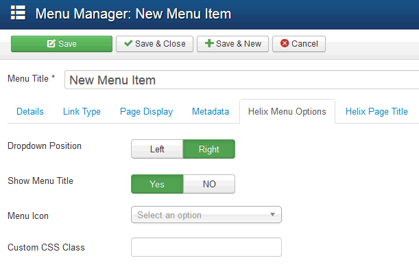
- Dropdown Position - allows you choose align (left/right) dropdown position.
- Show Menu Title - allows you to hide menu item title, this may be useful when you want to show only icon instead full title like for Home position.
- Menu Icon - the use of icons beside menu items is a fantastic alternative that favors a quick visual option identification; and even the use of icons without text to accompany is viable. You can use font icons based on Font Awesome v4.3, it means that you have big collection of 519 icons to choose from.
- Custom CSS Class - allows you to add Custom CSS Class(es) to this menu item.
Adding module into menu
Once Menu item is saved you can check this tab again. You should notice a new advanced Helix MegaMenu Options. From here, you can select a module and drop inside this menu item as a submenu.
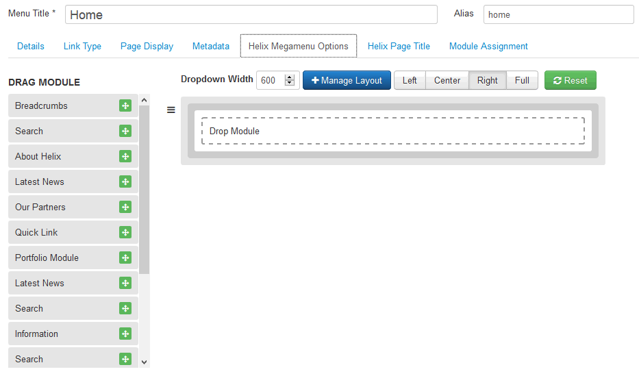
You can use module from list of published in Module Manager. It means that if you want to add a new one into menu, it must be listed there as a published, position name is not required to work.
Menu Layout Management
You can choose column layout, which allows you to set menu items in selected positions. To get this feature use "Manage Layout" option (blue button).
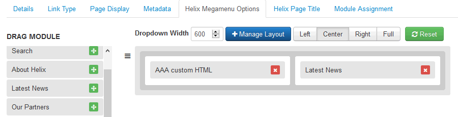
Using: Left, Center, Right and Full buttons you can control appearance of dropdown submenu.
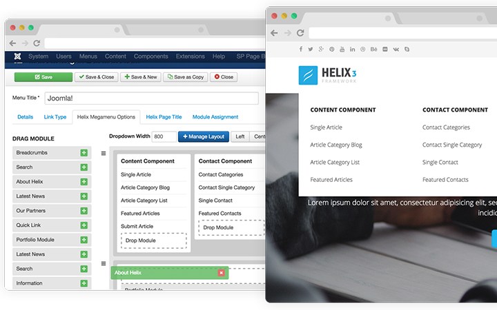
Two and Three Columns SubMenu
Building a two or three columns SubMenu is quite easy process - all starts from Menu Manager, where you have to add all those sub menu items. Here is example structure to get 3 columns menu for Home.
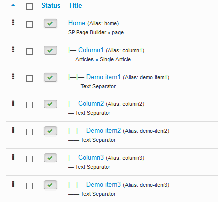
Of course we suggest to use your own menu items types for real items like Single Article or chosen Component view. And Text Separator is great for showing titles of menu sections. Remember that in Helix MegaMenu Options you have to refresh appearance of menu structure to get final result - like in following example.
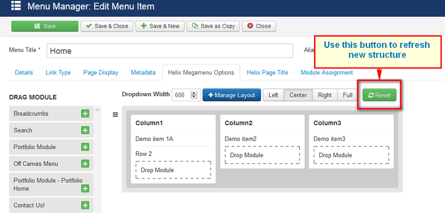
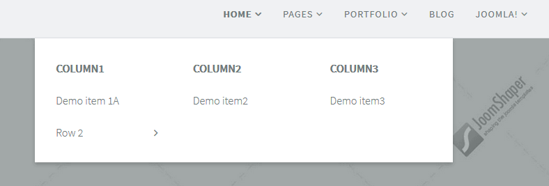
And the final result might be similar to following example
Layout Manager Settings
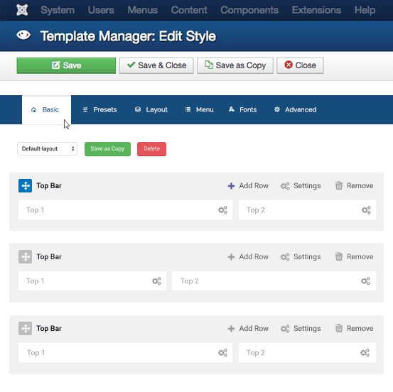
Layout Manager allowing you to build flexible and beautiful layout based on module positions. Layout Builder is one of the unique features of Helix3 which allows anyone to customize the existing template in any shape without having any programming language! In the layout builder we used 6 columns. Those 6 columns covered the whole width of our layout. If you want to create 4 columns then have to use wider blocks for every column.
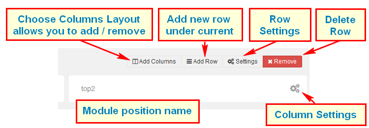
Using Layout Manager is easy to master, learn. Following icons legend should help you understand which icons are responsible for what feature/setting. We suggest to make a copy of current layout to keep it for later in case if you would delete all rows and you forget how they were placed at the beginning.
Each layout which you create can be saved and used later for example in template copy.
Column Settings
- Make Component Area - Enable this option to make this column as a Component area. If you already selected component area for another column then unselect that one first then select this one. Joomla message section will also be loaded inside this column. Only one column in whole layout can be used for showing component (!).
- Module Position - Select any suitable module position from the list. Do not set one module position to multiple position. Each such have unique name.
- Hide on Mobile/Tablet/Desktop - Allows you to choose where this block should be displayed and where shouldn't be. For example some module position can be displayed only on deskop/laptops computer but not on smartphones nor tablets.
- Custom CSS Class - If you wish to style particular content element differently, then use this field to add a class name and then refer to it in your css file.
Note! Do not forget to save column settings on popup window - save button is at the bottom, also general template must be saved after changes.
Advanced Settings
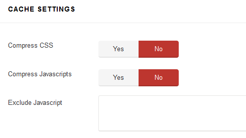
This section of Helix3 settings allows you to reduce size of loaded template files. By speeding up template, you offer a better experience for your customers, improve your page speed (and therefore, possibly, your search engine ranking) and make your CMS appear more stable and professional.
 After you will decided that you have finished last works on template customization we suggest you to turn on some Cache options.
Compress CSS
In order to reduce the number of requests from a browser to the server to render a page, and to take advantage of browser caching, this tag also does some advanced processing of the stylesheets. It generates uniquely named css file which are then returned to the browser, and allowed to cache on the browser.
Note! Custom CSS field is not compressed when you're using this option. It will help you to keep control about small changes.
Compress JavaScript
Also optimize JavaScript is to improve your site performance by compress JS files into one - so that the total size and number of requests will be decreased.
When the optimization option is enabled, the optimized JS file package will be auto generated when a page is viewed in the first time. After enabling this option please check whole website. In some cases it may generate conflicts between this compress option and some third-party extensions, so then leave this one off or use third, following option if you know which file shouldn't be compressed.
Exclude JavaScript files to be optimized
You may want to exclude some JavaScript files and folders from compression by using this option. To exclude JS files that you don't want to optimize, just add the file name, if you have many files, please separate them with comma.
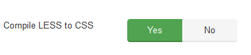
Compile LESS to CSS option - Helix 3 is developed with LESS system built-in. When customize your site, we suggest you to work with LESS files. All your changes in the LESS files will be compiled into the final CSS files. It will override previus changes
Blog Settings
This area of settings allows you to enable some apperance elements (icons in posts) as much a social comments and social share buttons.
Show Type Post Icon(s)
Each Joomla article can have option to use Post formats it means use addcional illustration icon, which can show about what type of article (post) is that content.
Front-end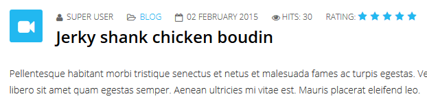 Back-end
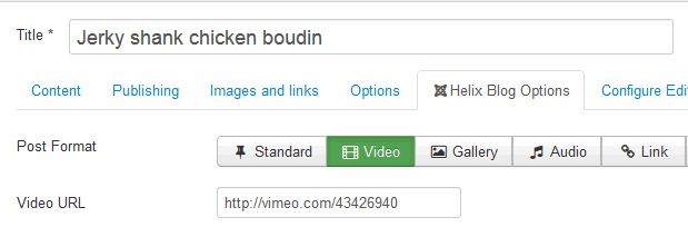
Of course those icons from Post Format settings are based on FontAwesome typography.
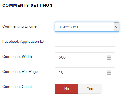
Comments Settings
This build-in option adds IntenseDebate Comments system, Facebook comments and / or Disqus Comments to your site. All in one tool. You don't have to install any addcional plugin anymore to get this feature. Social allows your readers to log in via a preferred social network and add comment under article. All you have to do is choose and set correct Facebook Application ID, IntenseDebate Account or Disqus Username/Subdomain. Sorry, but right now you can use only one selected social comments system or disable it for all content.
Social Share buttons
You can also enable Social Share buttons under each article. Current version have improved social share alignment. In future (upcoming) version we will add more social share buttons.
3rd Extensions Configuration
Installing Kunena template
If you build your site with clean Joomla package, you can download Kunena extension here
After installing Kunena component, log in your customer area then download the extended style for Kunena component, extract and upload "warp" folder to joomla/components/com_kunena/template
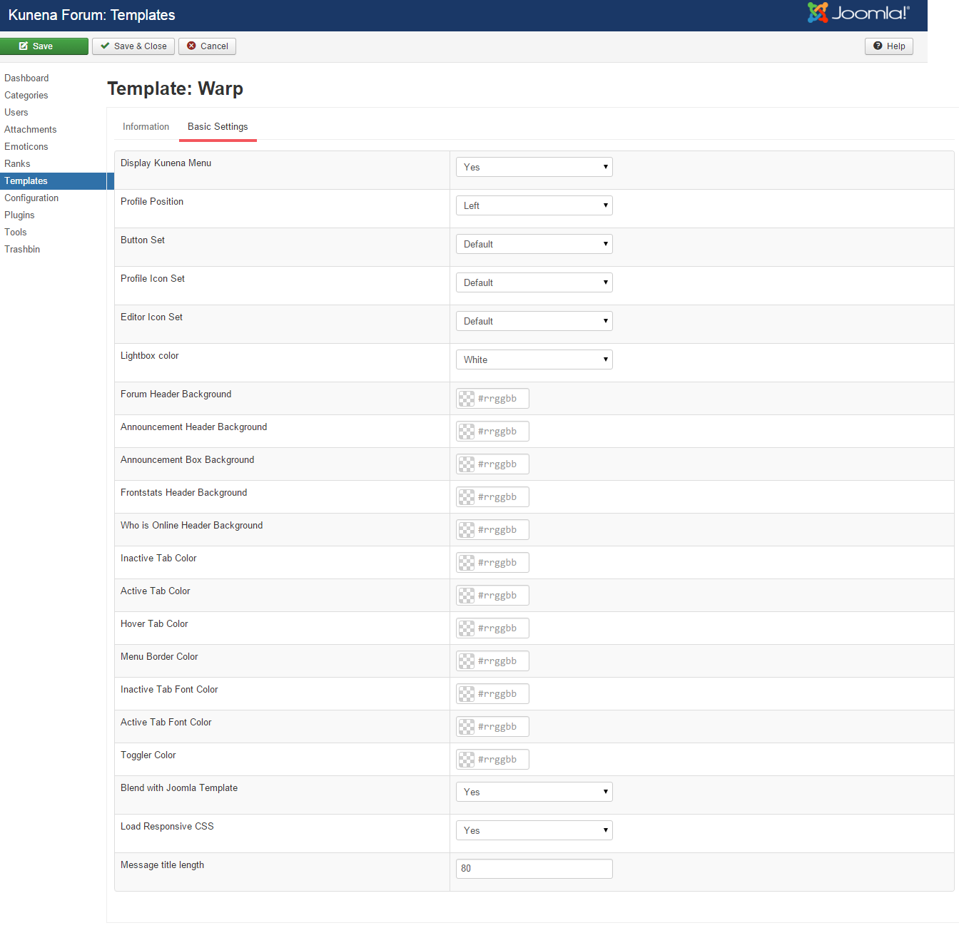
In Joomla backend, go to Components -> Kunena Forum -> Template -> set Warp as default template for Kunena
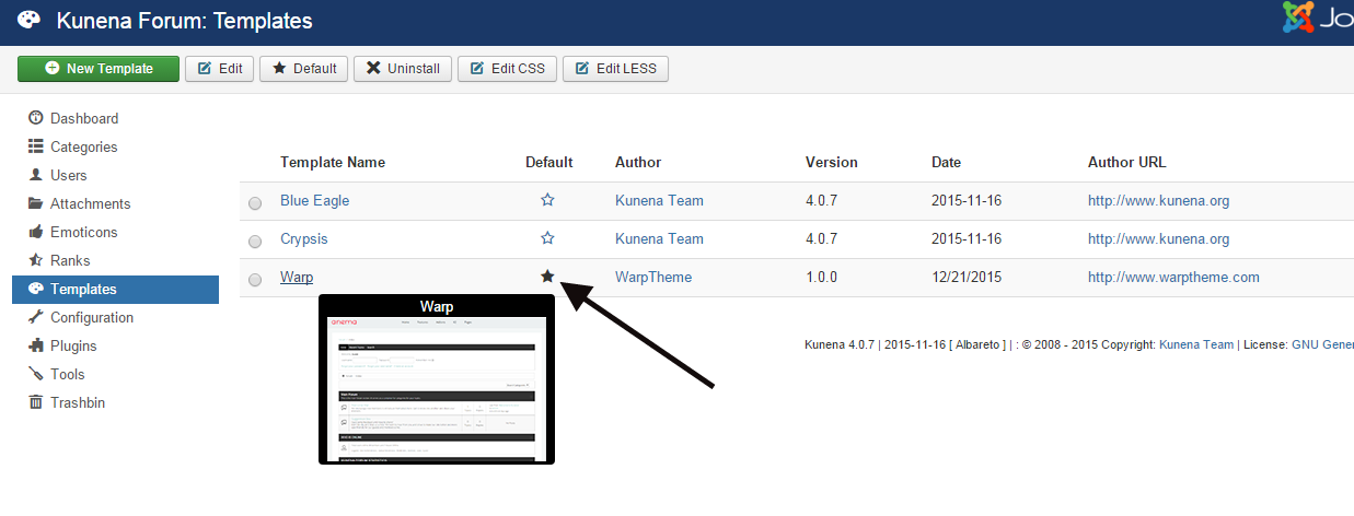
Click warp template to see the template configuration for Kunena
K2 styles already added via less files for PRO edition templates
Credits
This template uses the following images, javascript libraries, icons, plugins, modules, components, or other files as listed below. All the content relating to products, services and events are fictional and are designed to showcase a live site. All images, icons, and photos are copyrighted to their respective owners.- Helix 3 Framework by Joomshaper
- Stock images from billionphotos and Pexels
- Freepik
- Flaticon
- Iconfinder
- Pixeden
- GraphicBurger
- Shutterstock